Background: COVID-19 caused a pandemic, due to its ease of transmission and high number of infections. The evolution of the pandemic and its consequences for the mortality and morbidity of populations, especially the elderly, generated several scientific studies and many research projects. Among them, we have the Predictive Models of COVID-19 Outcomes for Higher Risk Patients Towards a Precision Medicine (PREMO) research project. For such a project with many data records, it is necessary to provide a smooth graphical analysis to extract value from it. Methods: In this paper, we present the development of a full-stack Web application for the PREMO project, consisting of a dashboard providing statistical analysis, data visualization, data import, and data export. The main aspects of the application are described, as well as the diverse types of graphical representations and the possibility to use filters to extract relevant information for clinical practice. Results: The application, accessible through a browser, provides an interactive visualization of data from patients admitted to the intensive care unit (ICU), throughout the six waves of COVID-19 in two hospitals in Lisbon, Portugal. The analysis can be isolated per wave or can be seen in an aggregated view, allowing clinicians to create many views of the data and to study the behavior and consequences of different waves. For instance, the experimental results show clearly the effect of vaccination as well as the changes on the most relevant clinical parameters on each wave. Conclusions: The dashboard allows clinicians to analyze many variables of each of the six waves as well as aggregated data for all the waves. The application allows the user to extract information and scientific knowledge about COVID-19’s evolution, yielding insights for this pandemic and for future pandemics.
1. Introduction
COVID-19 is caused by the SARS-CoV-2 coronavirus identified for the first time in humans in the city of Wuhan, China, in November 2019. This led to a pandemic, due to its high number of cases and ease of transmission. This disease causes respiratory infections, flulike symptoms, and may evolve to more serious conditions, such as pneumonia causing death.
The evolution of this pandemic and its consequences were reflected in the mortality and morbidity of populations, leading to the development of several scientific studies and research projects all over the world [
1,
2,
3,
4,
5,
6,
7,
8,
9,
10,
11]. For instance, the study carried out by Florensa et al. [
1] was carried out in Lleida, Spain, and compared the Alpha variant, first detected in the United Kingdom, and the Delta variant, first detected in India. It concluded that the Alpha variant was more aggressive, with a wider range of symptoms when compared to the Delta variant, mostly due to the lack of vaccination, as the existing one was aimed at the Delta variant [
1]. The work of Amin et al. [
2] compared the first five waves of COVID-19 in Tehran, Iran. It showed that the aggressiveness of the virus, and consequently the probability of death, worsened from the first to the third wave, in which the most serious cases were identified. In the fourth and fifth waves, the gravity of the pandemic gradually decreased.
2. Preliminary Work on the PREMO Project—The Starting Point
The work reported in this paper arises within the scope of the PREMO project, following the study carried out by Rekowski [
12] aimed to identify predictive biomarkers for severe outcomes in the context of COVID-19, namely, death, in critically ill patients admitted to the ICU. To this end, clinical, demographic, and laboratory data collected along the patients’ stay in the ICU were analyzed. It is important to distinguish two different types of data:
longitudinal data (LD) and
cross-sectional data (CD). In CD, there is one set of measurements with multiple observations on the relevant variables, taken at approximately the same point in time. In LD, records for the same entities are obtained over multiple moments in time, making it possible to obtain information about the trajectory of variables over time, as described by Molenberghs and Verbeke [
13].
To infer the evolution of the patients’ clinical condition in the first week of ICU hospitalization, a comparative analysis was carried out between data from the second and seventh day. The statistical distribution for the laboratory parameters of interest were compared between the group of deceased patients and the group of patients who were discharged. Survival analysis studies were also carried out, through the estimation of Kaplan–Meier survival curves [
14,
15]. To compare survival curves for patients characterized by distinct risk patterns, according to biomarker cutoffs, for example, the cut-off point that separates the normal and non-normal reference values of a biomarker, the log-rank (Mantel–Cox) [
16,
17], Breslow (generalized Wilcoxon) [
18,
19], and Tarone–Ware tests were carried out [
20]. The analysis of associations between biomarkers and death was tested using univariate models suitable for LD, acquired throughout the stay of patients in the ICU. It was concluded that the patients who died were considerably older, had a larger number of comorbidities, required more often the use of IMV support, and spent less time in the hospital, as compared to patients who were discharged. This analysis was carried out with standard software tools, and there was no programming involved.
As a first programming approach to support the study by Rekowski [
12], the work of Ribeiro [
21] used data from the first three waves of COVID-19, from one hospital in Lisbon, Portugal with the following objectives:
-
To devise a relational database with the LD of the patients admitted to the ICU, using scripts written in Python. The database was set up dynamically allowing rapid adaptation depending on the number of biomarkers that may arise.
-
To perform the necessary data transformations before being stored in the database, without providing any dashboard nor visualization capabilities.
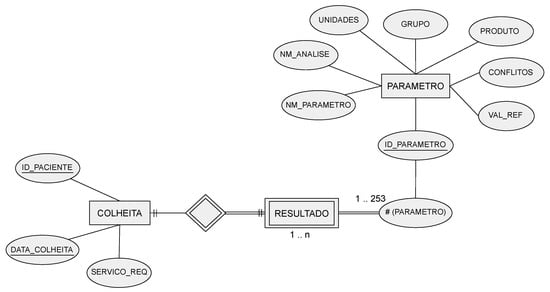
The data were initially stored in Excel files, with one file per patient, with each row representing a biomarker measurement within the collection from the patient. The contents of these Excel files were transposed to the database, after some data preprocessing steps. All files were scanned, extracting the data, excluding columns with meaningless or erroneous values. The devised relational database had the following tables:
-
COLLECTION—identifies the patient, a collection date, and the service that requested the collection.
-
PARAMETER—stores different variables (parameters), such as the name of the laboratory, the parameter name, and reference values, among others.
-
RESULT—the patient’s analysis results for each parameter.
The corresponding entity relationship (ER) model is depicted in Figure 1. Regarding the COLLECTION attributes, the ID-PACIENTE attribute is a sequential number that identifies a patient but hides their identity, under the General Data Protection Regulation (GDPR) guidelines. Only the authorized hospital personnel can access the mapping between this database’s ID-PACIENTE and the real patient identification.
3. Dashboards for COVID-19 and Clinical Data
A dashboard refers to the representation of useful information to the user. As stated by Wexler et al. [
22] “A dashboard is a visual display of data used to monitor and/or facilitate understanding”. A dashboard is typically composed of graphs, diagrams, and numbers providing adequate data visualization and interpretation. The proper use of a dashboard on the data allows the extraction of information and knowledge about the disease and the pandemic, according to the data, information, knowledge, and wisdom (DIKW) model [
23,
24,
25].
Some COVID-19-related projects also address the development of dashboards. Some of them report the largest number of infections, number of recoveries, number of vaccinations, number of deaths, among other indicators, to monitor the spread of the SARS-CoV-2 virus and its variants. An example of this type of dashboard is the one developed by the Johns Hopkins University Center for Systems Science and Engineering [
26]. Another example is the COVID-19 Watcher dashboard to monitor the disease spread in the United States [
27]. The dashboard developed by Ibrahim et al. [
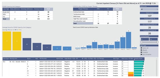
28], depicted in
Figure 2, concerns the management of infected and noninfected patients. The dashboard identifies the hospitalized patients’ location and their status through a color scheme. It allows users to monitor patients in multiple wards and intervene when clinically necessary or to relocate patients, yielding better resource management.
This entry is adapted from the peer-reviewed paper 10.3390/biomedinformatics4010026