Submitted Successfully!
To reward your contribution, here is a gift for you: A free trial for our video production service.
Thank you for your contribution! You can also upload a video entry or images related to this topic.
Version Summary Created by Modification Content Size Created at Operation
1 -- 3288 2023-03-08 16:43:33 |
2 Reference format revised. -2 word(s) 3286 2023-03-09 09:00:01 | |
3 Main text format revised. Meta information modification 3286 2023-03-09 09:00:27 | |
4 Revise the main text format Meta information modification 3286 2023-03-09 09:01:02 |

Video Upload Options

Do you have a full video?

Confirm

Are you sure to Delete?
Cite
If you have any further questions, please contact Encyclopedia Editorial Office.
Vera-Piazzini, O.; Scarpa, M.; Peron, F. Visualization Techniques in Building Energy Simulation and Monitoring. Encyclopedia. Available online: https://encyclopedia.pub/entry/41994 (accessed on 04 May 2024).
Vera-Piazzini O, Scarpa M, Peron F. Visualization Techniques in Building Energy Simulation and Monitoring. Encyclopedia. Available at: https://encyclopedia.pub/entry/41994. Accessed May 04, 2024.
Vera-Piazzini, Ofelia, Massimiliano Scarpa, Fabio Peron. "Visualization Techniques in Building Energy Simulation and Monitoring" Encyclopedia, https://encyclopedia.pub/entry/41994 (accessed May 04, 2024).
Vera-Piazzini, O., Scarpa, M., & Peron, F. (2023, March 08). Visualization Techniques in Building Energy Simulation and Monitoring. In Encyclopedia. https://encyclopedia.pub/entry/41994
Vera-Piazzini, Ofelia, et al. "Visualization Techniques in Building Energy Simulation and Monitoring." Encyclopedia. Web. 08 March, 2023.
Visualization Techniques in Building Energy Simulation and Monitoring
Edit

Data visualization has become relevant in the framework of the evolution of big data analysis. Being able to understand data collected in a dynamic, interactive, and personalized way allows for better decisions to be made when optimizing and improving performance. Although its importance is known, there is a gap in the research regarding its design, choice criteria, and uses in the field of building energy consumption. Therefore, the state-of-the-art of visualization techniques used in the field of energy performance, in particular by considering two types of building analysis: simulation and monitoring are discussed. Likewise, data visualizations are categorized according to goals, level of detail and target users. Visualization tools published in the scientific literature, as well as those currently used in the IoT platforms and visualization software, were analyzed. The overview can be used as a starting point when choosing the most efficient data visualization for a specific type of building energy analysis.

building energy analysis building energy performance data visualization simulation monitoring

1. Introduction

The growing energy demands of buildings and their consequent environmental impacts motivate professionals and researchers in the field of building construction to seek out more sustainable ways to create built environments. To achieve energy efficiency, it is necessary to evaluate processes and consumption behavior. This building information not only allows the reduction in energy waste, but also the increase in energy savings, improving building efficiency [1]. Building Energy Simulation (BES), a computer-based analytical process, is one of the most used alternatives to understand the energy performance and environmental impact of buildings due to its variety of tools and retrofit alternatives [2]. BES could help in the identification of environmental issues in buildings, especially in the last stage of the design [3], and is mainly used in the prediction and analysis of building energy consumption [4]. Another useful alternative to control and monitor energy is the Building Energy Management System (BEMS), a technology which not only allows one to obtain updated and historical information on energy use, but also to predict consumption trends by means of appropriate models, thus promoting energy savings by controlling building loads [5].
Data obtained through BES or BEMS become relevant information when a data-driven analytic approach is used. This method allows for the interpretation and analysis of the data through their graphical representation [2][6], allowing these data to be processed, organized, and structured, gaining significance and purpose [7]. Currently, several tools may be used in the framework of this approach, among which are data visualization software and Internet of Things (IoT) platforms. These technologies could contribute to the efficient management of energy consumption, support the decision-making process and reduce costs while maintaining the required energy demand [8].
Due to the relevance of energy efficiency in this field of research and the importance of data visualization in the framework of the evolution of big data analysis [9], many companies have become interested in developing tools aimed at monitoring their energy metrics. When analyzing building energy simulation results, it is often necessary to combine different tools and software due to the large amount of data and various needs [10]. This limitation has led to companies developing their own visualization tools due to the complexity and advanced knowledge requirement for BES [3]. However, one of the recurring problems of specialized visualization is the lack of adaptability when the user is interested in relating different metrics and parameters [11]. Likewise, these dashboards do not have the ability to modify the charts according to particular purposes. Thus far, there is no data visualization tool that can analyze and compare scenarios based on custom parameters [10].
Being able to understand the metrics of the data collected in a dynamic, interactive, and personalized way allows for better decisions to be made when optimizing and improving performance [12][13][14], as well as for awareness and motivation/learning [15][16]. Additionally, there is currently a great variety of types of visualization, each of them having different levels of complexity. Therefore, several types of graphs, plots, and charts are used in the interdisciplinary field of data visualization in order to communicate information efficiently. Hence the characteristics of an effective graphical representation are: clarity, precision, and efficiency [17], considering that visual information should not only be useful but also meaningful [18][19][20].
Moreover, graph types can be organized in relation to: data dimensions (univariate or multivariate analysis), types of variables (numeric or categoric), as well as functional categories, such as comparison, relationship, distribution, and composition, among others. Likewise, their choice depends, above all, on the purpose of the analysis, the source and availability of the data, and the target user. Furthermore, in some cases, there is a need for simple and clean graphs in order to make quick decisions; in others, the users have more advanced knowledge and require personalized charts, with the possibility of creating their own data models [21].
Intelligent energy control in buildings is an important aspect towards sustainability [22][23][24], and Internet of Things (IoT) technology is leading this transformation due to its ability to store, process, and exchange huge amounts of data [25][26]. By monitoring the target infrastructure through sensors and actuators, IoT technology gives an overview of the current situation of energy costs and consumption, allowing the user to have complete insight of the parameters at all times [23][27][28].
In many cases, these platforms include the graphical representation of data as an intrinsic feature; in others, they are supported by visualization software with a wide variety of charts. By providing an interface with the database and a Machine Learning (ML) tool for faster processing and improved efficiency, these platforms help users with no prior experience to better understand their information and data for future decision making. Although the opportunity to visualize data through dashboards is provided, Sarikaya et al. [29] emphasized the difficulty that exists when using pre-established dashboard tools, as they fail to reflect the multiple and varied needs of users, not allowing them to clearly interpret their data. It is important that visualization tools are adapted to the goals and intended scopes of the study [30] and become more “case-focused” [21].
Regarding this issue, the use of interactive tools capable of presenting complex information on a single display and making use of various types of visualization charts can be introduced [14][31]. In fact, several articles have already reviewed a great variety of visual analytics; however, the scientific literature is still lacking in organizing these visualizations into useful categories according to the types of building energy analysis and their levels-of-detail (LOD) of data.

2. Visualization Techniques in Building Energy Simulation and Monitoring

2.1. Types of Visualization Used in Relation to the Goal of the Analysis

When choosing the best way to visualize energy data, more than one graph can be used at the same time, but these types are the same ones being used constantly. Line and bar charts are the most used graphs, having been identified in 26 and 20 scientific papers, respectively. Likewise, it is observed that more complex graphs, which offer the possibility of analyzing multiple data dimensions or attributes (e.g., bubble charts and boxplots) and hierarchical graphs (e.g., sunbursts) are used less frequently. Furthermore, 3D visualizations and floor plans are used in a large number of tools as a visual and contextual support, thus reinforcing the presentation of quantitative graphics [32].
In relation to the goal of energy report analysis, scholars predominantly focus their visualizations on a professional/expert user in the field of energy management. These users need to be aware of the building’s energy performance in order to make informed decisions. Among the charts aimed at this purpose, in addition to the typical lines and bars, histograms, scatter plots, parallel coordinates, as well as pie charts and their variations were found. In most cases, these graphs complement data tables that present the same numerical information [1][10][33][34][35][36][37], giving the expert user the opportunity to interpret data under different possible relationships between variables.

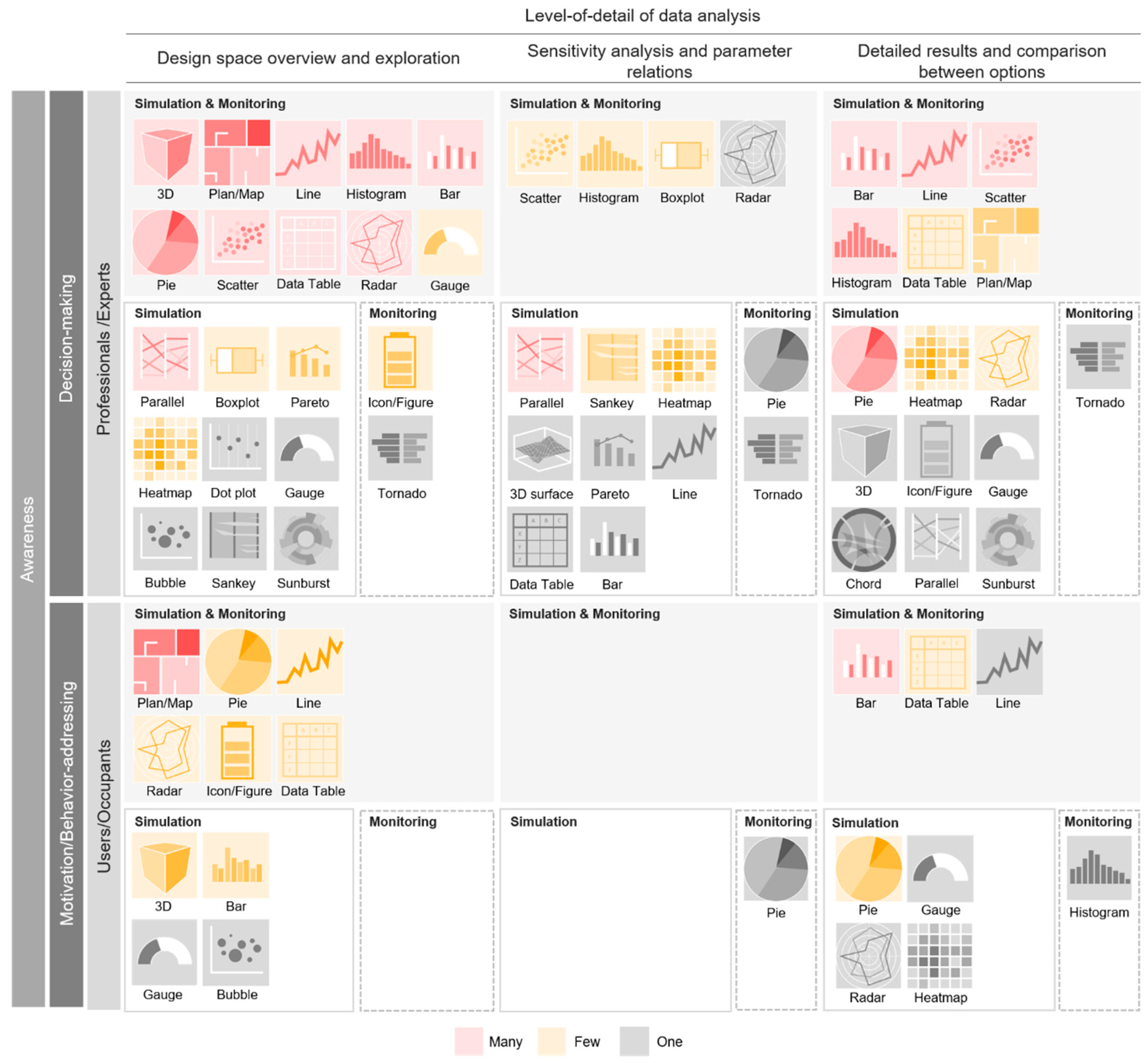
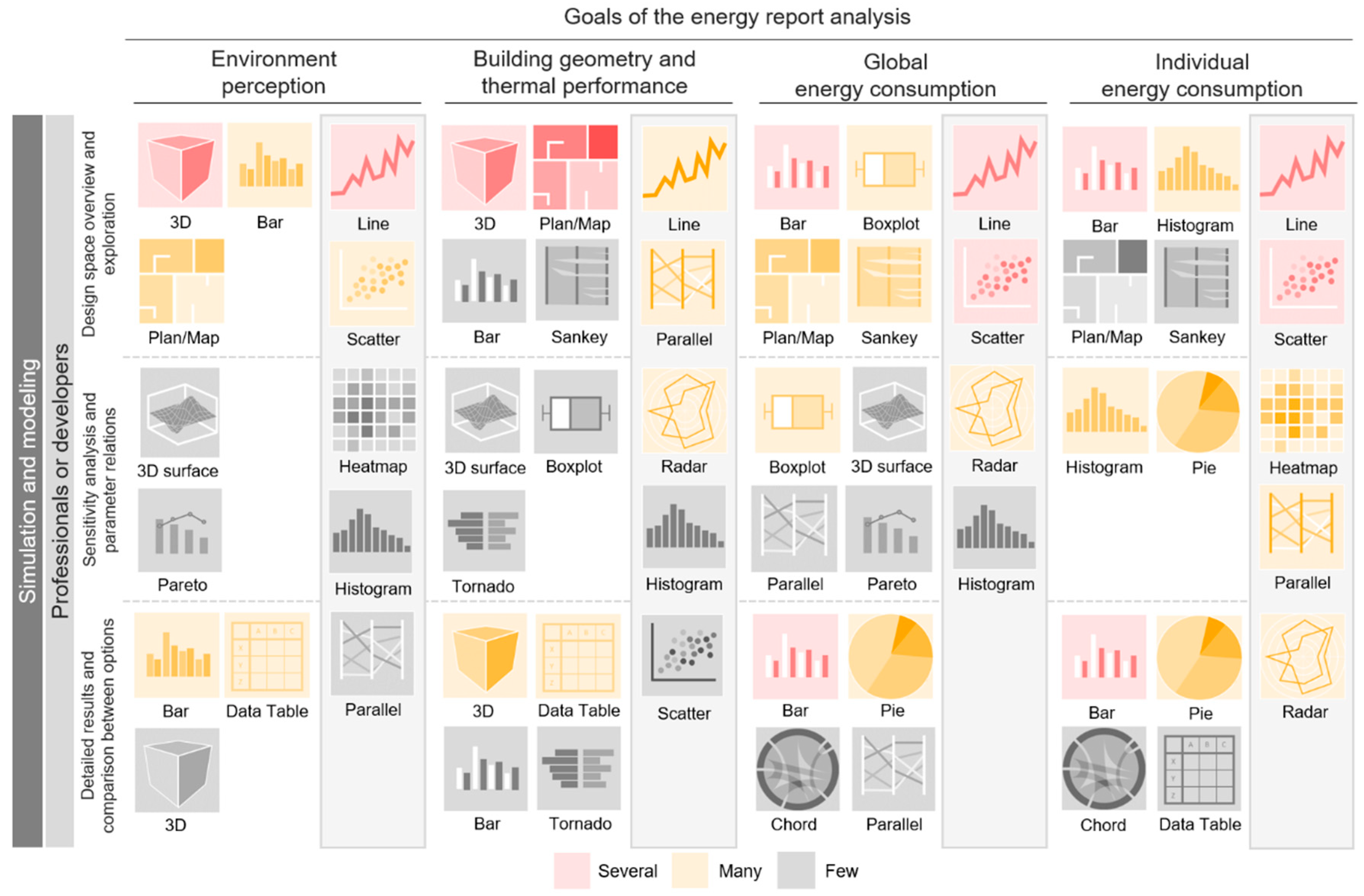
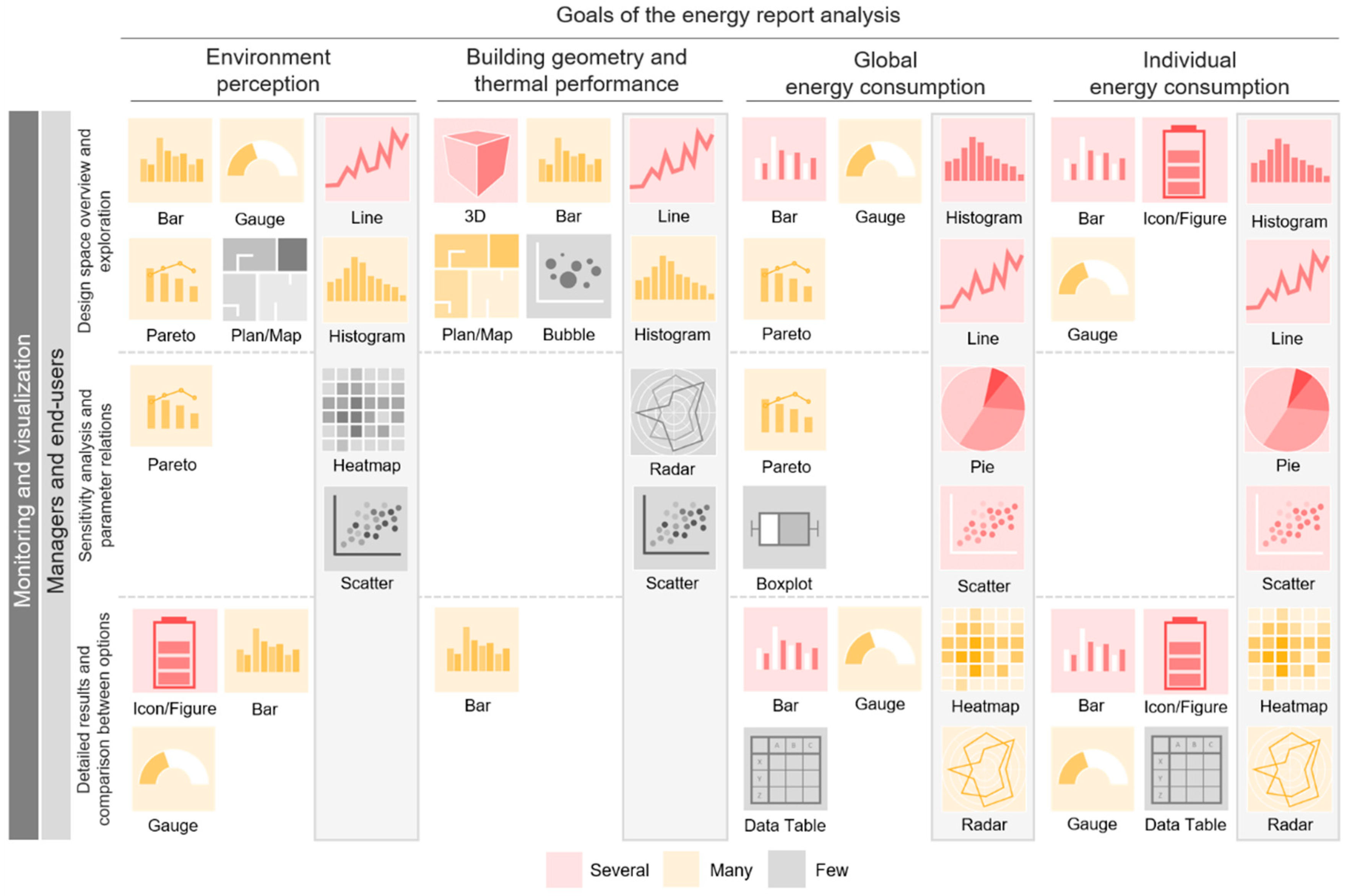
The literature focused on energy performance visualization presents a wide variety of types of presentations and techniques of use. Literature presenting case studies as the main goal use common graphs, such as line, bar, and pie charts. Moreover, some papers present information with just one type of chart in which the time-scale and variables change, and these can be presented in isolation or as a composition. Some examples of graphs used in these papers are Sankey diagrams [38], heatmaps [39], radar charts [40], parallel coordinates [36][41], scatter plots [42], and sunbursts [43].

2.2. Types of Visualization Used in Relation to Performance Indicators

Environment perception. Temperature/comfort and relative humidity are the most recurrent variables and generally presented in a single graph. When the data source is a simulation, the time-scale is predominantly monthly and daily; when it comes to monitoring data, the main scales are hourly and sub-hourly. Generally, the graph chosen in these cases is a line chart.
In relation to daylight/luminance/glare, a trend towards its relationship with geometry variable is observed. This is presented by means of 3D visualizations and/or floor plans at an annual time-scale, when the analysis is simulated, and sub-hourly when it is monitored.
Although air quality and ventilation are closely related variables, a weak relationship has been observed in the analyzed graphs. Ventilation is usually associated with temperature/comfort and presented as a line graph on an hourly scale.
Building geometry and thermal performance. Geometric data are usually shown through 3D visualizations and floor plans, often accompanied by a data table that deepens the information displayed. Although the geometry and envelope variables play an important role in the internal temperature/comfort of the building, no strong relationship has been observed between these parameters. When the geometry and envelope of the building are associated, bar charts, parallel coordinates, radar charts, and tornado diagrams are regularly used.
When analyzing building occupancy through simulations, line and bar charts with daily and hourly time-scales are preferred; when monitoring, 3D visualizations, floor plans, and gauges are additionally used. Some graphs have been prevalently used to represent air quality in relation to occupancy, but in no case has occupancy been associated with noise values.
General energy consumption. There are several types of visualization used in the field of energy consumption. Among the most representative, line, bar, pie/donut, and radar charts have been notably used to show general consumption in simulations with annual, daily, and hourly time-scales. In relation to monitoring, in addition to those already mentioned, gauges and widgets/icons/figures were identified when at-a-glance and eye-catching visualizations are needed. Heatmaps have been used to visualize average demands over a given time [42][44] and compare performance between individual consumption patterns [45]. However, this graph gains even more relevance when data are visualized spatially with the support of 3D visualizations or floor plans [29][37][40][46][47].
Tornado diagrams and radar charts are used when energy performance is simulated and display information on an annual scale. The first one is used to visualize the influence of design variables in relation to its performance [2], load factors [48], and costs [49], while the second is used to compare design alternatives in relation to energy savings [10], as well as multiple variables and key performance indicators [40][50].
Individual energy consumption. Line, bar, and histogram charts are chosen to display monthly, daily and hourly lighting consumption, while pie/donut charts show just annual data. No relation is observed between lighting and daylight/luminance/glare parameters, despite the fact that their association often derives from cause–consequence analysis. Furthermore, it is noted that the lighting–geometry relation is not as strong as expected. Although papers focus on the final energy consumption rather than analyzing the underlying causes, it would be useful to show data of both variables in a single graph to study the correlation.
Regarding heating and cooling consumption—the most studied parameters in the field—sunburst charts, parallel coordinates, and chord diagrams are the common visualization types chosen to present annual data as an overview, while bar and line charts, heatmaps, histograms, and scatter plots are preferred when the aim is to understand behavior over shorter periods of time.
Parallel coordinates, in most cases, show interrelated design variables and attributes [10][41][51], allowing one to identify the impact generated by the design alternatives in general consumption and achieve a “direct reading key” between input and output [36]. Furthermore, the use of the pie/donut chart and its variations is observed in the following cases: when showing the total consumption and its subdivisions by category, e.g., heating, cooling, lighting, and hot water [33]; when comparing consumption between spaces [1] and equipment [52]; and when monitoring [53][54] and predicting [55] minimum and maximum consumption, with the help of color differentiation.
In addition to the typical line and bar charts, which seem to have the ability to adapt to all parameters and purposes, scatter plots and histograms are the most versatile visualizations. Scatter plots are used when different variables must be related to one or more objectives [2][10][56]. It offers the possibility to identify patterns [42] or separate clusters [41] in search of anomalies and allows for the analysis of design performance according to different alternatives [49]. Histograms have proven useful when comparing hourly and daily consumption [37][38][56], as well as weekly and monthly variations [55][57][58][59]. Historical performance and design variables can also be plotted using this graph [49][60].
Water and natural gas consumption. For the study of these parameters, line and bar charts associated with widgets/icons/figures, data tables, or gauges were identified when data monitoring activities are being displayed. Scatter plots are used in simulations on a monthly scale, mainly due to the availability of water and gas bills.
Costs and renewable energy. Costs related to consumption are represented annually by means of bars, scatter plots, Pareto charts, and tornado diagrams. Likewise, presentations of renewable energy use are always related to cost and general consumption and thus use bar charts and heatmaps. It is noted that this information is not commonly displayed and is not related to other parameters.

2.3. Synthesis of Visualizations According to the Type of Building Energy Analysis

The results of the analysis of data visualization types are summarized in Figure 1. In order to understand which graphical representations are the most used according to the type of building energy analysis, a subdivision by categories is presented. On the left side of the table, the types are related to the goals of the interpretation phase, while the LOD of the data analysis is shown at the top. The visualizations are color-coded to differentiate the number of times each graphic is used in the scientific literature. The red color indicates that the use of the graphic has been identified many times, yellow indicates less use, while the gray color indicates its use only once.
Figure 1. Graphical representations per type of building energy and level of detail of data analysis in relation to users.
Having noticed that awareness is a shared goal between professionals/experts and occupants, users were divided according to two main purposes: decision making and motivation/learning. This classification allows the identification of the most used types for each of the LODs.
In the initial exploration phase, eight charts were identified as the most used graphics when making decisions in both types of performance analysis (i.e., simulations and monitoring): line charts, histograms, bar charts, pie/donut charts, scatter plots, data tables, and radar charts. When displaying combined simulation results, parallel coordinates is a recurring option, followed by boxplots, Pareto charts, and heatmaps. By contrast, when monitoring data, widgets/icons/figures are used for detecting hotspots. Dynamisms such as alerts allow trends to be identified and for mitigating measures to be taken. Furthermore, when the goal is to motivate and educate the occupant, the use of contextualized charts, such as 3D visualizations and floor plans/maps, is a trending strategy, aiming to help a non-expert user to better understand the metrics. Their use is observed mainly in simulations, taking advantage of the model previously elaborated in the preceding phase.
The use of scatter plots, histograms, and boxplots is observed in the second LOD. These graphs, focused on an expert user, allow multiple variables to be related at the same time and facilitate the analysis of sensitive data. Specifically for combined simulation analysis, the tendency to use parallel coordinates is once again observed, but for monitoring, no predilections were identified. In this case, pie/donut charts and tornado diagrams were used to subdivide and present data by annual categories. The only chart aimed at occupants was the pie chart, most likely because this graph allows one to observe data in real time by dividing the total consumption by services.
The use of line and bar charts, scatter plots, and histograms was mainly observed when analyzing results in detail and comparing the performance between design options. The visualization of this kind of information is intended for energy experts with decision making power. Among those chosen for occupants, pie/donut charts were again prioritized for simulation, while for monitoring time-series, histograms were chosen due to their ability to show frequency distributions.
In order to deepen the analysis and prioritize expert users, such as professionals, developers, managers, and end-users, the graphical representations in relation to the types of building energy analysis, whether simulation (Figure 2) or monitoring (Figure 3), are presented.
Figure 2. Graphical representations per goals and level of detail of data analysis for simulation and modeling.
Figure 3. Graphical representations per goals and level of detail of data analysis for monitoring and visualization.

2.4. Interactive Dashboards as a Supporting Strategy for Decision Making

Energy results, whether derived from simulation or monitoring, need graphical representations in order to be understood effectively. It was found that the choice of the most appropriate graph depends on key factors: data source and availability, goals of the energy analysis, and target user. Likewise, prioritizing a single graph without context, without explanation of the findings or situational comparisons, restricts the scope of interpretation and limits decision-making. For this reason, the fluid integration of different types of graph, where the user is allowed to explore and control the information, is necessary [31][46]. The graphs must complement each other and be presented with a certain hierarchy, prioritizing some of them and emphasizing important results [61].

2.5. Data Visualization Tools and Platforms

Table 1 shows tools that have been identified as highly useful and versatile in the field of building energy analysis. Their characteristics and potentials are pointed out, as well as the variety of chart types offered.

Table 1. Data visualization software development tools.
Software Tools Source Free
Version
Dashboard Dynamic Interactive Customizable Historical
Analytics
Predictive
Analytics
Data Alert Chart Types
Bokeh [62] open available - - - M
ChartBlocks [63] open available n/a n/a n/a   F
Chartist.js [64] open available n/a - - - F
Charts.js [65] open available - - - F
D3.js [66] open available - - - M
DataHero [67] n/a   n/a n/a n/a n/a n/a F
Datapine [68] closed   S
Dundas BI [69] n/a   S
Dygraphs [70] open available - - - M
FusionCharts [71] open   - - - M
Google Charts [72] open available n/a     S
Grafana [73] open available     M
Infogram [74] n/a available n/a     S
Klipfolio [75] n/a available n/a n/a n/a S
Looker [76] n/a   S
Matplotlib [77] open available - - - - M
Plotly [78] open available - - - S
Power BI [79] closed available   S
Qlikview [80] closed available S
Sisense [81] open   F
Tableau [82] open available M
Zoho Analytics [83] open available n/a S
Note: “-” it does not apply, “n/a” information not available, “M” many, “S” several, “F” few.
IoT platforms offer a wide variety of very useful charts for the industrial, business, health and transport sectors, while for the energy consumption of buildings, this offer decreases. As a consequence, the same types of graphs identified in the scientific literature were found. Although some software and platforms allow users to create and/or choose between visually captivating graph options, it seems that familiar charts provide some security and avoid possible confusion around data interpretation caused by less used ones.

References

  1. Ruiz, L.G.B.; Pegalajar, M.C.; Molina-Solana, M.; Guo, Y.K. A case study on understanding energy consumption through prediction and visualization (VIMOEN). J. Build. Eng. 2020, 30, 101315.
  2. Jia, H.; Chong, A. Eplusr: A framework for integrating building energy simulation and data-driven analytics. Energy Build. 2021, 237, 110757.
  3. Forouzandeh, N.; Tahsildoost, M.; Zomorodian, Z.S. A review of web-based building energy analysis applications. J. Clean. Prod. 2021, 306, 127251.
  4. Karlsson, F.; Rohdin, P.; Persson, M.L. Measured and predicted energy demand of a low energy building: Important aspects when using Building Energy Simulation. Build. Serv. Eng. Res. Technol. 2016, 28, 223–235.
  5. Mahdavi, A.; Taheri, M. An ontology for building monitoring. J. Build. Perform. Simul. 2016, 10, 499–508.
  6. Project Stasio. Available online: https://projectstasio.com/mission/ (accessed on 22 April 2022).
  7. What Are Data, Information, and Knowledge? Available online: https://internetofwater.org/valuing-data/what-are-data-information-and-knowledge/ (accessed on 12 August 2022).
  8. Al-Ali, A.R.; Zualkernan, I.A.; Rashid, M.; Gupta, R.; Alikarar, M. A smart home energy management system using IoT and big data analytics approach. IEEE Trans. Consum. Electron. 2017, 63, 426–434.
  9. Chen, X.; Chen, X. Data visualization in smart grid and low-carbon energy systems: A review. Int. Trans. Electr. Energy Syst. 2021, 31, e12889.
  10. Gadelhak, M.; Lang, W.; Petzold, F. A Visualization Dashboard and Decision Support Tool for Building Integrated Performance Optimization. 2017, p. 10. Available online: http://papers.cumincad.org/data/works/att/ecaade2017_029.pdf (accessed on 3 March 2022).
  11. Ergasheva, S.; Ivanov, V.; Khomyakov, I.; Kruglov, A.; Strugar, D.; Succi, G. InnoMetrics Dashboard: The Design, and Implementation of the Adaptable Dashboard for Energy-Efficient Applications Using Open Source Tools. IFIP Adv. Inf. Commun. Technol. 2020, 582, 163–176.
  12. Srivastav, S.; Lannon, S.; Alexander, D.K.; Jones, P. A Review and Comparison of Data Visualization Techniques Used in Building Design and in Building Simulation. 2009. Available online: https://www.aivc.org/sites/default/files/BS09_1942_1949.pdf (accessed on 24 February 2022).
  13. Murugesan, L.K.; Hoda, R.; Salcic, Z. Design criteria for visualization of energy consumption: A systematic literature review. Sustain. Cities Soc. 2015, 18, 1–12.
  14. Alhamadi, M. Challenges, strategies and adaptations on interactive dashboards. In Proceedings of the 28th ACM Conference on User Modeling, Adaptation and Personalization, Genoa, Italy, 14–17 July 2020; pp. 368–371.
  15. Sedrakyan, G.; Mannens, E.; Verbert, K. Guiding the choice of learning dashboard visualizations: Linking dashboard design and data visualization concepts. J. Comput. Lang. 2019, 50, 19–38.
  16. Herrmann, M.R.; Brumby, D.P.; Oreszczyn, T.; Gilbert, X.M.P. Does data visualization affect users’ understanding of electricity consumption. Build. Res. Inf. 2017, 46, 238–250.
  17. Tufte, E. The Visual Display of Quantitative Information, 2nd ed.; Graphics Press LLC: Cheshire, CT, USA, 2001.
  18. Camoes, J. Excel Charts. Available online: https://excelcharts.com/author/jorge-camoes/ (accessed on 10 October 2022).
  19. Few, S. Show Me the Numbers: Designing Tables and Graphs to Enlighten, 1st ed.; Analytics Press: Berkeley, CA, USA, 2004.
  20. Few, S. Eenie, Meenie, Minie, Moe: Selecting the Right Graph for Your Message. Intell. Enterp. 2004, 7, 14–35. Available online: https://www.perceptualedge.com/articles/ie/the_right_graph.pdf (accessed on 10 October 2022).
  21. Allen Hillery. The Evolution of Data Visualization. 19 November 2020. Available online: https://chartio.com/blog/the-evolution-of-data-visualization/ (accessed on 24 February 2022).
  22. Khajenasiri, I.; Estebsari, A.; Verhelst, M.; Gielen, G. A Review on Internet of Things Solutions for Intelligent Energy Control in Buildings for Smart City Applications. Energy Procedia 2017, 111, 770–779.
  23. Wang, J.; Lim, M.K.; Wang, C.; Tseng, M.L. The evolution of the Internet of Things (IoT) over the past 20 years. Comput. Ind. Eng. 2021, 155, 107174.
  24. Bedi, G.; Venayagamoorthy, G.K.; Singh, R.; Brooks, R.R.; Wang, K.C. Review of Internet of Things (IoT) in Electric Power and Energy Systems. IEEE Internet Things J. 2018, 5, 847–870.
  25. Traboulsi, S.; Knauth, S. Towards implementation of an IoT analysis system for buildings environmental data and workplace well-being with an IoT open software. Procedia Comput. Sci. 2020, 170, 341–346.
  26. Lawal, K.; Rafsanjani, H.N. Trends, benefits, risks, and challenges of IoT implementation in residential and commercial buildings. Energy Built Environ. 2021, 3, 251–266.
  27. Al Faruque, M.A.; Vatanparvar, K. Energy Management-as-a-Service over Fog Computing Platform. IEEE Internet Things J. 2016, 3, 161–169.
  28. Gavrilović, N.; Mishra, A. Software architecture of the internet of things (IoT) for smart city, healthcare and agriculture: Analysis and improvement directions. J. Ambient Intell. Humaniz. Comput. 2020, 12, 1315–1336.
  29. Sarikaya, A.; Correll, M.; Bartram, L.; Tory, M.; Fisher, D. What do we talk about when we talk about dashboards. IEEE Trans. Vis. Comput. Graph. 2019, 25, 682–692.
  30. Hollberg, A.; Kiss, B.; Röck, M.; Soust-Verdaguer, B.; Wiberg, A.H.; Lasvaux, S.; Galimshina, A.; Habert, G. Review of visualising LCA results in the design process of buildings. Build. Environ. 2021, 190, 107530.
  31. Few, S. Information Dashboard Design: The Effective Visual Communication of Data, 1st ed.; O’Reilly: Cambridge, MA, USA, 2006.
  32. ACCA Software|Programmi per Edilizia, Architettura e Ingegneria. Available online: https://www.acca.it/ (accessed on 22 April 2022).
  33. Oh, T.K.; Lee, D.; Park, M.; Cha, G.; Park, S. Three-Dimensional Visualization Solution to Building-Energy Diagnosis for Energy Feedback. Energies 2018, 11, 1736.
  34. Lee, D.; Cha, G.; Park, S. A study on data visualization of embedded sensors for building energy monitoring using BIM. Int. J. Precis. Eng. Manuf. 2016, 17, 807–814.
  35. Chen, Y.; Liang, X.; Hong, T.; Luo, X. Simulation and visualization of energy-related occupant behavior in office buildings. Build. Simul. 2017, 10, 785–798.
  36. Elbeltagi, E.; Wefki, H.; Abdrabou, S.; Dawood, M.; Ramzy, A. Visualized strategy for predicting buildings energy consumption during early design stage using parametric analysis. J. Build. Eng. 2017, 13, 127–136.
  37. Shen, J.; Krietemeyer, B.; Bartosh, A.; Gao, Z.; Zhang, J. Green Design Studio: A modular-based approach for high-performance building design. Build. Simul. 2020, 14, 241–268.
  38. Abdelalim, A.; O’Brien, W.; Shi, Z. Data visualization and analysis of energy flow on a multi-zone building scale. Autom. Constr. 2017, 84, 258–273.
  39. Yarbrough, I.; Sun, Q.; Reeves, D.C.; Hackman, K.; Bennett, R.; Henshel, D.S. Visualizing building energy demand for building peak energy analysis. Energy Build. 2015, 91, 10–15.
  40. Stavropoulos, G.; Krinidis, S.; Ioannidis, D.; Moustakas, K.; Tzovaras, D. A building performance evaluation & visualization system. In Proceedings of the 2014 IEEE International Conference on Big Data (Big Data), Washington, DC, USA, 27–30 October 2014; pp. 1077–1085.
  41. Cottafava, D.; Sonetti, G.; Gambino, P.; Tartaglino, A. Explorative Multidimensional Analysis for Energy Efficiency: DataViz versus Clustering Algorithms. Energies 2018, 11, 1312.
  42. Xiao, C.; Khayatian, F.; Dall’O’, G. Unsupervised learning for feature projection: Extracting patterns from multidimensional building measurements. Energy Build. 2020, 224, 110228.
  43. Kiss, B.; Szalay, Z. A Visual Method for Detailed Analysis of Building Life Cycle Assessment Results. Appl. Mech. Mater. 2019, 887, 319–326.
  44. Li, Y.; Gao, W.; Ruan, Y.; Ushifusa, Y. Grid Load Shifting and Performance Assessments of Residential Efficient Energy Technologies, a Case Study in Japan. Sustainability 2018, 10, 2117.
  45. Manfren, M.; Aste, N.; Leonforte, F.; Del Pero, C.; Buzzetti, M.; Adhikari, R.S.; Zhixing, L. Parametric energy performance analysis and monitoring of buildings—HEART project platform case study. Sustain. Cities Soc. 2020, 61, 102296.
  46. Shneiderman, B. The eyes have it: A task by data type taxonomy for information visualizations. In Proceedings of the IEEE Symposium on Visual Languages, Boulder, CO, USA, 3–6 September 1996; pp. 336–343.
  47. Jakubiec, J.A.; Doelling, M.C.; Heckmann, O.; Thambiraj, R.; Jathar, V. Dynamic Building Environment Dashboard: Spatial Simulation Data Visualization in Sustainable Design. Technol. Archit. Des. 2017, 1, 27–40.
  48. Brown, N.; Ubbelohde, M.S.; Loisos, G.; Philip, S. Quick Design Analysis for Improving Building Energy Performance. Energy Procedia 2014, 57, 1868–1877.
  49. Basbagill, J.P.; Flager, F.; Lepech, M. Measuring the impact of dynamic life cycle performance feedback on conceptual building design. J. Clean. Prod. 2017, 164, 726–735.
  50. Cerquitelli, T.; Di Corso, E.; Proto, S.; Bethaz, P.; Mazzarelli, D.; Capozzoli, A.; Baralis, E.; Mellia, M.; Casagrande, S.; Tamburini, M. A Data-Driven Energy Platform: From Energy Performance Certificates to Human-Readable Knowledge through Dynamic High-Resolution Geospatial Maps. Electronics 2020, 9, 2132.
  51. Lin, B.; Chen, H.; Liu, Y.; He, Q.; Li, Z. A preference-based multi-objective building performance optimization method for early design stage. Build. Simul. 2020, 14, 477–494.
  52. Nimbarte, A.D.; Smith, N.; Gopalakrishnan, B. Human Factors Evaluation of Energy Visualization Dashboards. Ergon. Des. 2021.
  53. Mataloto, B.; Ferreira, J.C.; Cruz, N. LoBEMS—IoT for Building and Energy Management Systems. Electronics 2019, 8, 763.
  54. Niu, S.; Pan, W.; Zhao, Y. A BIM-GIS Integrated Web-based Visualization System for Low Energy Building Design. Procedia Eng. 2015, 121, 2184–2192.
  55. Piscitelli, M.S.; Brandi, S.; Capozzoli, A.; Xiao, F. A data analytics-based tool for the detection and diagnosis of anomalous daily energy patterns in buildings. Build. Simul. 2020, 14, 131–147.
  56. Jradi, M.; Arendt, K.; Sangogboye, F.C.; Mattera, C.G.; Markoska, E.; Kjærgaard, M.B.; Veje, C.T.; Jørgensen, B.N. ObepME: An online building energy performance monitoring and evaluation tool to reduce energy performance gaps. Energy Build. 2018, 166, 196–209.
  57. Itoh, T.; Kawano, M.; Kutsuna, S.; Watanabe, T. A visualization tool for building energy management system. Proc. Int. Conf. Inf. Vis. 2015, 2015, 15–20.
  58. Ali, A.S.; Coté, C.; Heidarinejad, M.; Stephens, B. Elemental: An Open-Source Wireless Hardware and Software Platform for Building Energy and Indoor Environmental Monitoring and Control. Sensors 2019, 19, 4017.
  59. Desogus, G.; Quaquero, E.; Rubiu, G.; Gatto, G.; Perra, C. BIM and IoT Sensors Integration: A Framework for Consumption and Indoor Conditions Data Monitoring of Existing Buildings. Sustainability 2021, 13, 4496.
  60. Gerrish, T.; Ruikar, K.; Cook, M.; Johnson, M.; Phillip, M.; Lowry, C. BIM application to building energy performance visualisation and management: Challenges and potential. Energy Build. 2017, 144, 218–228.
  61. Krackov, A. Dashboards Are Not Data Stories. 9 November 2021. Available online: https://nightingaledvs.com/dashboards-are-not-data-stories/ (accessed on 25 March 2022).
  62. Bokeh. Available online: https://bokeh.org/ (accessed on 3 May 2022).
  63. ChartBlocks. Online Chart Builder. Available online: https://www.chartblocks.com/en (accessed on 18 February 2022).
  64. Chartist—Simple Responsive Charts. Available online: https://gionkunz.github.io/chartist-js/ (accessed on 18 February 2022).
  65. Chart.js|Open Source HTML5 Charts for Your Website. Available online: https://www.chartjs.org/ (accessed on 18 February 2022).
  66. D3.js—Data-Driven Documents. Available online: https://d3js.org/ (accessed on 18 February 2022).
  67. DataHero: Data Visualization & Data Dashboard Software. Available online: https://datahero.com/ (accessed on 18 February 2022).
  68. Datapine|Modern Business Intelligence & Dashboard Platform. Available online: https://www.datapine.com/ (accessed on 18 February 2022).
  69. Dundas BI Data Visualization. Available online: https://www.dundas.com/dundas-bi/features (accessed on 18 February 2022).
  70. Dygraphs Charting Library. Available online: https://dygraphs.com/ (accessed on 18 February 2022).
  71. FusionCharts. JavaScript Charts for Web & Mobile. Available online: https://www.fusioncharts.com/ (accessed on 18 February 2022).
  72. Charts|Google Developers. Available online: https://developers.google.com/chart (accessed on 18 February 2022).
  73. Grafana: The Open Observability Platform|Grafana Labs. Available online: https://grafana.com/ (accessed on 18 February 2022).
  74. Infogram. Create Infographics, Reports and Maps. Available online: https://infogram.com/ (accessed on 18 February 2022).
  75. Klipfolio|Business Dashboard & Analytics Software. Available online: https://www.klipfolio.com/ (accessed on 18 February 2022).
  76. Looker. Business Intelligence (BI) & Data Analytics Platform. Available online: https://looker.com/#exit-popup (accessed on 18 February 2022).
  77. Matplotlib—Visualization with Python. Available online: https://matplotlib.org/ (accessed on 18 February 2022).
  78. Plotly: The Front End for ML and Data Science Models. Available online: https://plotly.com/ (accessed on 18 February 2022).
  79. Microsoft Power BI|Visualización de Datos. Available online: https://powerbi.microsoft.com/es-es/ (accessed on 18 February 2022).
  80. Qlik Dashboard Reporting. Available online: https://www.qlik.com/us/dashboard-examples/dashboard-reporting (accessed on 18 February 2022).
  81. Sisense. Available online: https://www.sisense.com/ (accessed on 10 February 2022).
  82. Tableau. Business Intelligence and Analytics Software. Available online: https://www.tableau.com/ (accessed on 18 February 2022).
  83. Zoho Analytics. Self-Service BI & Analytics Software. Available online: https://www.zoho.com/analytics/ (accessed on 18 February 2022).
More
Information
Contributors MDPI registered users' name will be linked to their SciProfiles pages. To register with us, please refer to https://encyclopedia.pub/register : , ,
View Times: 907
Revisions: 4 times (View History)
Update Date: 09 Mar 2023
1000/1000