Your browser does not fully support modern features. Please upgrade for a smoother experience.
Submitted Successfully!
 +1 credit
Thank you for your contribution! You can also upload a video entry or images related to this topic.
For video creation, please contact our Academic Video Service.
| Version | Summary | Created by | Modification | Content Size | Created at | Operation |
|---|---|---|---|---|---|---|
| 1 | Pavlos Msaouel | -- | 5613 | 2022-08-24 14:29:32 | | | |
| 2 | Camila Xu | -8 word(s) | 5605 | 2022-08-25 03:13:18 | | | | |
| 3 | Camila Xu | -13 word(s) | 5592 | 2022-08-26 05:41:47 | | | | |
| 4 | Camila Xu | Meta information modification | 5592 | 2022-08-26 05:46:19 | | | | |
| 5 | Camila Xu | Meta information modification | 5592 | 2022-08-26 05:47:10 | | |
Video Upload Options
We provide professional Academic Video Service to translate complex research into visually appealing presentations. Would you like to try it?
Cite
If you have any further questions, please contact Encyclopedia Editorial Office.
Msaouel, P.; Lee, J.; Karam, J.A.; Thall, P.F. Causal Diagrams in Oncology. Encyclopedia. Available online: https://encyclopedia.pub/entry/26448 (accessed on 26 July 2026).
Msaouel P, Lee J, Karam JA, Thall PF. Causal Diagrams in Oncology. Encyclopedia. Available at: https://encyclopedia.pub/entry/26448. Accessed July 26, 2026.
Msaouel, Pavlos, Juhee Lee, Jose A. Karam, Peter F. Thall. "Causal Diagrams in Oncology" Encyclopedia, https://encyclopedia.pub/entry/26448 (accessed July 26, 2026).
Msaouel, P., Lee, J., Karam, J.A., & Thall, P.F. (2022, August 24). Causal Diagrams in Oncology. In Encyclopedia. https://encyclopedia.pub/entry/26448
Msaouel, Pavlos, et al. "Causal Diagrams in Oncology." Encyclopedia. Web. 24 August, 2022.
Copy Citation
Causal diagrams can be used to facilitate patient-specific decision-making by showing what data should be used and by explicitly representing the assumptions needed to combine data obtained from different sources.
adjuvant therapy
causal diagrams
individualized inferences
patient-specific decision-making
1. Introduction
Clinicians routinely make individualized treatment decisions for their patients based on data that may come from multiple sources, including randomized clinical trials (RCTs), observational studies, and preclinical experiments [1][2][3]. Combining such information is a procedure known as data fusion [3][4][5][6]. Causal diagrams can be used to facilitate patient-specific decision-making by showing what data should be used and by explicitly representing the assumptions needed to combine data obtained from different sources. To illustrate causal diagrams and data fusion and show how they may be used to guide individualized treatment decisions, researchers will use adjuvant treatment for patients with renal cell carcinoma (RCC) as the motivating example.
KEYNOTE-564 was a phase 3 RCT that randomized patients with clear cell RCC, the most common RCC histology [7][8], to either adjuvant pembrolizumab or placebo following nephrectomy with curative intent [9][10]. Eligible patients with stage M0, defined as no history of radiologically visible metastases, were classified into either intermediate-to-high or high risk of clear cell RCC recurrence, as shown in Table 1. Eligible patients with metastasis to a distant organ or tissue (stage M1) who underwent nephrectomy and complete resection of all metastatic disease were classified as “M1 with no evidence of disease” (M1 NED) (Table 1). At the scheduled interim analysis after a median follow-up of 24.1 months, based on a stratified Cox proportional-hazards model, the estimated hazard ratio (HR) of pembrolizumab versus placebo for the primary endpoint of disease-free survival (DFS) time was 0.68 with a 95% confidence interval (CI) of 0.53 to 0.87. For overall survival (OS) time, the trial’s key secondary endpoint, the estimated HR was 0.54 with a 95% CI of 0.30 to 0.96. Several prespecified comparisons within subgroups did not refute the assumption that the HR was the same across all subgroups examined. In the pembrolizumab arm, no treatment-related deaths occurred, but grade ≥3 treatment-related adverse events (AEs) occurred in 18.9% of patients, versus 1.2% of placebo patients [9]. These results led to the approval of adjuvant pembrolizumab by the United States Food and Drug Administration (FDA) for patients with RCC. This led to a discussion of how best to choose adjuvant therapies for RCC based on patient-level characteristics [10], which researchers ill focus on in this overview.
Table 1. Prespecified disease risk categories for each enrolled patient used by the KEYNOTE-564 randomized clinical trial of adjuvant pembrolizumab versus placebo control in patients with clear cell renal cell carcinoma [9].
| Intermediate-High Risk | High Risk | M1 with No Evidence of Disease | |||
|---|---|---|---|---|---|
| Pathologic primary tumor (T) stage | pT2 | pT3 | pT4 | Any pT | Any pT |
| Tumor nuclear grade | Grade 4 or sarcomatoid | Any grade | Any grade | Any grade | Any grade |
| Regional lymph node (N) stage | N0 | N0 | N0 | N1 | Any lymph node stage |
| Metastatic stage | M0 | M0 | M0 | M0 | M1 |
| pT2: primary tumor >7 cm in greatest dimension, limited to the kidney pT3: primary tumor extends into major veins or perinephric tissues, but not into the ipsilateral adrenal gland and not beyond Gerota’s fascia pT4: Tumor invades beyond Gerota’s fascia (including contiguous extension into the ipsilateral adrenal gland) N0: No regional lymph node metastasis N1: Metastasis in regional lymph node(s) M0: No history of radiologically visible distant metastasis M1: History of radiologically visible distant metastasis |
|||||
Utilizing observational and RCT datasets outside of KEYNOTE-564, fitted statistical regression models have been developed to predict the DFS and OS probabilities of new patients with RCC who did not receive adjuvant pembrolizumab [11]. One such example is the Assure RCC prognostic nomogram, which is a freely available web-based computer program (https://studies.fccc.edu/nomograms/492; accessed on 20 July 2022) that uses fitted statistical regression models to risk stratify patients with RCC based on their age, pathologic tumor size in centimeters (cm), RCC histology, Fuhrman nuclear grade, presence and extent of vascular invasion, and presence or absence of coagulative necrosis, pathological lymph node involvement, and sarcomatoid features [11]. Additionally, comprehensive molecular characterization of clinical tissue samples, as well as experimental preclinical in vitro and in vivo studies, have provided substantial insights into the biology of RCC [12][13][14][15][16][17][18][19]. This biological knowledge can be represented by a causal diagram, which may shed light on the transportability of treatment effect estimates obtained from RCTs to the population of RCC patients seen in the clinic and may facilitate the computation of nomograms for predicting the clinical outcomes of these patients [3][5][20].
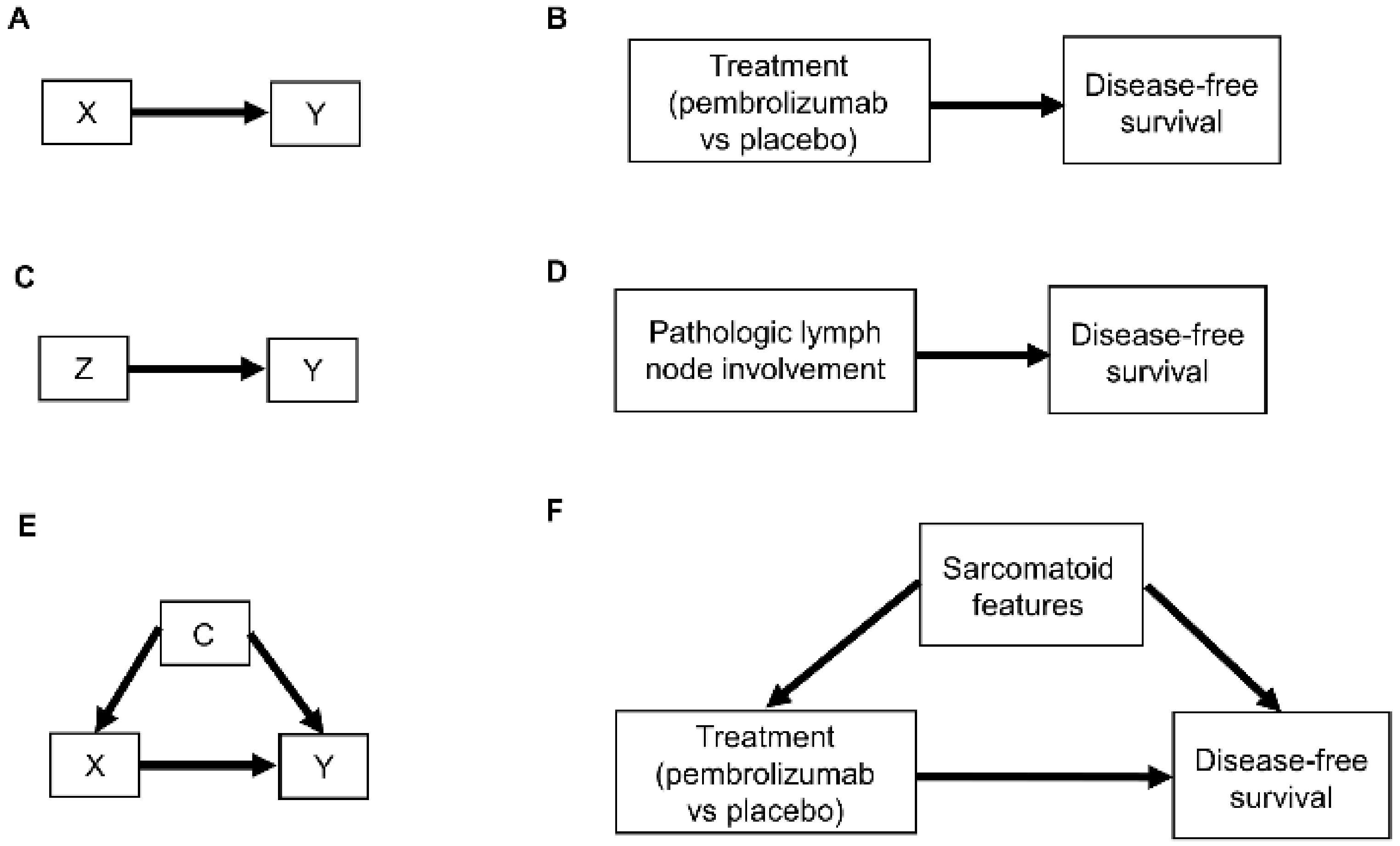 Figure 1. Examples of causal relationships represented by DAGs: (A) A simple scenario whereby the treatment choice X (also known as “exposure”) directly influences the outcome of interest Y; (B) Corresponding simple clinical scenario whereby the treatment choice between adjuvant pembrolizumab or placebo directly influences the outcome of disease recurrence or death measured by DFS; (C) Simple scenario whereby a prognostic variable Z directly influences the outcome Y; (D) Corresponding clinical scenario whereby the presence or absence of pathologic lymph node involvement directly influences DFS; (E) Scenario whereby a confounder C directly influences both the treatment choice X and the outcome Y; (F) Corresponding clinical scenario whereby the presence or absence of sarcomatoid features acts as a confounder by influencing treatment choice and DFS.
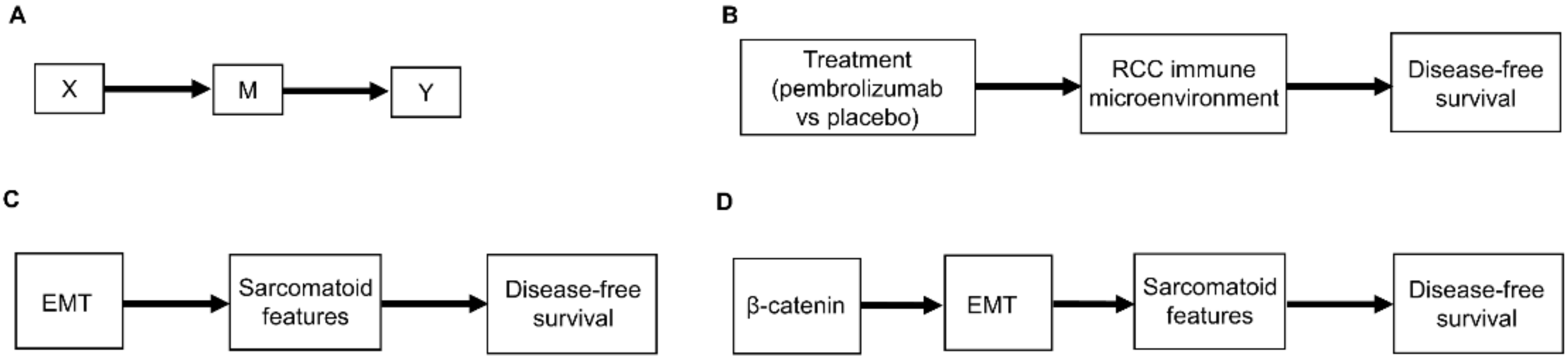 Figure 2. (A) Scenario whereby the effect of the treatment choice X on the outcome Y is transmitted by a mediator M; (B) Corresponding clinical scenario whereby the effect of treatment choice on DFS is transmitted by the renal cell carcinoma (RCC) immune microenvironment; (C) Another clinical scenario whereby the effect of epithelial-mesenchymal transition (EMT) on DFS is transmitted by the presence or absence of sarcomatoid features; (D) More detailed version whereby the effect of β-catenin levels on DFS is mediated by EMT and the resultant presence or absence of sarcomatoid features.
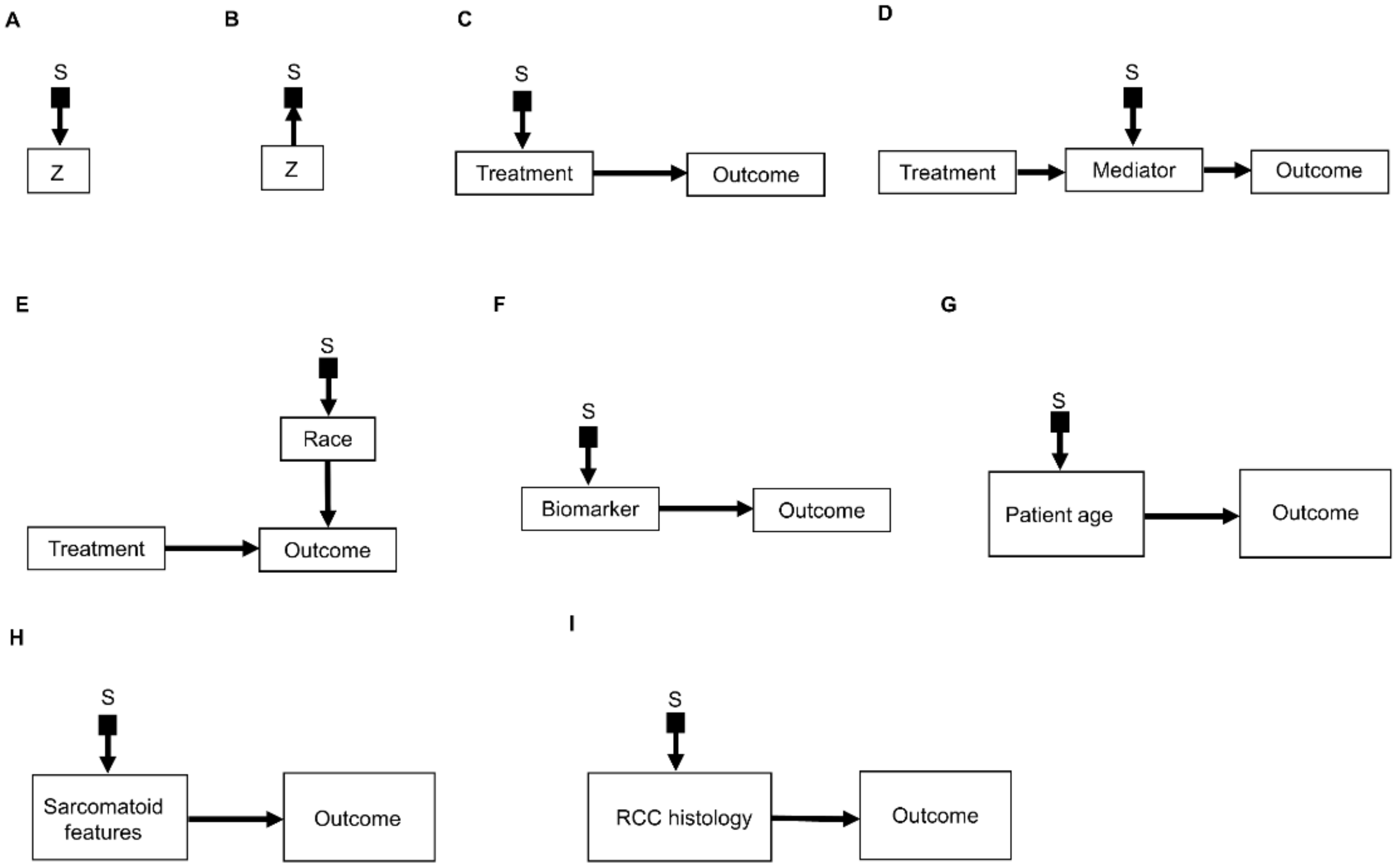 Figure 3. Examples of causal relationships represented by selection diagrams to guide transportability of causal effects across populations: (A) Selection node S indicating shifts across populations in the variable Z. In this scenario, the possible values of Z inherently differ between populations; (B) Selection node S indicating selection bias for the variable Z. In this scenario, the differences in Z between populations are due to sampling biases and not due to inherent variation; (C) Selection node S indicating treatment shifts across populations; (D) Selection node S indicating mediator shifts across populations; (E) Selection node S indicating shifts in the race of patients treated in a randomized controlled trial (RCT) performed in the United States, compared with an RCT performed in China. In this diagram, the variable “race” directly influences the outcome of interest and the race of patients enrolled is different between the two RCTs; (F) Selection node S indicating shifts in biomarker values across populations; (G) Selection node S indicating shifts in patient age across populations; (H) Selection node S indicating shifts in the presence or absence of sarcomatoid features across populations; (I) Selection node S indicating shifts in RCC histology across populations.
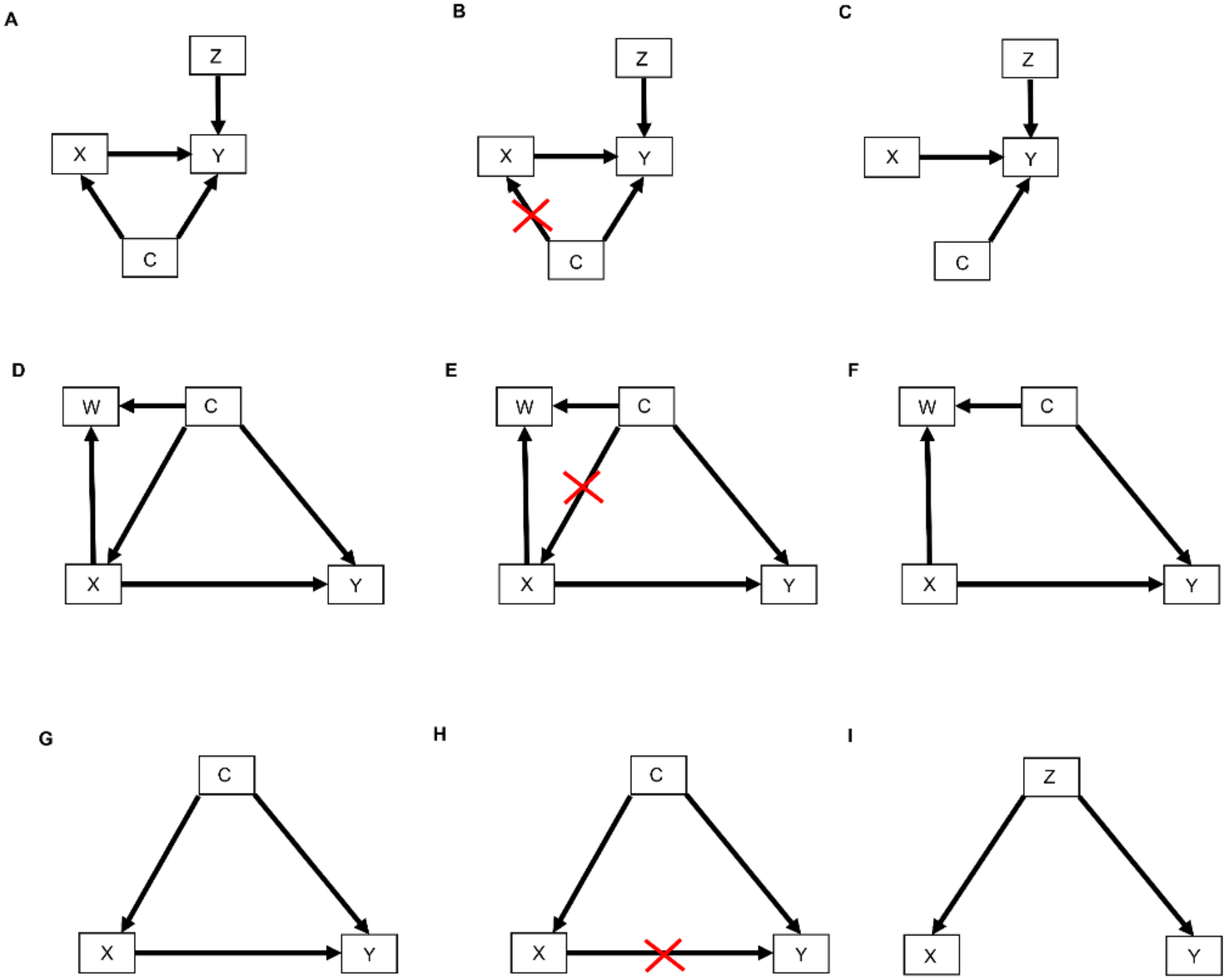 Figure 4. DAGs modified by the do() operator: (A) Treatment choice X influences the outcome Y which is also influenced by covariates Z. Furthermore, unknown confounders C may influence both treatment choice X and the outcome Y; (B) As indicated by the red crossmarks, the do() operator expression do(X = x) removes all arrows entering X. This modification represents the physical effect of an experimental intervention that sets the value X = x as constant while keeping the rest of the causal model unchanged; (C) This yields a new DAG whereby the distribution P(Y | do(X = x), Z) is the same as P(Y | X = x, Z); (D) In this DAG, treatment choice X influences the outcome Y and another covariate W. The confounder C influences X, Y, and W; (E) The do() operator expression do(X = x) removes all arrows entering X; (F) This yields a new DAG whereby the distribution P(Y | do(X = x), C) is the same as P(Y | X = x, C); (G) The confounder C influences the treatment choice X and the outcome Y; (H) Paths from X to Y that remain after removing all arrows pointing out of X are called “backdoor” paths because they flow backward out of X into Y. Shown here is the backdoor path from X to Y via the confounder C; (I) In this DAG, there are no forward-directed arrows pointing out of X toward Y. Therefore, according to rule 3 of the do-calculus, P(Y | do(X = x, Z) = P(Y | Z).

2. Causal Diagrams
It is important to first distinguish between population parameters, a sample of observed data, and statistical estimators. A parameter, which is easily understood but not observed, is a population quantity such as median survival time, response probability, or the effect of a covariate or treatment on a clinical outcome. Researchers denote a clinical outcome by Y, which may be survival time or a response indicator, and write y for an observed value of Y, such as y = 12 months. The same convention will be used for other variables that may take on different values in some random fashion, such as X for treatment and x for a particular treatment x, for example, denoting X = 1 for pembrolizumab and X = 0 for placebo or standard of care. A statistic, which is anything that can be computed from observed data using a formula or algorithm, may be used to estimate a parameter. For example, to estimate a population median, a computed sample median may be 14.5 months with a 95% CI of 9.4 to 18.7, keeping in mind that a second sample would give different numbers because outcomes and samples are random. A Kaplan–Meier plot [21] is a statistical estimator of the survival function of the population represented by the sample used to compute the plot, and here the population survival function is the parameter. The underlying statistical principle is that, ideally, a sample of Y values should be obtained in such a way that it represents the population of interest, and statistical sampling theory provides a wide array of methods for ensuring this representation [22][23][24]. The design of experiments such as clinical trials is distinct from sampling theory and can be facilitated by the explicit representation of the causal relationships researchers wish to estimate.
Relationships between patient covariates, treatments, and clinical outcomes can be represented by causal diagrams, such as directed acyclic graphs (DAGs) [4][25][26]. The simplest causal relationship occurs when a variable X, known as the “exposure” in epidemiology or “treatment” in clinical medicine, directly transmits its effect on an outcome Y of interest (Figure 1A). In the RCC setting, the treatment, either adjuvant pembrolizumab (X = 1) or placebo (X = 0), acts directly on the time to disease recurrence or death, defined as Y = DFS time (Figure 1B). A prognostic variable Z may also directly affect DFS time (Figure 1C,D), and in most settings, there is a vector of several prognostic variables. A confounder C is a variable that influences both the outcome Y and treatment X (Figure 1E). For example, the presence (C = 1) or absence (C = 0) of sarcomatoid features acts as a confounding variable if it influences both DFS time and whether a physician chooses to treat a patient with adjuvant pembrolizumab (Figure 1F).
Figure 1. Examples of causal relationships represented by DAGs: (A) A simple scenario whereby the treatment choice X (also known as “exposure”) directly influences the outcome of interest Y; (B) Corresponding simple clinical scenario whereby the treatment choice between adjuvant pembrolizumab or placebo directly influences the outcome of disease recurrence or death measured by DFS; (C) Simple scenario whereby a prognostic variable Z directly influences the outcome Y; (D) Corresponding clinical scenario whereby the presence or absence of pathologic lymph node involvement directly influences DFS; (E) Scenario whereby a confounder C directly influences both the treatment choice X and the outcome Y; (F) Corresponding clinical scenario whereby the presence or absence of sarcomatoid features acts as a confounder by influencing treatment choice and DFS.Another type of causal relationship occurs when the effect of treatment on the outcome is not entirely direct, but rather is transmitted, at least in part, through a third variable, known as a mediator, M (Figure 2A). For example, the effect of adjuvant pembrolizumab compared with placebo on DFS time is mediated by the RCC immune microenvironment (Figure 2B). The immune microenvironment of each RCC histologic subtype responds differently to immune checkpoint therapies, such as pembrolizumab [8], and the microenvironment, in turn, affects DFS time. Consequently, the effect of a given treatment on DFS time should vary with the immune microenvironment of each RCC histologic subtype because the RCC immune microenvironment acts as a mediator.
Figure 2. (A) Scenario whereby the effect of the treatment choice X on the outcome Y is transmitted by a mediator M; (B) Corresponding clinical scenario whereby the effect of treatment choice on DFS is transmitted by the renal cell carcinoma (RCC) immune microenvironment; (C) Another clinical scenario whereby the effect of epithelial-mesenchymal transition (EMT) on DFS is transmitted by the presence or absence of sarcomatoid features; (D) More detailed version whereby the effect of β-catenin levels on DFS is mediated by EMT and the resultant presence or absence of sarcomatoid features.As additional variables are included, causal diagrams become more complex. For example, it can also be included the influence of epithelial-mesenchymal transition (EMT) on sarcomatoid dedifferentiation, as shown in Figure 2C. A more detailed causal diagram may be obtained by including β-catenin levels that causally influence EMT (Figure 2D) [27]. As more variables are added, a causal graph may become too complex to interpret usefully. An important practical goal thus may be to reduce an overly complex causal graph to a more coarse-grained causal description that can be used to deal with the problem at hand [28][29][30][31]. For example, the causal diagram in Figure 2C may be appropriate if a drug that modifies EMT is being studied. Similarly, the more fine-grained causal diagram in Figure 2D may be used in a study evaluating the prognostic role of assays measuring β-catenin levels. Choosing the right level of granularity for a causal diagram is a subjective decision that should be guided by the goal to use the diagram as a practical tool. This can be performed by investigating how causal relationships may change when finer or coarser resolutions are chosen.
2.1. Selection Diagrams
An important refinement of a causal diagram is to identify variables by which populations, or studies that are designed to represent them, may differ [5]. This is achieved by including graphical objects called selection nodes that, while they are not variables themselves, use arrows to point to variables that have different sets of possible values between populations [5][32]. If an arrow points from a selection node S to a variable Z (Figure 3A), this says that the possible values of Z differ between populations. If no arrow points to Z, then all populations of interest have the same set of possible Z values. A third scenario occurs if an arrow points from a variable Z to a selection node S (Figure 3B), which indicates the presence of selection bias, wherein there are differences that are not between the populations but instead are between the datasets due to sampling artifacts. Selection nodes with outgoing arrows are not mutually exclusive with selection nodes with incoming arrows, and both types of arrows can appear in the same selection diagram if they represent two distinct features of the data collection process [33][34]. In the present research, researchers will focus only on transportability scenarios wherein the differences between populations are inherent, which is denoted by selection nodes S having outgoing arrows toward variables (Figure 3A).
Figure 3. Examples of causal relationships represented by selection diagrams to guide transportability of causal effects across populations: (A) Selection node S indicating shifts across populations in the variable Z. In this scenario, the possible values of Z inherently differ between populations; (B) Selection node S indicating selection bias for the variable Z. In this scenario, the differences in Z between populations are due to sampling biases and not due to inherent variation; (C) Selection node S indicating treatment shifts across populations; (D) Selection node S indicating mediator shifts across populations; (E) Selection node S indicating shifts in the race of patients treated in a randomized controlled trial (RCT) performed in the United States, compared with an RCT performed in China. In this diagram, the variable “race” directly influences the outcome of interest and the race of patients enrolled is different between the two RCTs; (F) Selection node S indicating shifts in biomarker values across populations; (G) Selection node S indicating shifts in patient age across populations; (H) Selection node S indicating shifts in the presence or absence of sarcomatoid features across populations; (I) Selection node S indicating shifts in RCC histology across populations.A selection diagram is a DAG that includes one or more selection nodes. A selection node may be used to show where treatments (Figure 3C) or mediators (Figure 3D) are different across populations. Whether or not a given variable has a selection node can be determined from either external knowledge or the available dataset itself. A selection node identifies a variable in a causal chain that may be affected by study differences. Selection nodes provide an explicit way to determine whether inferences are transportable between populations and, if not, what additional data are needed to ensure transportability [5][32][35][36]. A major practical point is that a selection node may show that the data from an RCT are not representative of a patient seen in the clinic. In this case, either the trial’s results cannot be used to choose that patient’s treatment, or possibly additional data may be obtained and combined with the RCT data to provide a basis for choosing a treatment.
A selection node can be used to show that the effects of treatments (Figure 3C) or mediators (Figure 3D) are different between populations. For example, if an RCT of two RCC treatments is performed in the United States and another RCT of the same treatments is conducted in China, since the US trial will include African Americans and the Chinese trial will not, a selection node should point to the variable “race” (Figure 3E). As another example, if one study includes a treatment given at dose levels 1, 2, and 3 and a second study includes the same treatment at dose levels 3 and 4, then a selection node should point toward treatment (Figure 3C). If, for a targeted biomarker, an “all-comers” population includes patients who were either biomarker positive or negative, while a second study population only includes biomarker-positive patients, then a selection node should point toward the biomarker (Figure 3F). A selection node can indicate that patient age differs between the population of patients being seen in the clinic, which includes patients older than 65 years, and the population of a study that restricted patients to be younger than 65 years (Figure 3G). Because Figure 3G indicates that patient age influences outcome, external data from studies that included patients older than 65 years are needed to obtain valid inferences on the outcome for such patients seen in the clinic. A selection node may also indicate that some studies included patients with sarcomatoid features whereas others did not (Figure 3H), or that a study only included patients with clear cell RCC and no other histologies (Figure 3I). The general practical point is that, if the variables denoted by selection nodes are substantively different than those in a study population, then a conclusion from that study alone cannot be transported to that patient.
In contrast, the range of a variable without a selection node does not change across populations. For example, the lack of a selection node pointing toward “treatment” in Figure 3D indicates that the treatment choices do not vary between populations. Such assumed invariance in specific causal mechanisms allow inferences to be transported from a study population to patients in a different population, e.g., a patient seen in the clinic [5][20][36].
2.2. The Do-Calculus
The relationships represented by all types of DAGs, including selection diagrams, can be used to guide a set of mathematical rules known as the do-calculus [25][37], which is expressed using conditional probabilities. The central idea is to estimate causal effects by distinguishing between two types of conditional probabilities. The first type conditions on a variable, say X, that simply was observed and thus may have been confounded by other, possibly unknown variables. The second type conditions on a known value x of X that was determined by one’s action or intervention, represented by do(X = x), and thus, X is free of confounding effects. The mathematical expression do(X = x) is known as the do() operator and is used to denote a known intervention. For example, in an RCT, if a patient with covariates Z and unknown confounders C (Figure 4A) was randomly assigned adjuvant pembrolizumab (X = 1), then the do() operator may be used to replace the conditional probability P(RCT)(Y | X, Z) with P(RCT)(Y | do(X = 1), Z). This ensures that there are no confounding effects on X, so the causal effect of pembrolizumab versus a control treatment (X = 0) for a patient with covariates Z may be obtained from statistical estimates of P(RCT)(Y | do(X = 1), Z) and P(RCT)(Y | do(X = 0), Z). These estimates can be computed from the RCT data under an assumed statistical regression model including the effects of X and Z on Y. In contrast, if X is observed and not assigned, then the values of X in a dataset may have been affected by known or unknown confounding variables, which can cause severe bias and invalidate conventional statistical estimators.
Figure 4. DAGs modified by the do() operator: (A) Treatment choice X influences the outcome Y which is also influenced by covariates Z. Furthermore, unknown confounders C may influence both treatment choice X and the outcome Y; (B) As indicated by the red crossmarks, the do() operator expression do(X = x) removes all arrows entering X. This modification represents the physical effect of an experimental intervention that sets the value X = x as constant while keeping the rest of the causal model unchanged; (C) This yields a new DAG whereby the distribution P(Y | do(X = x), Z) is the same as P(Y | X = x, Z); (D) In this DAG, treatment choice X influences the outcome Y and another covariate W. The confounder C influences X, Y, and W; (E) The do() operator expression do(X = x) removes all arrows entering X; (F) This yields a new DAG whereby the distribution P(Y | do(X = x), C) is the same as P(Y | X = x, C); (G) The confounder C influences the treatment choice X and the outcome Y; (H) Paths from X to Y that remain after removing all arrows pointing out of X are called “backdoor” paths because they flow backward out of X into Y. Shown here is the backdoor path from X to Y via the confounder C; (I) In this DAG, there are no forward-directed arrows pointing out of X toward Y. Therefore, according to rule 3 of the do-calculus, P(Y | do(X = x, Z) = P(Y | Z).In terms of causal diagrams, the expression P(RCT)(Y | do(X = x), Z) modifies the graph in Figure 4A by removing all arrows going into X (Figure 4B). This results in a new causal model (Figure 4C) wherein the distribution P(RCT)(Y | do(X = x), Z) is the same as P(RCT)(Y | X = x, Z). This modification represents the physical effect of the experimental intervention that sets the value X = x, while keeping the rest of the causal model unchanged.
To illustrate how the do() operator works in practice, a common example in the RCC setting is one where a patient in an observational dataset (denoted as OBS), not obtained from an RCT, has X = 1 recorded, indicating that the patient received pembrolizumab, but it is not known how the patient’s physician chose that treatment. In statistical language, treatment selection was biased in the observational dataset. Consequently, in contrast with what is widely believed, fitting a regression model for DFS time Y as a function of treatment X and covariates Z to the observational dataset may not provide an unbiased statistical estimator of the effect of pembrolizumab versus standard of care. From a causal viewpoint, for a patient with covariates Z, the do() operator cannot be applied due to the treatment assignment bias, so while P(OBS)(Y | X = x, Z) can be computed, P(OBS)(Y | do(X = x), Z) cannot be computed for either X = 0 or X = 1. If, instead, the data came from an RCT of pembrolizumab (X = 1) versus surveillance (X = 0), then one can estimate P(RCT)(Y | do(X = x), Z) from the data for each x, since randomization removes any arrows into X. This allows one to obtain an unbiased estimator of the causal effect E(Y | do(X = 1), Z) - E(Y | do(X = 0), Z), which is the difference in expected DFS times for pembrolizumab versus standard of care for a patient with covariates Z. This example illustrates the scientific difference between recording data from medical practice, where physicians choose treatments based on their knowledge and each patient’s baseline information, and data from an RCT, where each patient’s treatment is chosen by randomization in order to obtain a statistically unbiased treatment comparison for the benefit of future patients. That is, data obtained from clinical practice are inherently biased due to each physician using available information to choose the treatment that they think will be best for each patient, while data from an RCT, where each patient’s treatment was chosen by flipping a coin, are unbiased. The point is that randomization is a statistical device to obtain unbiased estimators in order to maximize the benefit for future patients when choosing their treatments.
Three inferential rules, known as the do-calculus, have been derived to transform conditional probability expressions involving the do() operator into other, more useful conditional probability expressions. The first rule considers a DAG, such as the one shown in Figure 4D, where researchers are interested in the probability distribution of the outcome Y following treatment X conditioned on all patient covariates, which researchers denote by W and C. As noted earlier, in an RCT, which sets do(X = x), all arrows into X are removed (Figure 4E), resulting in the causal model shown in Figure 4F. Rule 1 of the do-calculus guides the insertion and deletion of variables by stipulating that if, after deleting all paths into X, the set of variables C and treatment choice X = x block all the paths from W to Y regardless of the direction of the arrows on these paths (Figure 4F), then P(RCT)(Y | do(X = x), C, W) = P(RCT)(Y | do(X = x), C). In probability language, the do() operator ensures that Y is conditionally independent of the covariates W, given do(X = x) and the covariates C. The practical implication of Rule 1 is that it allows to simplify the regression model by dropping the covariates W. For example, suppose that C is a prognostic score recorded in an RCT of pembrolizumab versus surveillance, W is the frequency of monitoring for treatment toxicity based on each patient’s prognosis and chosen treatment, and Y is DFS time. The path from W to Y is blocked by conditioning on C, and therefore Y is conditionally independent of W given C and do(X = x). Accordingly, in the RCT of pembrolizumab versus surveillance, researchers should condition on the prognostic score but not on the frequency of monitoring for treatment toxicity.
Before moving to Rule 2 of the do-calculus, it is first needed to define back-door path. A back-door path is a non-causal path from the treatment X to the outcome Y. As shown in Figure 4G,H, all paths from X to Y that remain after removing all arrows pointing out of X (Figure 4H) are back-door paths because they flow backward out of X into Y through C. Rule 2 of the do-calculus describes a relationship between an outcome Y, an intervention X, and a vector C of covariates by stipulating that, if the covariates in C block all back-door paths from X to Y (as shown for example in Figure 4D,G), then P(Y | do(X = x), C) = P(Y | X = x, C). This rule requires the strong, unverifiable assumption that there are no unknown external confounders that affect both Y and X and do not belong to the observed vector C. Under this assumption, the probability equality says that it is not necessary to randomize patients between X = 1 and X = 0 because knowledge of C allows the do() operator to be applied. The practical implication, however, is not that one may simply fit a regression model for P(Y | X, C) to observational data to estimate the covariate-adjusted treatment effect in an unbiased way. This is because the assumption underlying Rule 2 cannot be verified. In practice, statistical bias correction methods are applied, such as inverse probability of treatment weighting (IPTW), described in Section 2.4 below, that use the available covariates in C to provide an approximation to the strong assumption that a vector C of observed covariates blocks all back-door paths from X to Y. Thus, Rule 2 formalizes the motivation for applying statistical methods that correct for bias, or at least mitigate it, when analyzing observational data.
Rule 3 of the do-calculus guides the insertion and deletion of interventions by stipulating that, if there is no path from X to Y with only forward-directed arrows (Figure 4I), then P(Y | do(X = x), Z) = P(Y | Z). In this case, observing the covariates Z implies that treatment (or exposure) X has no causal effect on outcome Y. An example from epidemiology is the once common belief that soda pop consumption caused poliomyelitis, due to the observation that higher sales of soda pop (X) were positively associated with a higher incidence of poliomyelitis (Y). However, once the season (Z) of the year was recorded, it was seen that both soda pop consumption and poliomyelitis incidence were higher during the summer months (Z = 1) and lower during the winter months (Z = 0). Thus, Y was conditionally independent of X given Z. This phenomenon is commonly described by saying that association does not imply causation, where an apparent effect of X on Y is due to the fact that Z drives both X and Y. In this case, Z is sometimes called a “lurking variable” acting as a confounder, and X is called an “innocent bystander.” For a therapeutic example, suppose that X = 1 corresponds to standard treatment combined with a completely ineffective experimental agent and X = 0 is standard treatment alone, while Z = 1 denotes good prognosis and Z = 0 denotes poor prognosis. If X = 1 is more likely to be given to good-prognosis patients (Z = 1) and less likely to be given to poor-prognosis patients (Z = 0), then the resulting data will show that X and DFS time (Y) are positively associated, with estimates Ê[Y | X = 1] > Ê[Y | X = 0] apparently implying that adding the experimental agent increases expected DFS time. However, once one accounts for prognosis (Z) the estimates are the same, that is, Ê[Y | X = 1, Z] = Ê[Y | X = 0, Z], aside from random variation in the data. This is because P(Y | do(X = x), Z) = p(Y | Z). That is, DFS time (Y) is conditionally independent of the choice of treatment (X) given prognosis (Z). While this example may seem somewhat contrived, the practice of combining an active control with a new experimental agent and cherry-picking patients with a better prognosis for evaluating the combination in a single-arm trial is not uncommon in oncology [38][39].
2.3. Causal Hierarchy
Causal relationships represented by DAGs and expressed by conditional probabilities involving the do() operator apply to one domain, such as the population represented by patients enrolled in an RCT. To use a DAG to determine whether causal knowledge can be transported to another domain, such as the population of patients a physician sees in the clinic [5][36][37], it is useful to distinguish between three types of causal problems. These comprise a hierarchy of increasing difficulty, called the ladder of causation (Table 2) [40]. The simplest type of causal problem, layer 1, is predicting an event in a population based on association. A conditional probability, such as P(salmonella infection | diarrhea), characterizes association and may be estimated statistically from data on salmonella and diarrhea, but it is inadequate for addressing layer 2 or layer 3 causal problems without additional experimental knowledge or assumptions. Layer 2 involves determining what happens when an intervention, such as an RCT, is performed in a cohort of patients. The do() operator can be used to denote such interventions, and the do-calculus rules can be used to transform expressions by introducing do() operators in layer 2 conditional probabilities. Layer 3 involves choosing between treatments for an individual patient, and this class of queries requires the potential outcomes framework, which is described below.
Table 2. The ladder of causation [40]. Y is the outcome, DFS time; X is treatment, with X = 1 for adjuvant pembrolizumab and X = 0 for placebo; Z is the baseline prognostic risk, with Z = 1 for high risk of recurrence. ccRCC = clear cell renal carcinoma.
| Layer | Activity | Analysis Unit | Mathematical Expression | Example Query |
|---|---|---|---|---|
| One | Observation | Population | P(Y | Z) | What is the DFS time distribution in patients at high risk for ccRCC recurrence? |
| Two | Intervention | Population | P(Y | do(X = 1)) | What is the DFS time distribution in patients with ccRCC treated with adjuvant pembrolizumab? |
| Three | Potential outcomes | Individual Patient | E(YX = 1 | Z = 1) − E(YX = 0 | Z = 1) | What would the expected DFS time be if I treat a patient with high-risk ccRCC with adjuvant pembrolizumab compared to placebo? |
2.4. Causal Inference and Potential Outcomes
To explain potential outcomes, researchers return to the setting where a physician wishes to decide between adjuvant pembrolizumab (X = 1) and surveillance monitoring (X = 0) for a patient with covariates Z. The physician may consider what the patient’s future outcomes would be for each treatment, which is written as YX = 1 and YX = 0. These are called potential outcomes [41][42][43] because only one treatment can be given and, thus, only one of YX = 1 or YX = 0 can be observed. This thought experiment corresponds to an imaginary world where one can make two identical copies of each patient, treat one with adjuvant pembrolizumab and the other with surveillance monitoring, and observe both YX = 1 and YX = 0. Writing the expected value of Y for the copy treated with adjuvant pembrolizumab as E(YX = 1 | Z) and for the copy treated with standard of care as E(YX = 0 | Z), the difference
Ψ = E(YX = 1 | Z) − E(YX = 0 | Z) (1)
is the causal effect of treating the patient with adjuvant pembrolizumab rather than surveillance monitoring.
Of course, in the real world one cannot make two copies of a patient. Only one of the two treatments can be given to a patient, and thus only one of each patient’s potential outcomes can be observed. If the patient is treated with pembrolizumab, then X = 1, and the potential outcome YX = 0 for the treatment X = 0 is called a counterfactual. This thought experiment has a very useful practical application because it provides a basis for computing an unbiased statistical estimator of Ψ using data from either an RCT or an observational study, under some reasonable assumptions. First, thinking about YX = 1 and YX = 0 only makes sense if, for example, a patient actually treated with adjuvant pembrolizumab has an observed outcome equal to the potential outcome for pembrolizumab, that is, if Y = YX = 1 when X = 1. Similarly, if the patient actually receives surveillance monitoring, X = 0, then Y = YX = 0. This is called consistency [43][44][45]. Defining the propensity scores as treatment assignment probabilities Pr(X = 1 | Z), both treatments must be possible for each Z, formally 0 < Pr(X = 1 | Z) < 1, called positivity. The potential outcomes YX = 1 and YX = 0 also must be conditionally independent of X given Z. Defining the causal estimator as
it follows from a simple probability calculation that E(Ψcausal) = Ψ under these assumptions. That is, the causal estimator Ψcausal is an unbiased estimator of the causal effect Ψ. If the causal estimator is computed for each patient in a sample, assuming that the potential outcomes of each patient are not affected by the treatments given to the other patients, known as the Stable Unit Treatment Value Assumption (SUTVA) [43][44][45], then the sample mean of the individual causal estimates is an unbiased estimator of Ψ, provided that each treatment assignment probability Pr(X = 1 | Z) (propensity score) is known. If the values of Pr(X = 1 | Z) are not known, as in an observational dataset, then they can be estimated from the data by fitting a regression model for Pr(X = 1 | Z). These propensity score estimates quantify how treatments were chosen based on individual patient covariates, and using them to compute Ψcausal produces an approximately unbiased estimator of Ψ. This is called inverse probability of treatment weighting (IPTW) estimation [46][47][48], a method often used when analyzing observational data. In a fairly randomized trial, Pr(X = 1 | Z) = 1/2 regardless of Z, and some simple algebra shows that the IPTW estimator equals the difference between the sample means for the two treatments. This also holds for unbalanced randomization, say with probabilities 2/3 for the experimental and 1/3 for the control treatment.
Under a statistical regression model for P(Y | X, Z), the causal treatment effect for a patient with covariates Z is defined as the difference
Ψ(Z) = E(Y | do(X = 1), Z) − E(Y | do(X = 0), Z),
and an estimator of Ψ(Z) for each Z may be obtained by fitting the regression model to RCT data. With observational data, IPTW or a variety of other statistical methods for bias correction may be used [46][49][50]. If two or more datasets are combined based on a causal diagram, then appropriate statistical methods for bias correction also must be used [51][52][53][54].
References
- Liu, K.; Meng, X.-L. There Is Individualized Treatment. Why Not Individualized Inference? Annu. Rev. Stat. Appl. 2016, 3, 79–111.
- Msaouel, P.; Lee, J.; Thall, P.F. Making Patient-Specific Treatment Decisions Using Prognostic Variables and Utilities of Clinical Outcomes. Cancers 2021, 13, 2741.
- Msaouel, P. Impervious to Randomness: Confounding and Selection Biases in Randomized Clinical Trials. Cancer Investig. 2021, 39, 783–788.
- Shapiro, D.D.; Msaouel, P. Causal Diagram Techniques for Urologic Oncology Research. Clin. Genitourin. Cancer 2021, 19, 271.e1–271.e7.
- Bareinboim, E.; Pearl, J. Causal inference and the data-fusion problem. Proc. Natl. Acad. Sci. USA 2016, 113, 7345–7352.
- Breskin, A.; Cole, S.R.; Edwards, J.K.; Brookmeyer, R.; Eron, J.J.; Adimora, A.A. Fusion designs and estimators for treatment effects. Stat. Med. 2021, 40, 3124–3137.
- Adashek, J.J.; Genovese, G.; Tannir, N.M.; Msaouel, P. Recent advancements in the treatment of metastatic clear cell renal cell carcinoma: A review of the evidence using second-generation p-values. Cancer Treat Res. Commun. 2020, 23, 100166.
- Zoumpourlis, P.; Genovese, G.; Tannir, N.M.; Msaouel, P. Systemic Therapies for the Management of Non-Clear Cell Renal Cell Carcinoma: What Works, What Doesn’t, and What the Future Holds. Clin. Genitourin. Cancer 2021, 19, 103–116.
- Choueiri, T.K.; Tomczak, P.; Park, S.H.; Venugopal, B.; Ferguson, T.; Chang, Y.H.; Hajek, J.; Symeonides, S.N.; Lee, J.L.; Sarwar, N.; et al. Adjuvant Pembrolizumab after Nephrectomy in Renal-Cell Carcinoma. N. Engl. J. Med. 2021, 385, 683–694.
- Msaouel, P.; Grivas, P.; Zhang, T. Adjuvant Systemic Therapies for Patients with Renal Cell Carcinoma: Choosing Treatment Based on Patient-level Characteristics. Eur. Urol. Oncol. 2021, 5, 265–267.
- Correa, A.F.; Jegede, O.A.; Haas, N.B.; Flaherty, K.T.; Pins, M.R.; Adeniran, A.; Messing, E.M.; Manola, J.; Wood, C.G.; Kane, C.J.; et al. Predicting Disease Recurrence, Early Progression, and Overall Survival Following Surgical Resection for High-risk Localized and Locally Advanced Renal Cell Carcinoma. Eur. Urol. 2021, 80, 20–31.
- Ricketts, C.J.; De Cubas, A.A.; Fan, H.; Smith, C.C.; Lang, M.; Reznik, E.; Bowlby, R.; Gibb, E.A.; Akbani, R.; Beroukhim, R.; et al. The Cancer Genome Atlas Comprehensive Molecular Characterization of Renal Cell Carcinoma. Cell Rep. 2018, 23, 313–326.e315.
- Cancer Genome Atlas Research Network. Comprehensive molecular characterization of clear cell renal cell carcinoma. Nature 2013, 499, 43–49.
- Cancer Genome Atlas Research, N.; Linehan, W.M.; Spellman, P.T.; Ricketts, C.J.; Creighton, C.J.; Fei, S.S.; Davis, C.; Wheeler, D.A.; Murray, B.A.; Schmidt, L.; et al. Comprehensive Molecular Characterization of Papillary Renal-Cell Carcinoma. N. Engl. J. Med. 2016, 374, 135–145.
- Davis, C.F.; Ricketts, C.J.; Wang, M.; Yang, L.; Cherniack, A.D.; Shen, H.; Buhay, C.; Kang, H.; Kim, S.C.; Fahey, C.C.; et al. The somatic genomic landscape of chromophobe renal cell carcinoma. Cancer Cell 2014, 26, 319–330.
- Msaouel, P.; Malouf, G.G.; Su, X.; Yao, H.; Tripathi, D.N.; Soeung, M.; Gao, J.; Rao, P.; Coarfa, C.; Creighton, C.J.; et al. Comprehensive Molecular Characterization Identifies Distinct Genomic and Immune Hallmarks of Renal Medullary Carcinoma. Cancer Cell 2020, 37, 720–734.e713.
- Brodaczewska, K.K.; Szczylik, C.; Fiedorowicz, M.; Porta, C.; Czarnecka, A.M. Choosing the right cell line for renal cell cancer research. Mol. Cancer 2016, 15, 83.
- Hsieh, J.J.; Purdue, M.P.; Signoretti, S.; Swanton, C.; Albiges, L.; Schmidinger, M.; Heng, D.Y.; Larkin, J.; Ficarra, V. Renal cell carcinoma. Nat. Rev. Dis. Primers 2017, 3, 17009.
- Wolf, M.M.; Kimryn Rathmell, W.; Beckermann, K.E. Modeling clear cell renal cell carcinoma and therapeutic implications. Oncogene 2020, 39, 3413–3426.
- Piccininni, M.; Konigorski, S.; Rohmann, J.L.; Kurth, T. Directed acyclic graphs and causal thinking in clinical risk prediction modeling. BMC Med. Res. Methodol. 2020, 20, 179.
- Kaplan, E.L.; Meier, P. Nonparametric Estimation from Incomplete Observations. J. Am. Stat. Assoc. 1958, 53, 457–481.
- Hoogland, J.; IntHout, J.; Belias, M.; Rovers, M.M.; Riley, R.D.; Harrell, F.J.E.; Moons, K.G.M.; Debray, T.P.A.; Reitsma, J.B. A tutorial on individualized treatment effect prediction from randomized trials with a binary endpoint. Stat. Med. 2021, 40, 5961–5981.
- Kruskal, W.; Mosteller, F. Representative sampling, IV: The history of the concept in statistics, 1895–1939. Int. Stat. Rev. Rev. Int. De Stat. 1980, 48, 169–195.
- Kruskal, W.; Mosteller, F. Representative sampling, III: The current statistical literature. Int. Stat. Rev. Rev. Int. De Stat. 1979, 47, 245–265.
- Pearl, J. Causality: Models, Reasoning, and Inference, 2nd ed.; Cambridge University Press: Cambridge, UK, 2009; pp. 1–384.
- Greenland, S.; Pearl, J.; Robins, J.M. Causal diagrams for epidemiologic research. Epidemiology 1999, 10, 37–48.
- Blum, K.A.; Gupta, S.; Tickoo, S.K.; Chan, T.A.; Russo, P.; Motzer, R.J.; Karam, J.A.; Hakimi, A.A. Sarcomatoid renal cell carcinoma: Biology, natural history and management. Nat. Rev. Urol. 2020, 17, 659–678.
- Kim, J. Events as Property Exemplifications. In Action Theory; Brand, M., Walton, D., Reidel, D., Eds.; Springer: Dordretch, The Netherlands, 1976; pp. 310–326.
- Quine, W.V. Events and reification. In Actions and Events: Perspectives on the Philosophy of Davidson; Lepore, E., McLaughlin, B., Eds.; Blackwell: Oxford, UK, 1985; pp. 162–171.
- Carmona-Bayonas, A.; Jimenez-Fonseca, P.; Gallego, J.; Msaouel, P. Causal considerations can inform the interpretation of surprising associations in medical registries. Cancer Investig. 2021, 40, 1–27.
- Msaouel, P. The Big Data Paradox in Clinical Practice. Cancer Investig. 2022, 40, 567–576.
- Bareinboim, E.; Pearl, J. Transportability of causal effects: Completeness results. In Proceedings of the Twenty-Sixth AAAI Conference on Artificial Intelligence, Toronto, ON, Canada, 22–26 July; pp. 698–704.
- Correa, J.; Tian, J.; Bareinboim, E. Adjustment Criteria for Generalizing Experimental Findings. In Proceedings of the 36th International Conference on Machine Learning, Proceedings of Machine Learning Research, Long Beach, CA, USA, 9–15 June 2019; pp. 1361–1369.
- Pearl, J. Generalizing Experimental Findings. J. Causal Inference 2015, 3, 259–266.
- Bareinboim, E.; Pearl, J. A General Algorithm for Deciding Transportability of Experimental Results. J. Causal Inference 2013, 1, 107–134.
- Pearl, J.; Bareinboim, E. Note on “Generalizability of Study Results”. Epidemiology 2019, 30, 186–188.
- Pearl, J.; Bareinboim, E. External Validity: From Do-Calculus to Transportability Across Populations. Stat. Sci. 2014, 29, 517, 579–595.
- Mishra-Kalyani, P.S.; Amiri Kordestani, L.; Rivera, D.R.; Singh, H.; Ibrahim, A.; DeClaro, R.A.; Shen, Y.; Tang, S.; Sridhara, R.; Kluetz, P.G.; et al. External control arms in oncology: Current use and future directions. Ann. Oncol. 2022, 33, 376–383.
- Hirsch, B.R.; Califf, R.M.; Cheng, S.K.; Tasneem, A.; Horton, J.; Chiswell, K.; Schulman, K.A.; Dilts, D.M.; Abernethy, A.P. Characteristics of oncology clinical trials: Insights from a systematic analysis of ClinicalTrials.gov. JAMA Intern. Med. 2013, 173, 972–979.
- Pearl, J.; Mackenzie, D. The Book of Why: The New Science of Cause and Effect; Basic Books: New York, NY, USA, 2018.
- Lewis, D.K. Counterfactuals, Rev. ed.; Blackwell Publishers: Malden, MA, USA, 2001; p. viii. 156p.
- VanderWeele, T.J.; Robins, J.M. Directed acyclic graphs, sufficient causes, and the properties of conditioning on a common effect. Am. J. Epidemiol. 2007, 166, 1096–1104.
- Rubin, D.B. Causal Inference Using Potential Outcomes. J. Am. Stat. Assoc. 2005, 100, 322–331.
- Rubin, D.B. Statistics and causal inference: Comment: Which ifs have causal answers. J. Am. Stat. Assoc. 1986, 81, 961–962.
- Oganisian, A.; Roy, J.A. A practical introduction to Bayesian estimation of causal effects: Parametric and nonparametric approaches. Stat. Med. 2021, 40, 518–551.
- Austin, P.C.; Stuart, E.A. Moving towards best practice when using inverse probability of treatment weighting (IPTW) using the propensity score to estimate causal treatment effects in observational studies. Stat. Med. 2015, 34, 3661–3679.
- Rosenbaum, P.R.; Rubin, D.B. The central role of the propensity score in observational studies for causal effects. Biometrika 1983, 70, 41–55.
- Rosenbaum, P.R.; Rubin, D.B. Reducing Bias in Observational Studies Using Subclassification on the Propensity Score. J. Am. Stat. Assoc. 1984, 79, 516–524.
- Bang, H.; Robins, J.M. Doubly robust estimation in missing data and causal inference models. Biometrics 2005, 61, 962–973.
- Naimi, A.I.; Cole, S.R.; Kennedy, E.H. An introduction to g methods. Int. J. Epidemiol. 2017, 46, 756–762.
- Dahabreh, I.J.; Robertson, S.E.; Tchetgen, E.J.; Stuart, E.A.; Hernan, M.A. Generalizing causal inferences from individuals in randomized trials to all trial-eligible individuals. Biometrics 2019, 75, 685–694.
- Lee, D.; Yang, S.; Dong, L.; Wang, X.; Zeng, D.; Cai, J. Improving trial generalizability using observational studies. Biometrics 2022, 1–13.
- Dahabreh, I.J.; Hernan, M.A. Extending inferences from a randomized trial to a target population. Eur. J. Epidemiol. 2019, 34, 719–722.
- Colnet, B.; Mayer, I.; Chen, G.; Dieng, A.; Li, R.; Varoquaux, G.; Vert, J.-P.; Josse, J.; Yang, S. Causal inference methods for combining randomized trials and observational studies: A review. arXiv 2020, arXiv:2011.08047.
More
Information
Subjects:
Oncology
Contributors
MDPI registered users' name will be linked to their SciProfiles pages. To register with us, please refer to https://encyclopedia.pub/register
:
View Times:
868
Revisions:
5 times
(View History)
Update Date:
26 Aug 2022
Table of Contents


Notice
You are not a member of the advisory board for this topic. If you want to update advisory board member profile, please contact office@encyclopedia.pub.
OK
Confirm
Only members of the Encyclopedia advisory board for this topic are allowed to note entries. Would you like to become an advisory board member of the Encyclopedia?
Yes
No
${ textCharacter }/${ maxCharacter }
Submit
Cancel
Back
Comments
${ item }
|
${ item.createdUser.fullName }
${ item.createdAt }
${ item.vote }
${ item.reply }
Delete
${ reply.createdUser.fullName }
${ reply.createdAt }
${ reply.vote }
Delete
There is no reply to this comment~
${ item.replyTextCharacter }/${ item.replyMaxCharacter }
Submit
Cancel
More
No more~
There is no comment~
${ textCharacter }/${ maxCharacter }
Submit
Cancel
${ selectedItem.replyTextCharacter }/${ selectedItem.replyMaxCharacter }
Submit
Cancel
Confirm
Are you sure to Delete?
Yes
No