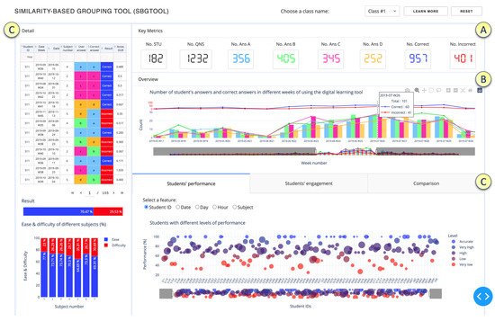
2. Overall Design of SBGTool v2.0
TIn th
e researchersis section, we describe the design of the SBGTool v2.0. The proposed tool is interactive, and the views are coordinated and interconnected, which allows much deeper interactions than simply a set of graphs generated in Excel. Interactive, coordinated views allow for the testing of hypotheses and multilevel exploration of complex data
[7]. As can be seen in
Figure 12,
thwe
researchers eemployed a strategy of increasing details, starting from Key Metrics, followed by Overview and finally Detail. These three levels follow Shneiderman’s mantra
[8], “overview first, zoom and filter, then details on demand”, which drives visual information-seeking behavior and interface design. The most important global information about the dataset is displayed in the
Key Metrics section (
Figure 12A), which includes the total numbers of correct and incorrect answers, number of students, questions, and number of answers in the four answer choices (A, B, C, D).
Figure 12. Overview of tabs and components of SBGTool v2.0. (A) Key Metrics section, (B) Overview section, (C) Detail section presented in 2 parts of the tool.
To make it easier to recognize key metrics in different visualizations,
thwe
researchers used the following colors:
● dark blue for correct answer,
● red for incorrect answer,
● light blue for option A,
● green for option B,
● pink for option C, and
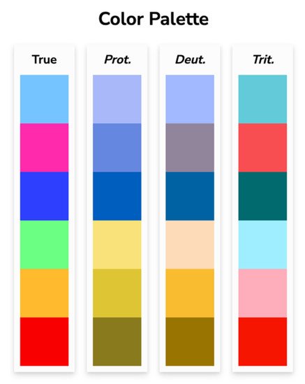
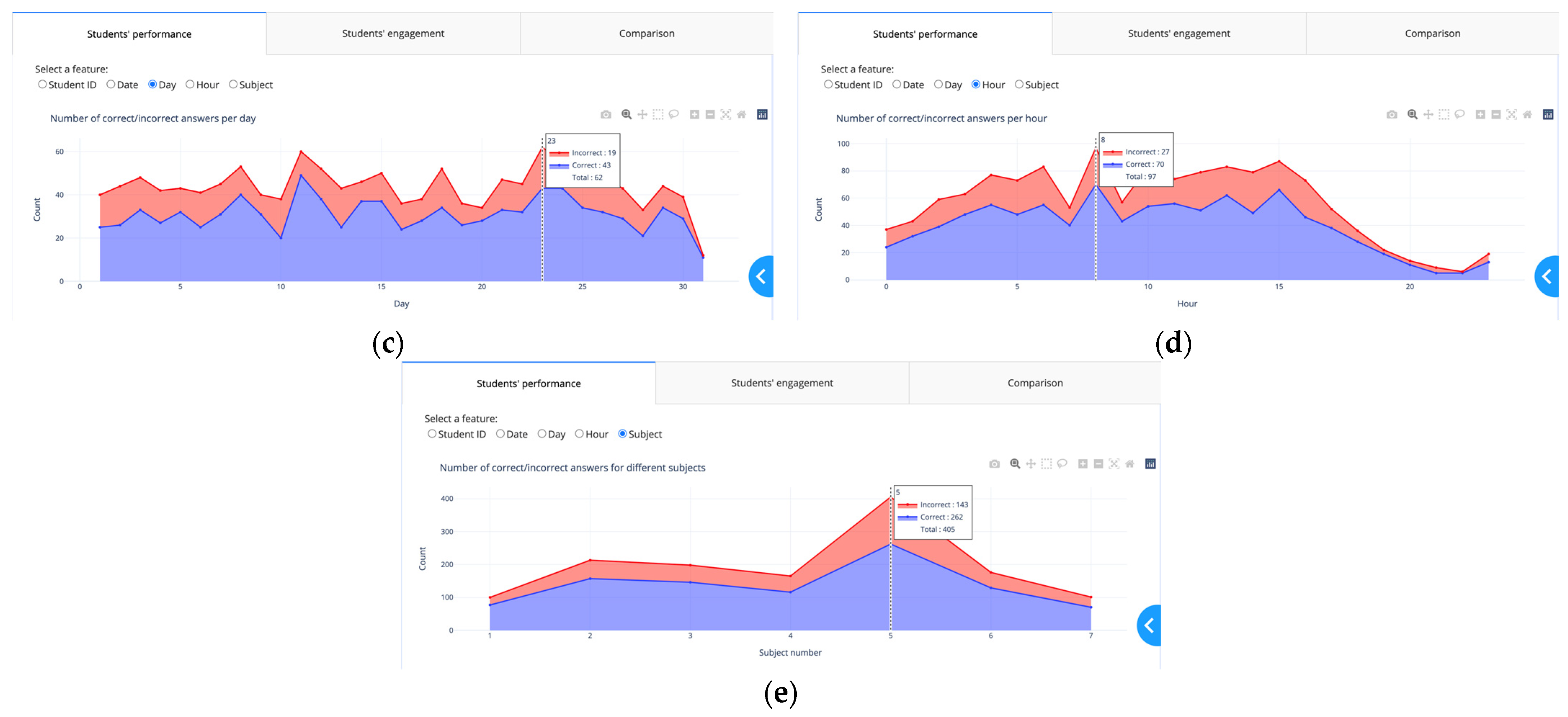
● orange for option D. Since color blindness affects about 1 in every 20 people,
the researchers chwe chose colors that are appropriate for people who are colorblind (
Figure 23)
[9].
ThWe
researchers utilized the possibility of choosing the color of the website
[9] to examine what
the reseaour
chers' chosen color palette would seem like to colorblind viewers. The colors in the leftmost column of
Figure 23 are the “true” colors, which are shown in the remaining three columns as they would seem to someone with protanopia, deuteranopia, or tritanopia, i.e., color blindness or less sensitivity to red, green, or blue-yellow light, respectively
[9].
Figure 23.
Chosen color palette for color blindness. Reprinted/adapted with permission from Ref.
. Copyright 2022, David Nichols.
The
Overview section of SBGTool v2.0 (
Figure 12B) includes a view that displays the total numbers of correct and incorrect answers, the total number of students’ answers for the four answer choices, and the total number of correct answers for the four answer choices over time. This view is an overlay of grouped bar and line charts. By selecting a point (week) in the overview, all the key metrics and visualizations in the
Detail section (
Figure 12C) of SBGTool v2.0 are updated accordingly. In addition, a range slider on the overview enables the teacher to limit the
x-axis value within a given range (minimum and maximum values). By moving the mouse in the overview and looking at the number of students’ answers and correct answers (in the four answer choices for multiple-choice questions in a given week), the teachers can determine how near the students’ learning activities were to a correct response. In order to focus on the students’ activity inside a classroom, a class name should be selected from the dropdown component on the top right side of the tool. To reload the entire selected 10,000 samples, the “reset” button on the tool’s top right side can be pressed. Likewise, the “learn more” button next to the “reset” button may be used to obtain a general description of the tool that has been developed.
SBGTool v2.0 allows the user to interact with each visualization individually and drill down to more detailed levels of information. Brushing, zooming, and filtering are all supported by the majority of the visualizations. The main purpose of brushing is to emphasize brushed data elements in the various tool views. The user can obtain more information by picking a portion of each graphic and zooming in. The user can also filter the view by clicking on the legend (square or circle) in the right half of each display.
The
Detail section of the proposed tool (
Figure 12C) includes a table and two bar charts on the left-hand side, as well as three tabs with specific visualizations to aid in the discovery of insight about various subjects, students’ groups with similar activities in terms of the number of correct answers, number of student interactions, number of interactions in different features, and the difference between students’ learning activities.
Teachers can obtain thorough information on students’ activities and the time they set aside to answer a question by glancing at the table shown in
Figure 12C. In addition, they can filter and sort the table according to the student ID, date week, date, subject number, user answer, correct answer, result, and answer duration, to have more focused information. The first bar chart shown in
Figure 12C on the left-hand side depicts the overall percentages of correct and incorrect responses. As can be seen in the bar chart presented in
Figure 12C, the percentages of correct and incorrect answers for students in class 1 are 70.47% and 29.53%, respectively. The second bar chart on the left-hand side of the tool with multicategory axis type presents the percentages of difficulty and ease in seven subjects. For example, as seen in this bar chart, the percentages of difficulty and ease in subject 1 are 23% and 77%, respectively. By comparing these percentages to those in other subjects,
thwe
researchers ccan determine the most difficult and easiest subjects. In order to determine the percentage of difficulty in different subjects,
the researchers we use Equation (1) where
NC and
NI are the numbers of correct and incorrect answers, respectively, in each subject. Equation (1) is based on the difficulty index
[10] which allows us to calculate the proportion of students who correctly answered the questions belonging to a subject.
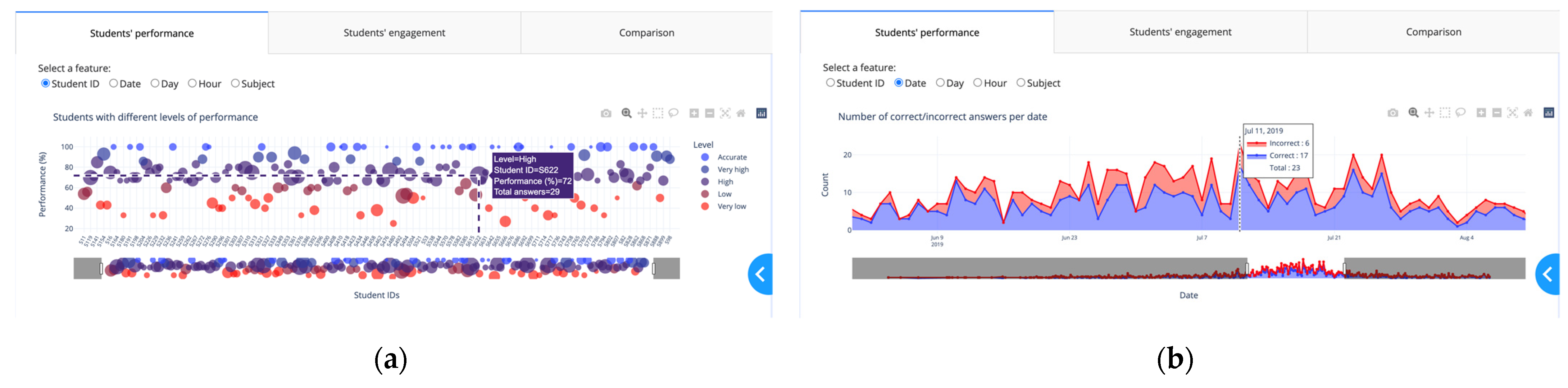
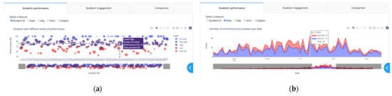
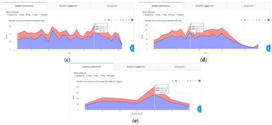
Figure 34 displays the “Students’ performance” tab which contains a scatter plot and selections (radio buttons) for rendering a set of features in the scatter plot. By selecting the student ID from the checkbox list, the performance levels are shown (
Figure 34a). To define the percentage of performance,
thwe
researchers aapply Equation (2) where
NC and
NI are the numbers of correct and incorrect answers, respectively, for each student.
Figure 34.
“Students’ performance” tab with different checkbox items: (
a
) student ID; (
b
) date; (
c
) day; (
d
) hour; (
e
) subject.
For the color scale,
thwe
researchers cconsidered five levels of performance, in increasing order: “Very low”, “Low”, “High, “Very high”, and “Accurate”.
The researchers We used the proportion of performance to group the students into these different levels of performance. For color blindness,
the researchers we chose the color palette presented in
Figure 4 5 where the colors in the leftmost column are the “true” colors, which are shown in the remaining three columns as they would seem to someone with protanopia, deuteranopia, or tritanopia. Students with a performance of 100% are in the ‘Accurate” level, students with a performance of 86% to 99% are in the “Very high” level, students with a performance of 66% to 85% are in the “High” level, students with a performance of 51% to 65% are in the “Low” level, students with a performance of 1% to 50% are in the “Very low” level. According to the performance levels,
thwe
researchers cconsidered “Accurate” and “Very high” levels as high-performing, “High” as average-performing, and “Low” and “Very low” as low-performing.
Figure 45.
Chosen colors for the five levels of performance in the scatter plot. Reprinted/adapted with permission from Ref.
. Copyright 2022, David Nichols.
Teachers can use the visualizations in
Figure 34b–d to determine the total number of interactions (the total numbers of correct and incorrect answers) and the numbers of correct and incorrect answers for each date, day, and hour.
The numbers of correct and incorrect answers and the total number of interactions for each subject are shown in
Figure 34e. Since the
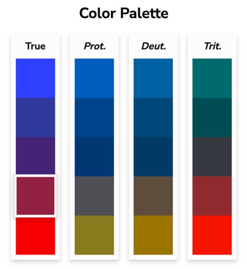
x-axis of the view in the Overview section represents the weekly activity, the visualizations in this tab allow teachers to dig deeper into the numbers of correct and incorrect answers for each feature. The “Students’ engagement” tab shown in
Figure 56 displays the students’ activity levels. Because the heatmap is arranged from left to right, teachers can quickly identify students who have similar numbers of activities in each of the four answer choices, as well as those who have the most and least interactions with the digital learning material. Students with the most interactions are represented by navy blue, while those with the fewest interactions are represented by light blue.
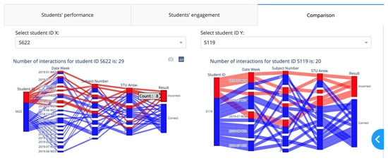
Figure 6 7 illustrates the “Comparison” tab that includes two dropdown components and two Sankey diagrams. A Sankey diagram can be thought of as a flow diagram in which the width of arrows is proportional to the flow quantity. In these diagrams,
thwe
researchers visualize the contributions to a flow by designating “Student ID” as a source; “Result” as a target; and “Date Week”, “Subject number”, and “Student answer” as flow volume. Using this tab enables a teacher to compare the students’ learning outcomes by choosing their IDs from the dropdown components.
Figure 56.
“Students’ engagement” tab.
Figure 67.
“Comparison” tab.