Your browser does not fully support modern features. Please upgrade for a smoother experience.
Please note this is a comparison between Version 1 by Damir Ivanković and Version 2 by Beatrix Zheng.
The visualization of environmental data is important for the assessment of processes taking place in the environment. Visualization of collected data includes plotting charts or drawing maps with values of the variables collected by monitoring system or predicted by modelling software. There are many tools used by environmental scientists developed for the purpose of data visualization.
- spatio-temporal visualization
- GIS
- environmental data
- status and trend
1. Motivation
Environmental science with oceanography is important for understanding the environment and addressing climate change. Measurements, including fieldwork and cruises, are very expensive, which brings with it a great responsibility for data management so that these measurements can provide new knowledge and understanding of natural processes. In the more than 20 years thwe researchers hhave been working with oceanographic data, the researchers hwe have concluded that data management is very often inadequate, leaving data unchecked or incomplete. Much of the blame in such cases lies with inappropriate tools for organising, storing, reviewing and analysing data.
2. Related Work on the Visualization of Environmental Data
Spatio-temporal web data visualization often involves the use of the web GIS and various graphical representations of data with combined views of space and time [1][2]. Oceanographic data management relies on visualization for insight of both state and trends of the environment [2][3]. Visualization in a web environment also includes an interface (human-computer interaction), transfer of data to the client side, and user interactions [3][4]. Of additional importance for a successful web application is the time needed to collect the data and draw the scene (it should be short enough for smooth use) [4][5]. Relational databases are standard today as a source of data for general types of websites (content management systems). They are used for spatio-temporal visualization for the same reason: easy and fast query and extraction of subsets of data based on user queries [5][6].
Traditionally, spatio-temporal (environmental) data are collected, validated, and stored in a file system using specialized software. Oceanographic data validation additionally involves setting the “validation factor” that describes the quality of the data. This flag should be set as a result of data visualisation by a local expert, and this information states that this value corresponds to the expected value range for a given parameter, location and time [6][7]. The increasing prevalence of relational databases has led to their use for managing environmental data as well [7][8]. Special client programs are used to access the database and visualize and validate the data. The user creates a data product from a subset of data and produces some images with maps and graphs. A schematic representation of this process can be found in Figure 1. The data product is a validated and visualized dataset tailored to the specific purpose. The result is a “one-dimensional” view of the dataset used. In the end, the result can be published as a web page or text document. Errors identified and corrected in this process are in most cases not returned to the database or data source, and for another data product, the analyses and validation of the data must be performed again.
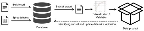
Figure 1.
Schematic view of traditional “one direction” data flow.
NextIn the researchersnext section we will present the currently used tools for environmental spatio-temporal data visualization and outline their shortcomings.
2.1. General Purpose Software (Spreadsheet, etc.)
Environmental data management has traditionally involved the use of some general-purpose software tools. For example, spreadsheets (mostly MS Excel) are used for data visualization and some time as data storage. Various statistical tools (such as Statistica or R Statistics) are used for statistical analysis and some advanced data visualization. General purpose spatial data software (such as QGIS [8][9] or ESRI ArcView) is used to draw maps of the stations. The above programs have a wide range of applications and meet some data management requirements, but also have some major drawbacks:
-
Processing a subset of data is time-consuming. Example: If the user has a large Excel spreadsheet with data from all stations, it is time consuming to extract just one station or data from a group of stations;
-
Returning the analysis results to the main dataset is time consuming or non-existent. Example: the analysis of data from one station shows some errors in the values. It is time consuming to find the exact rows in the original dataset containing all stations and update the values;
-
Visualization of data only (chart) or map only (stations). One tool is used to draw charts (usually Excel) and another is used for maps (e.g., QGIS). In the end, the user has to extract both and put them together in a word processor;
-
Poor efficiency of the whole process. The process described is repetitive and time consuming.
2.2. Ocean Data View
Ocean data view (ODV) [9][10] is the most powerful software tool for the visualization of oceanographic data. It provides various graphical visualizations, stations maps and spatial interpolation. The interface shown in Figure 2 is based on context menus and requires some learning for new users due to the many options implemented.
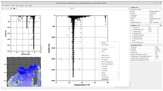
Figure 2.
ODV desktop application.
Despite its very good visualization capabilities, ODV is only a tool for visualizing a subset of data. The biggest disadvantages are:
-
Limited data filtering;
-
Desktop tool with no collaboration possibilities;
-
Changes and validations made in ODV can be exported to file, not committed to the database;
-
Separate and detached visualizations of status and trend.
Recently, Ocean Data View has also become available as a web version [10][11][11,12]. The web interface is implemented using a websocket (QtWebSockets) to run web applications, or a combination of WebSocket and HTML5 Canvas. These types of solutions are graphical versions of the terminal approach to the server. Each client has its own isolated process on the server side and performs various operations over WebSocket. The main disadvantage of this approach is that thwe researchers need some processing power on the server side for each client, and content caching on the browser side is not really used. The interface is the same as for the desktop version. With WebODV it is only possible to visualize prepared datasets available online. It is not possible to make any changes.
2.3. WISE Marine
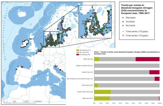
The European Environment Agency has its own services for visualization and presentation of data. One of these services is the Water Information System for Europe (WISE) Marine [12][13]. The purpose of this website is to present the state of the environment, as the agency explains on its website: “The marine environment assessments are typically informed by indicators which draw from monitoring data in a structured manner for each assessment topic. The indicators can cover all aspects of the DPSIR framework [13][14], but are generally more focused on pressures, state and impacts. The indicator assessments provide detailed information including the matrices, metrics and methods used, as well as the results. In the present section, a list of indicators is provided either used in the context of the Regional Sea Conventions work, or published by the European Environment Agency with a pan-European coverage”.
In many different visualizations, such as in Figure 3 [14][15], status and trends are shown. The map is presented as a static image showing only the trend without specific values. The chart shows only the percentage of trends within areas. The map and chart are not linked and the map is not interactive. In addition to the static elements, data visualizations often do not provide basic information about the dataset: what are the ranges of values, where are the hotspots, and what are the trends for specific locations and hotspots. Trend is often calculated as a statistically significant increase or decrease in value over time, without considering the value itself. Using this approach, a location with a measured value for a particular parameter may have an average value of 100 in one year and an average value of 80 in another year, indicating a statistically significant decline. Another location may have a value of 5 for the same parameter in one year and a value of 6 in another year. In the data visualization, the first site has a better status than the second (decrease vs. increase), regardless of the fact that the status with respect to this particular parameter is much better at the second site than at the first.
2.4. Comparison of Related Software and Targeted Properties
The software described is used in real-world applications to manage and present oceanographic data. There are many web pages that contain oceanographic data. WISE Marine site was chosen because it is intended to present the status and trend of certain oceanographic parameters and because this site has a serious background (European Environment Agency). Table 1 shows a summary of the main characteristics of the listed solutions.
Table 1.
Main properties of related solutions.
| Name | Data Insert and Update | Data Visualization | Graphs and Maps | Web Interface |
|---|---|---|---|---|
| General purpose software | Yes but file based and unstructured | Partial and particular | One or another, not connected | No |
| Ocean data view | No, only insert, file based | Yes, advanced | Yes | No (Web interface have limited preloaded datasets) |
| WISE Marine | No, only visualization | Yes | Yes, no interactivity | Yes |
As can be seen in Table 1, the big problem with the listed solutions is that the data cannot be easily inserted and updated. Considering that 20–30% of oceanographic data are lost worldwide; this is even more important. Extracting knowledge from data is another important issue. Identifying status, trends, and hot spots is important to experts and is becoming increasingly important to the general public. TheIn researchers herthis work we are trying to fill this gap with a database-based online solution that allows easy input and updating with coupled spatio-temporal visualization.