Your browser does not fully support modern features. Please upgrade for a smoother experience.
Please note this is an old version of this entry, which may differ significantly from the current revision.
Subjects:
Computer Science, Information Systems
There are many data visualization tools in various application fields, but at the same time, the main difficulty lies in presenting data of an interconnected (node-link) structure, i.e., networks. Typically, a lot of software means use graphs as the most straightforward and versatile models. To facilitate visual analysis, researchers are developing ways to arrange graph elements to make comparing, searching, and navigating data easier.
- data visualization
- human–computer interaction
- node-link diagrams
1. Table Representation
The table representation of graph data is the simplest method and is usually used for storage and graph processing. There are available several data storage formats, the most common of which are (1) the CSV format, which stores only edges as pairs of vertices or sets of edges and vertices as separate CSV files or stores relations in the form of an adjacency matrix, and (2) the JSON format, which stores edges and vertices in separate lists into a single file.
The table format is not a powerful technique, i.e., the complexity of the perception of patterns and object relations using the table format makes it useless for complex visual analysis and representation of graphs with a complex topology. Nevertheless, it is essential to mention it, as most graph data visualization techniques use this format as data input for their models.
2. Tree Maps
One of the most well-known ways to visualize hierarchical networks is treemaps [35,36,37,38,39]. In tree maps, each tree node is represented by a rectangle. Rectangles are nested in accordance with the topology of the tree: all ancestor nodes are located inside the descendant node. As a result, the treemap displays tree leaf rectangles located in the corresponding ancestor node rectangles, which are also located in the corresponding descendant node rectangles.
A feature of treemaps is that they display only the parameters of the tree’s leaves. In this case, the parameters of the nodes are formed based on child elements. Leaf parameters can be set using the size of the rectangles and color (including transparency, texture, saturation, and lightness). Thus, changing the size of a leaf rectangle entails changing the size of the entire hierarchy of rectangles in which it is nested. It follows from this that the size of the ancestor rectangle is always equal to the sum of the descendant rectangles.
For example, in Figure 1, the selected biological process is highlighted in yellow, displaying more detailed information in other windows. The hierarchy of treemaps allows one to see all the data in their entirety and quickly navigate the structure.
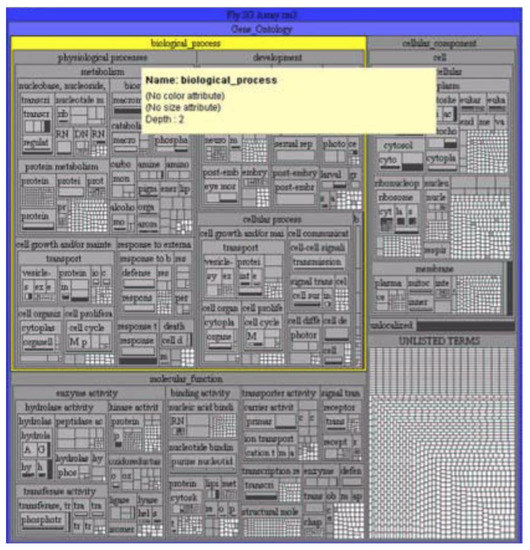
Figure 1. Gene ontology in the form of a treemap [35].
3. Voronoi Treemaps
The disadvantage of treemaps in terms of information perception (and, consequently, the speed and quality of analysis) is that with a large number of child nodes or with a large spread in the size of child nodes, rectangles with a large width-to-height ratio appear (Figure 2). This problem is solved by using ordered treemaps [40], squarified treemaps [41], or clustered treemaps [42]. The same tree in Figure 2 is redrawn using squarified treemaps [43] and presented in Figure 3. Another problem is the difficulty in defining nesting boundaries that result from using rectangular nodes.
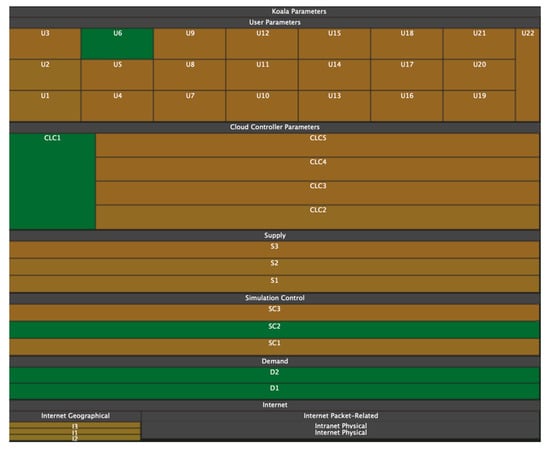
Figure 2. With a large scatter of parameter values, rectangles with a large width and height ratio may appear on treemaps [43].
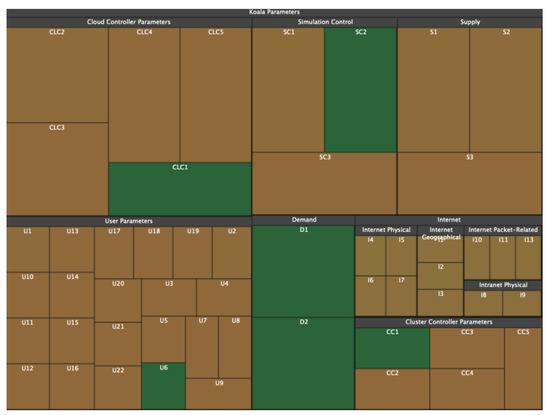
Figure 3. The tree shown in Figure 2 but redrawn using squarified treemaps [43]. It is noticeable that the desire for the equilateralness of rectangles gives rise to the complexity of determining hierarchical nesting.
Another visualization model that also expresses hierarchical networks and does not have the listed disadvantages is Voronoi treemaps [44]. Like tree maps (Figure 4), Voronoi treemaps (Figure 5) consist of nested regions that can be specified in color, size, and transparency; however, tree nodes are presented not by means of rectangles but by polygons. The use of polygons allows one to effectively distinguish different objects from each other and thereby level out the disadvantages of information perception inherent in treemaps [45].
Figure 4. Hierarchical structure in the form of a map of trees [46].
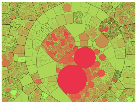
Figure 5. Hierarchical structure in the form of a Voronoi treemap [44].
4. Voronoi Maps
Another problem that is inherent in both maps of trees and Voronoi maps of trees is expressed in the hierarchy itself. First, the area of the ancestor polygon is equal to the sum of the descendant rectangles. As a consequence, we can only visualize the metrics of the leaves, and the metrics of the higher nodes must be expressed as the sum of the lower nodes in the hierarchy. Second, by definition, tree maps and Voronoi treemaps can only display hierarchical structures. Third, by changing the size and color of the polygons, tree maps and Voronoi treemaps can visualize the parameters of the nodes but cannot visualize the parameters of connections between the nodes. In these visualization models, a connection appears exclusively in the form of a nesting of polygons and uniquely corresponds to the topology.
Thus, Voronoi treemaps have been further developed in the form of Voronoi maps [47], which display the topology based on the ratio of polygons rather than their nesting. Voronoi maps can display networks with a planar topology, in which a polygon represents the network node without intersections, and the connections between the nodes are represented by the contact of polygons with edges. In such a structure, separators can also appear, i.e., edges that, on the contrary, separate rather than connect nodes. An example of a Voronoi map and the graph on whose basis it was built are shown in Figure 5 and Figure 6.
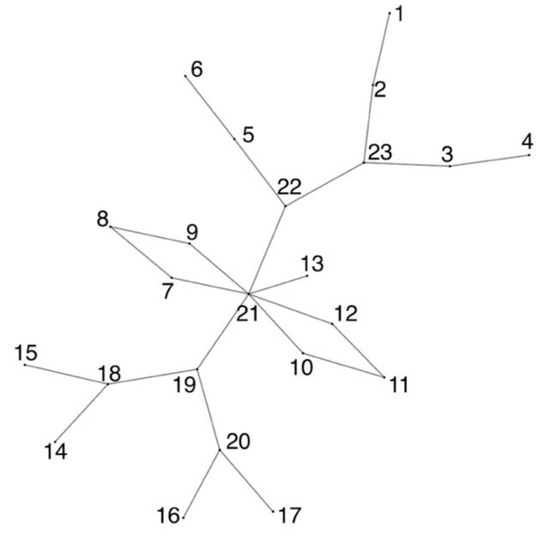
Figure 5. Planar graph.
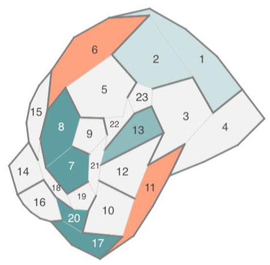
Figure 6. Voronoi map based on a planar graph.
Voronoi maps eliminate the listed shortcomings of tree maps and Voronoi treemaps: They can display node parameters independent of each other using the color, size, and transparency of the polygon; they can display not only hierarchical but also planar networks, and they can display the parameters of connections between network nodes by using the color, transparency, and thickness of adjoining edges.
A good analogy for this approach is a labyrinth (maze). Each cell of the map (node) is a maze room, some cell edges (connections between nodes) are doors, and other cell separator edges (no connection between nodes) are walls. The topology of the structure is perceived as an ability to move between rooms, while the parameters of nodes and their connections are perceived by various indicators of rooms and doors (colors, sizes, position).
The disadvantages of the Voronoi map are the ability to build a map for networks with planar topology only and the difficulty in resizing the polygons of the Voronoi map to display node parameters as a polygon size.
As a result, the disadvantage of this type of diagram is that when choosing them, first, the researcher has to determine the scale (in this case, the number of axes) of the data, which causes possible inconvenience when further manipulating the model images.
5. Chord Diagrams
There are networks with two types of links between nodes: hierarchical links and unstructured ones. They can be presented as a special case of the chord diagram (Figure 7 and Figure 8) [48,49,50,51]. In this approach, the object hierarchy is displayed as an inverted radial graph. Inside it, in the first ring, are the leaves of the tree. On subsequent rings, the ancestor nodes of the elements of the previous rings are located. The connection between the nodes is denoted as the presence of common x-coordinates in the radial reference system.
Figure 7. Chord diagram with straight edges. The outer shell consists of three rings, displaying a hierarchical topology. The inner shell consists of an unconnected graph.
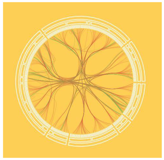
Figure 8. Chord diagram with seventh-order Bezier curves. Bezier curves allow one to “wisp” the connections of an unconnected graph and improve the readability of the image.
Unstructured links are displayed as a graph located inside the rings. The graph edges can be displayed both as straight lines (Figure 7) and as N-order Bezier curves (Figure 8). In this case, the order of the curves depends on the number of degrees of the hierarchy. Radial tree node parameters can be displayed as colors, and unstructured graph link parameters as the thickness, color, and transparency of an edge or curve.
6. Stacked Chord Diagrams
The stacked chord chart is a modified version of the chord chart and is used to display streaming or temporal data, with the ability to use cognitive graphics for visual analytics.
A stacked chord diagram is a torus that consists of rings, and each ring is located along the z-axis and displays a specific state at the corresponding moment in time. Rings consist of arc nodes. Node options can be displayed as the arc length, arc thickness, arc color, or arc transparency. Thus, the rings, located one after another, reflect the dynamics of the parameters change over time (Figure 8—only one parameter is used in the figure in the form of the arc length). Analogous to the chord diagram, inside the rings, there is an unstructured graph that connects the elements of the rings.
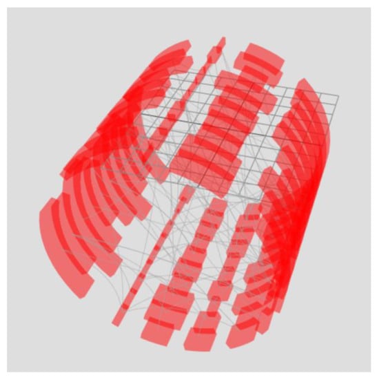
Figure 8. Stacked chord diagram. Each chart represents one-time slice. The arrangement of arc elements of the ring one after another provides information about the change in the parameter over time by analogy with a flowchart.
The power of cognitive graphics manifests itself as filtering the data set through graphical interaction rather than making changes to the displayed data set. For example, the exclusion of a time slice from the sample or the formation of a new set is possible by moving the ring outside the torus (Figure 9). Another example is the alignment of all rings (Figure 10). As a result of superposition, element connections for all periods are displayed—arc lengths display the maximum value of the arc element parameter for the entire period of the analyzed time, and edge opacity shows the probability distribution of the minimum parameter value. To display the probability distribution of the minimum value, the initial transparency of the edges must be equal to 100%Number of rings.
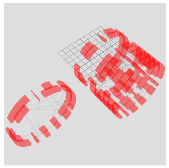
Figure 9. Moving part of the rings outside the torus allows one to select part of the time slices, forming a second filtered torus. At the same time, filtering occurs not by manipulating data but by manipulating graphics as if they were real physical objects.
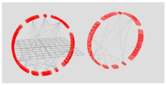
Figure 10. Combination of rings of tori.
On the left side of Figure 9, eight rings of the right torus in Figure 10 are combined. On the right side, there are two rings of the left torus in Figure 9. Superimposing the rings on top of each other allows one to obtain information about the bonds for the periods represented in the tori. The key feature is that the data are not processed, i.e., the analysis occurs through graphical manipulations as if over a physical object using cognitive graphics tools.
7. Voronoi Diagrams
A Voronoi diagram can be used to visualize compound data structures, such as ones describing proteins, atoms, or amino acid residues. This model is built on the basis of points (centroids) and divides the plane into polygons, which are called Voronoi cells. Each centroid corresponds to a Voronoi cell. In the classical Voronoi diagram, the cells have the following mathematical meaning: any point of the Voronoi cell is closest to the centroid based on which the cell was built (Figure 11). Each cell can be considered a zone of influence of an atom or other object, played by a point [52,53,54,55].
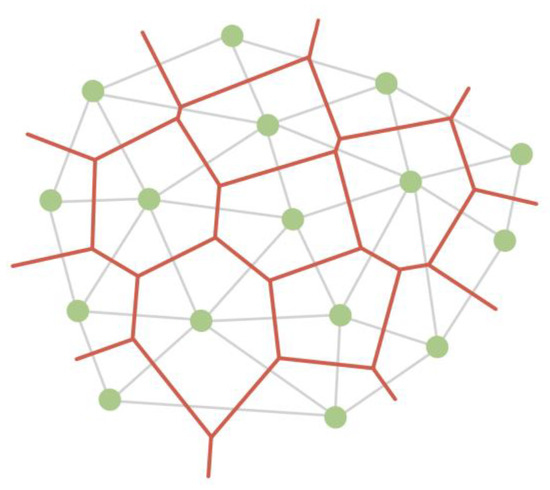
Figure 12. A Voronoi diagram (red) partitions a plane into cells based on triangulation (grey edges) of centroids (green vertices).
At the same time, there are various algorithms for constructing a Voronoi diagram, which can operate with the weight of the centroid, thereby taking into account the properties of atoms based on which the partition is built (Figure 13, Figure 14 and Figure 15) [56,57,58].
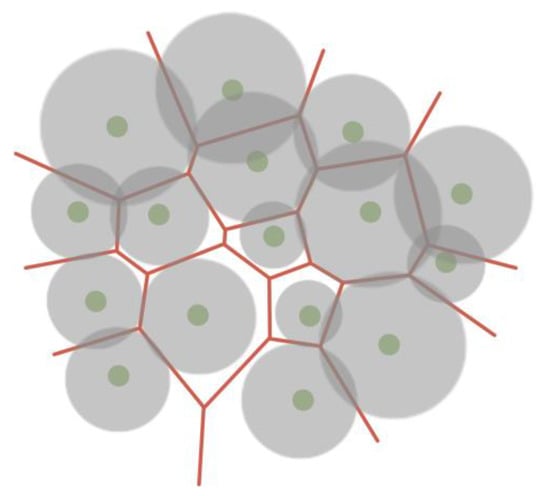
Figure 13. Voronoi force diagram, taking into account the weights of centroids, where the parameter of the atom determines the weight.
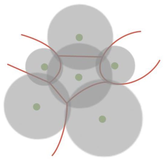
Figure 14. Voronoi diagram in which the distance to the separating edge is related to the weight of the centroid. This approach makes it possible to obtain curved edges of Voronoi cells.
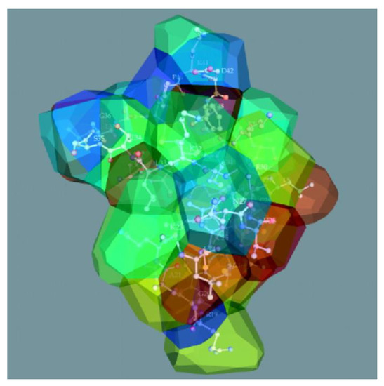
Figure 15. The structure of beta-purothionin in the form of a 3D Voronoi diagram, which was built taking into account weighting factors [59].
In addition to splitting the plane, there are algorithms for constructing a 3D model of the Voronoi diagram by splitting the space into polyhedra, which can also operate with the weight of the centroid (Figure 15) [59,60,61].
8. Trilinear Coordinate Model
A trilinear coordinate model can be used to display relative data. An example of trilinear coordinates is the United States Department of Agriculture’s soil texture triangle, which is used to define soil types. Robert Bruce Whitaker developed this idea by proposing the use of the trilinear coordinate model [62,63] to display any three or two object parameters relative to each other.
The trilinear coordinate model is a triangle whose sides represent the object’s parameters. The object is depicted as a point located in a trilinear coordinate system. Figure 16 shows a template where the object (red dot) has x, y, and z values of 50%, 20%, and 30%, respectively.
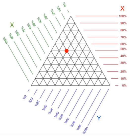
Figure 16. Trilinear coordinate pattern. It can be used to determine the value of the parameters of an object located on a triangle. The red dot denotes an example of data in trilinear coordinates [62].
The trilinear coordinate model can be used to detect deviations from the typical values of an object over time. An example of such use is shown in Figure 17. Figure 17 exposes several objects and their trajectories that are formed when changing the ratio of three parameters. Trajectories are highlighted with a color that indicates the rate at which the ratio changes. In this case, it is possible to single out areas in which the presence is typical for the object. Areas can be identified based on historical data on the range of values in which the object parameters have been the longest. In Figure 17, one of these areas is highlighted in blue.
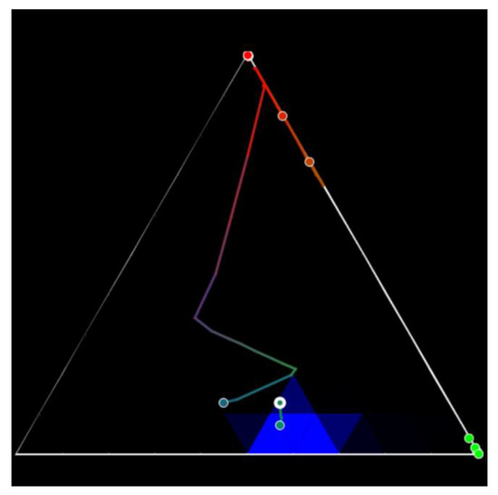
Figure 17. Trilinear coordinates illustrate the dynamics of objects. A change in parameters is represented by a trajectory, and the area of typical parameters for the object is highlighted in blue. The colors of the trajectory from warm (red) to cold (blue) indicate the rate of change in the ratios of the three coordinates used [62].
9. Custom Stacked Models
Separately, visualization models can be distinguished. These are formed by linking other models [64]. Such models rely on the structuring of a data set, highlighting the layers of data into a hierarchy. For example, the first layer can be a network and its parameters, and the second one can be an object and its parameters. In this case, each individual layer is represented by a different model. Such models can be diverse and, in fact are a combination of different models [65].
This approach can be used when the visualization model does not allow exposing many parameters. For example, in the case of visualizing a network using a graph, the object parameters can be represented as the graph vertex size and vertex color. It is also possible to display object parameters in the form of vertex transparency or vertex texturing. However, it is obvious that this way of representation will be difficult to perceive.
Using the example of a graph, stacked models imply that a vertex can be changed to another model that can accommodate more parameters, such as a glyph (Figure 18). Glyphs are made up of several parts, and each part presents a parameter with a color. Glyphs can also have layers that present the typical or previous setting value. An example of a graph combined with glyphs is shown in Figure 19.
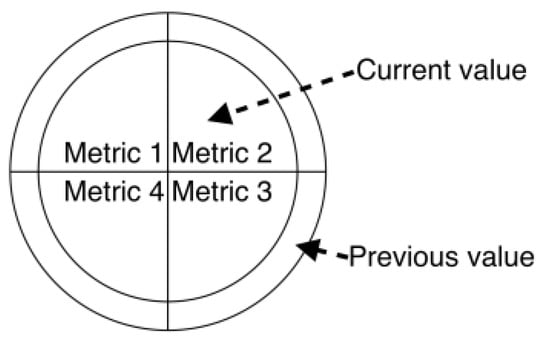
Figure 18. An example of a glyph with four kinds of parameters. The inner part of the glyph displays the current values, while the outer part shows the previous ones.
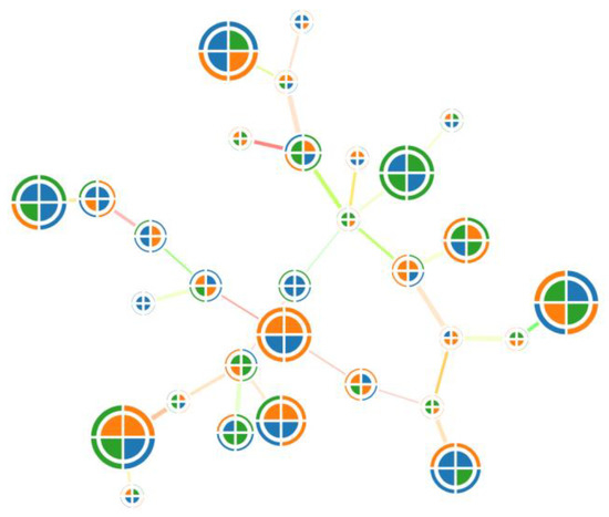
Figure 19. An example of a graph combined with glyphs. Due to glyphs, it becomes possible to use more object parameters.
10. Virtual and Augmented Reality
The use of virtual reality (VR) and augmented reality (AR) for data visualization is promising [66,67,68,69,70,71]. Graphic models in VR and AR are not limited by screen size, so they can accommodate a huge amount of data. Furthermore, in VR and AR, one can interact with data as with real physical objects [72,73,74]. This allows one to intuitively compare and arrange data. In general, the use of VR and AR allows coping with several disadvantages inherent in traditional approaches to visualization.
Virtual reality and augmented reality are relatively new areas since for a long time, VR and AR devices were not available due to their rather narrow professional orientation (for air pilots, race car drivers, etc.) or high cost, which significantly limited their widespread use [75,76,77]. In 2012, the first affordable virtual reality device, the OculusRift, was introduced. Later, similar affordable devices appeared, including Samsung Gear VR (2014), HTC Vive (2015), Sony PlayStation VR (2016), Google Daydream (2016), Oculus Quest (2021), and HTC Vive Flow (2022). The devices themselves are positioned by developers as gaming devices or devices for learning.
Augmented reality devices are a separate segment among virtual reality devices. Unlike virtual reality, in augmented reality, the image is superimposed upon real physical objects. On the one hand, this allows one to interact with both the virtual and the physical world; on the other hand, it requires more sensors that are necessary to determine the location of not only the user but also the objects around this user. The following augmented reality devices are currently available: GoogleGlass, MetaVision, and Microsoft HoloLens. Unlike virtual reality devices, augmented reality devices are positioned as aids for 3D model designers, architects, and other professional activities [78,79].
It should be noted that there is no single concept of how to develop data visualization in VR and AR. Despite this, solutions for particular data visualization tasks in VR and AR are already used by various companies [80,81].
-
A group of scientists from South Korea and the United States investigated ways to visualize graph structures in virtual reality on various types of spheres [82].
-
Ana Becker (data journalist of The Wall Street Journal) visualized the history of NASDAQ exchange quotes in virtual reality [83], which shows the possibilities of using VR in education and journalism.
-
Michal Koutek and Fritz Post developed the MolDRIVE visualization system, which makes it possible to visualize and control experiments in the field of molecular dynamics [84].
-
Bob Levy presented the VirtualCove project, which visualizes stock indices in augmented reality [85].
-
E-Semble develops emergency simulation programs to train qualified personnel.
-
Brown University (Providence, RI, USA) uses virtual reality for various scientific experiments and teaching in psychology, surgery, geology, bioengineering, and other fields [86].
-
At the Engenharia Nuclear Institute (Rio de Janeiro, Brazil), the possibilities of using virtual reality to ensure the functioning of nuclear power facilities are being explored [87].
Research on visualization through virtual and augmented reality is currently undergoing rapid growth. However, significant fundamental studies on the design of visualization systems in VR and AR have not been conducted. However, to date, the necessary basis has been formed for developing data visualization systems using virtual and augmented reality [88,89].
This entry is adapted from the peer-reviewed paper 10.3390/s23073747
This entry is offline, you can click here to edit this entry!