Driving is based on effective navigation. When using a navigation device, the user interface, the amount and quality of the underlying data and its representation all effect the quality of navigation. This study evaluates whether drivers in three different countries consider these devices to be useful and what functionality they would prefer. An online questionnaire was used to assess built-in navigation systems. The findings from 213 respondents show that current car GPSs are overloaded with features. Regardless of country, drivers simply require more basic functionality in the interface. It was also noted that the embedded functions in these devices are not fully utilized. In addition, many people use the navigation service to enter a new address while the car is moving. It may be worth examining how this option can be better implemented.
- car navigation
- built-in GPS
- GPS interface
1. Introduction
-
What do GPS systems look like today and how are they used?
-
Do drivers consider these devices to be appropriate? If not, what would they prefer?
-
Are there any differences in the preferences between countries with different economic backgrounds?
2. Our questionnaire
3. Results
3.1. Current interfaces
3.2. Recommended interfaces
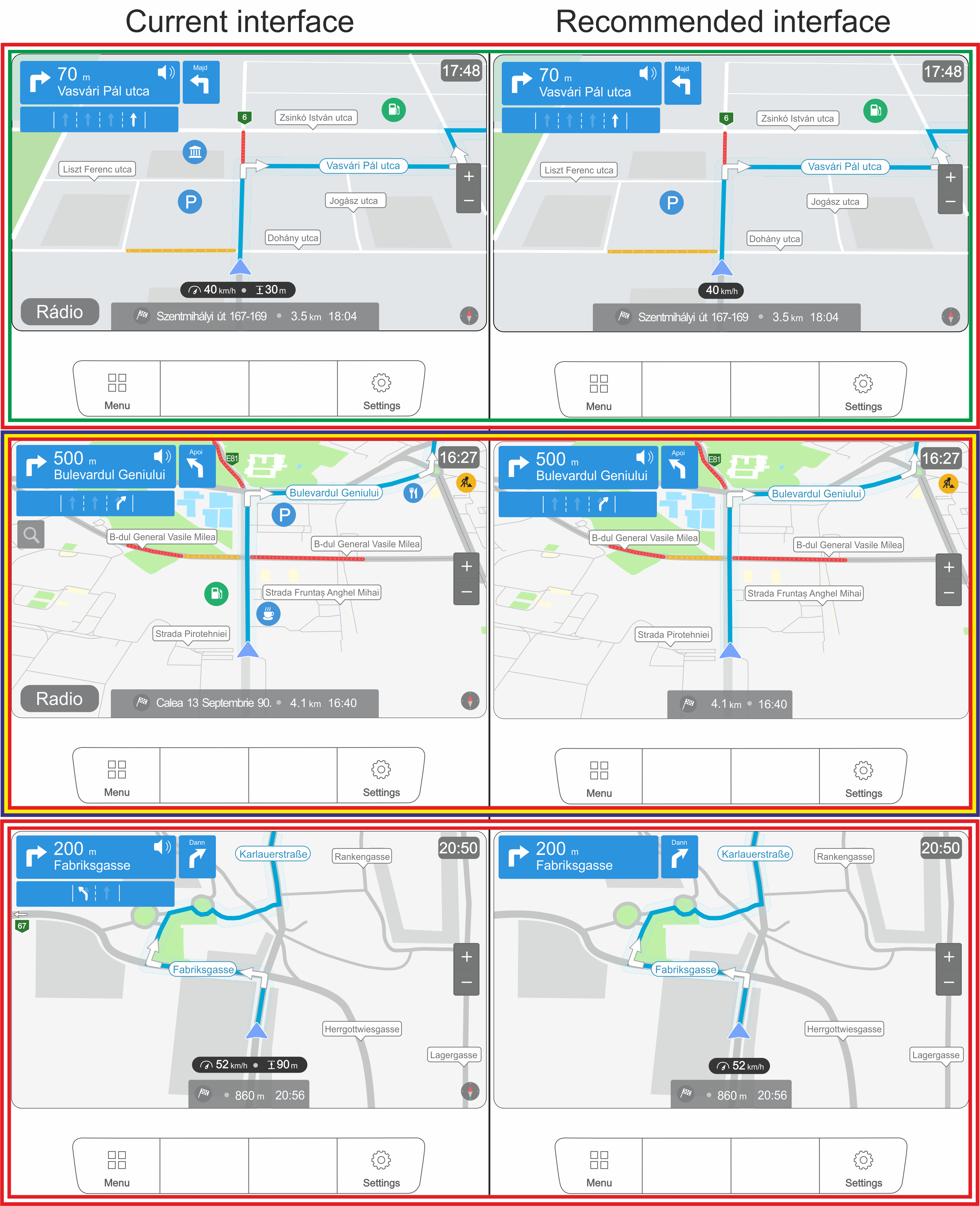
We used all four groups to create the proposed ideal interface, but we merged the values into two groups: I want it = “I have it and I want it” + “I don’t have it, but I want it” and I don’t want it = “I have it, but I don’t want it” + “I don’t have it and I don’t want it”.
 4. Discussion
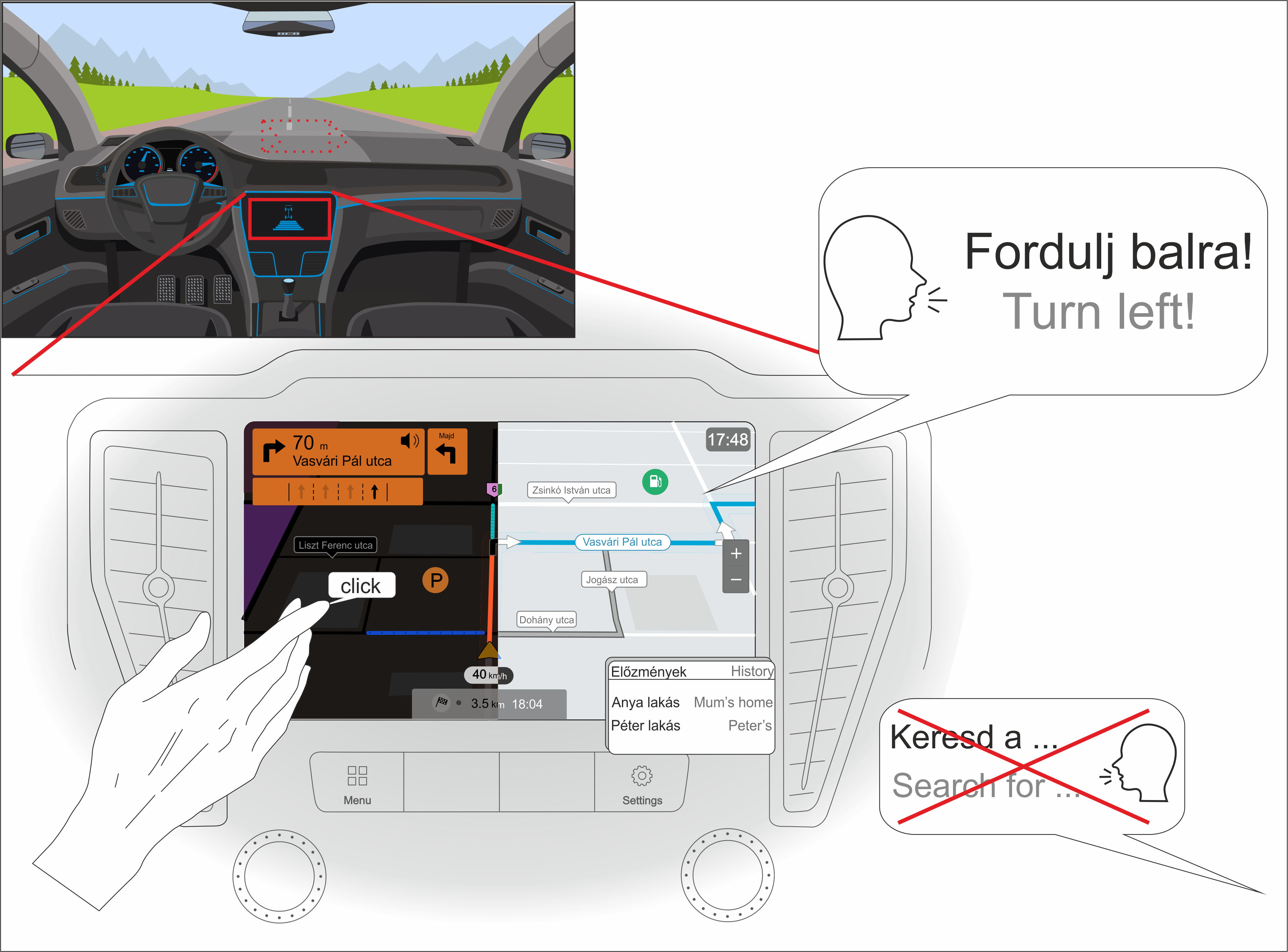
We summarized the 213 answers of the three countries for all the 24 questions (4023 answers). The results are presented in Figure 11. Hungarian is used in the illustration. “Utca” means street and “Majd” means then. For other terms or help labels, the English meaning is shown in gray.

-
-
The device speaks the user’s native language most of the time but cannot handle voice commands—even if it implements voice recognition, it is more common that drivers do not take advantage of this feature.
-
Most people use a perspective view (with the facing direction to the north).
-
Although it was not specifically asked what input method was preferred (just what they currently have), we can conclude that: (A) many people are bothered by the navigation knob (it makes it difficult to enter text); and (B) voice navigation is not widely used. Based on these questions, the touchscreen has been designated as the required input.
-
Since only a small percentage of users (~30) indicated that they are specifically bothered by the click sound when they select something on the interface, we concluded that users will also want this sound to some extent.
-
Most would prefer the current placement of the navigation interface. The top of the center console also received a similar percentage, so we marked it with a dashed line.
-
Users prefer the night mode and they usually check the alternative routes during planning (gray line in the illustration).
-
Although it is not connected to the map view of the interface, most drivers use history for frequently visited addresses (mostly addresses of family or friends).
5. Conclusions
In general, it seems that car and navigation companies have likely not carried out the necessary research to make built-in navigation devices really useful to a broad user base. This research can serve as a starting point. The specific findings are as follows:- (1)
-
Generally speaking, the built-in GPSs currently on the market are overloaded with features. On the one hand, users themselves (regardless of country) seem to require less functionality in the interface, and on the other hand, the existing functions are not fully utilized either.
- (2)
-
From a cartographic point of view, users desire the display of fewer and fewer objects and need them represented in the simplest possible form. Further simplification may be a necessary as a car navigation system is primarily intended to facilitate driving.
- (3)
-
The main downside is the price of these built-in devices. Many people also do not pay to update the data. Thus, these built-in devices will become less useful over time.
- (4)
-
Only a few users take advantage of the more sophisticated features in these devices. Those who do so do it confidently and regularly.
- (5)
-
Due to the different economic backgrounds in the countries surveyed, there are differences in the desired interface. However, when looking at usage habits, these differences become much more negligible.
- (6)
-
Navigation software companies should notice that a lot of people use the GPS while driving, especially to enter a new address. It may be worth re-thinking this feature to minimize the potential for accidents.
An area of future research associated with navigation devices of all types would be whether map-reading skills are declining as users become more dependent on their devices. It may also be the case that the quality or functionality of mental maps is declining. While navigation devices help us move through the spatial environment, they may not help the user conceive of the space they are traversing. If that is the case, humans will become increasingly dependent on them. -
This entry is adapted from the peer-reviewed paper 10.3390/app12083716
