The increasing use of electronic health record (EHR)-based systems has led to the generation of clinical data at an unprecedented rate, which produces an untapped resource for healthcare experts to improve the quality of care. Despite the growing demand for adopting EHRs, the large amount of clinical data has made some analytical and cognitive processes more challenging. The emergence of a type of computational system called visual analytics has the potential to handle information overload challenges in EHRs by integrating analytics techniques with interactive visualizations.
- electronic health records
- visual analytics
- interaction design
- visual analytics tasks
- analytics techniques
- visualization
1. Introduction
In recent years, medical organizations are increasingly deploying electronic health record (EHR)-based systems that generate, store, and manage their data. Therefore, the amount of data available to clinical researchers and clinicians continues to grow at an unprecedented rate, creating an untapped resource with the capacity to improve the healthcare system [1]. The EHR-based systems are used to detect hidden patterns and trends, monitor patient conditions [2], reduce medical errors [3], detect adverse drug events [4][5], and ultimately improve quality of care [6][7][8]. However, despite the evidence showing the benefits of EHR-based systems, they rarely improve healthcare experts’ ability to make better clinical decisions by having access to more comprehensive information [9][10]. Access to large volumes of clinical data has made some analytical and cognitive processes more difficult for healthcare experts. As the amount of data stored in EHRs continues to grow exponentially, and new EHR-based systems are implemented for those already overrun with too much data, there is a growing demand for computational systems that can handle the huge amount of clinical data.
Visual analytics (VA) systems have shown significant promise in addressing information overload challenges in EHRs by combining analytics techniques with interactive visualizations [11][12]. For a VA system to work well, there must be a strong coupling among all its components [13][14]. Such components include but are not limited to tasks, interactive visual representations, and analytics techniques. Analytics has the potential to facilitate healthcare experts’ clinical decision-making process by using techniques from various fields such as statistics, machine learning, and data mining. Completing analytics, interactive visualizations allow healthcare experts to explore the underlying data, alter the representations, and guide the analytics techniques to accomplish their tasks [15][16][17]. VA systems fuse the strengths of both analytics techniques and interactive visualizations to support the execution of EHR-driven tasks. VA is needed to support the intuitive analysis of EHRs for healthcare experts while masking the data’s underlying complexity. Clinical researchers can use VA to perform population-based analysis and gain insights from large volumes of patient data. Moreover, VA can also support physicians in tracking symptom evolution during disease progression and creating and visualizing detection models for disease surveillance [18][19][20][21]. The complex and diverse challenges and applications of VA in the analysis and exploration of EHRs have led to the development of several EHR-based VA systems, which aim to fulfill the computational and cognitive needs of healthcare experts.
2. EHR-Based Visual Analytics Systems
DecisionFlow [22] is a VA system that supports the analysis and exploration of temporal event sequences in high-dimensional datasets. It allows users to test different hypotheses regarding the factors that might affect the patient outcome and compare multiple complex patient event pathways by integrating on-demand statistical analysis techniques with interactive flow-based visualization. DecisionFlow helps users to specify a subsequence of interest with a milestone-based query interface. Then the matching data is aggregated to generate a DecisionFlow graph that contains a linear sequence of nodes (i.e., milestones) connected by directed edges. The system then analyzes the graph to extract multiple statistics (e.g., gender and age distributions and edge summary statistics). The system includes three main linked views-namely, the temporal flow view, edge overview view, and event statists view. The temporal flow view visualizes the DecisionFlow graph using a directed graph of nodes representing milestones where nodes are mapped to grey rectangles and are arranged in temporal order from left to right. The edges that connect these nodes are represented by two marks—namely, the time edges and the link edges, and they are color-coded to encode the average outcome. The edge overview panel summarizes the subsequence of interest that are returned from the query interface by showing multiple aggregate statistics. The event statistic view displays a color-coded bubble chart that represents different edge summary statistics.
RetainVIS [23] is a VA system that assists healthcare experts in the exploration of patient medical records in the context of risk prediction tasks. It provides users with the means to investigate common patterns in a patient’s history to identify which medical codes or patient visits (i.e., sequence and timing) contribute to the prediction score. It can also help users to conduct different what-if analyses by testing hypothetical scenarios on patients (e.g., edit/add/remove medical code, alter visit intervals). Furthermore, RetainVIs allows users to provide feedback to the model based on their domain knowledge if the model acts in an undesirable manner. RetainVIS generates prediction scores based on the RetainEX technique, a bidirectional recurrent neural networks (RNN) model that harnesses the temporal information stored in patient records (e.g., time intervals between patient visits). It increases the interpretability and interactivity of models by calculating code-level and visit-level contribution scores.
This system integrates RetainEX with multiple interactive visualizations. The Overview summarizes patients regarding their contribution scores, medical codes, and predicted diagnosis risks using a scatter plot, multiple bar charts, an area chart, and a circle chart. Patient Summary shows a temporal summary of the selected patients. It contains a table, a code bar chart, and a contribution progress area chart. Patient Summary provides a summary description of the selected patients and represents aggregated contribution scores of medical codes over time and their mean contribution scores. Patient List shows selected patients in a row of rectangles. It allows users to compare and explore multiple patients and select a patient of interest to view their details in the Patient Details view. Patient Details view is composed of a line chart of prediction scores, a temporal code chart of contribution scores of medical codes, and a code bar chart representing the most contributing medical codes for each patient. Finally, Patient Editor represents each patient visit horizontally in a temporal order and lists medical codes for each visit downwards. It allows users to test hypothetical scenarios by changing the date of the visit or inserting new medical codes into a visit. Once the user changes are complete, the system generates the new model and returns the new predicted risk and contribution scores on top of the original records.
DPvis [24] is a VA system that supports clinical researchers in interactively discovering and exploring disease progression patterns and studying interactions between such patterns and patient’s characteristics. It also allows users to test and refine hypotheses for multiple clinically relevant subgroup cohorts in an ad hoc manner. DPVis models disease progression pathways by characterizing a patient’s clinical course as a sequence of transitions between multiple states where each state describes a co-occurring pattern of observed symptoms and variables. Then, it uses a class of unsupervised models, namely- continuous-time hidden Markov models (CT-HMMs), to discover these hidden states and state transitions from large-scale longitudinal patient records. These models identify associations between disease progression patterns and various observed variables and predict a patient’s future states. DPVis combines the outcome of HMM models with interactive visualizations to assist medical experts in interpreting these models and clinically make sense of the discovered patterns.
DPVis is composed of seven linked views. The Static Variable Distribution view contains a list of selected measures in a horizontal bar chart. The Observed Attributes view contains feature matrix, feature distribution, feature heatmap over time, and feature over time. It summarizes all the characteristics of disease states that are discovered by HMM. State Transitions view shows multiple representations of state-to-state transition patterns over a series of visits or over time. It includes four views-namely, Pathway over Observation, Pathway by Time Unit, Pathway Waterfall, and State Transition Chord Diagram. Frequently Occurring State Transition Pattern view shows a list of frequently occurring state sequential patterns. Subject Timeline represents an individual patient’s observations over time. It contains Dual Kernel Densities view and Subject List view. State Sequence Query Builder allows users to create and refine cohorts based on state transitions. Cohort view enables users to load and save intermediate results. Once users create more than two cohorts in the Cohorts view, they can trigger the Comparison Mode between the selected views. This selection then turns all views into the Comparison Mode.
The VA system for pharmacovigilance in electronic medical records developed by Ledieu et al. [25] integrates a modified version of the Smith–Waterman (SW) sequence alignment algorithm with an interactive web interface to detect inappropriate drug administration and inadequate treatment decisions in patient sequences. The SW algorithm is used to compare a reference sequence (i.e., a sequence specified by the user) and a patient’s sequence, where each sequence is considered a string of characters. Each character in the sequence represents a clinical event, such as a laboratory test result or a drug administration. The algorithm calculates a similarity score for each comparison. A high similarity score corresponds to a higher similarity between the reference and the patient sequences. This VA system allows users to create the reference sequence(s) in a query interface. It provides them with a visual dictionary of event types (e.g., the discretized numerical events are encoded by color-coded squares or the direction of arrows represents the trend of change) in a grey rectangular area. To form a pattern, users can drag and drop these icons down to a query line. The system also enables the user to indicate time-constraint events in the query. The adopted SW algorithm returns the search result, which is displayed as a list of patients and their corresponding sequences, sorted based on their similarity score to the reference sequence. Each sequence is aligned to the reference pattern or its closest match. The time interval between the time-constraint event and the aligned events is shown by a vertical line along with the time duration in days on top of it.
Gotz et al. [26] develop a VA system to explore and query clinical event sequences stored in EHRs by combining on-demand analytics with visual queries and interactive visualizations (Figure 1). The visual query module provides an intuitive user interface that enables users to retrieve cohorts of patients that satisfy complex clinical episode specifications. Users can define a clinical episode by specifying milestones, time gaps, preconditions (i.e., a set of constraints that should be satisfied before the starting milestone), and outcome measures in the query interface. Upon submission of the query, the system returns a set of matching patient event sequences. The returned event sequence for each patient includes the specified milestones and several intermediate events that occur between milestones. Each episode is subdivided into a series of intermediate episodes at each milestone.
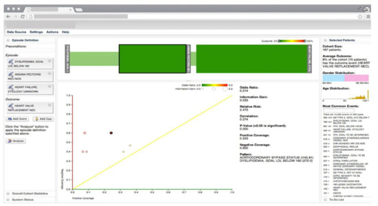
Figure 1. The screenshot of the VA system developed by Gotz et al. [26] including, the visual query panel, the milestone timeline, the cohort overview, and the pattern diagram. Source: Reprinted with permission from ref. [26], Copyright (2014), with permission from Elsevier.
Frequent pattern mining (FPM) is then performed first on the overall episode as well as on each of the intermediate episodes that are retrieved by the visual query module. The FPM engine includes two main components-namely, the frequent pattern miner and the statistical pattern analyzer. The frequent pattern miner uses the bitmap-based Sequential PAttern Miner (SPAM) [27] algorithm for pattern discovery. SPAM employs a search strategy that combines a depth-first traversal of the search space with an efficient pruning mechanism. It takes a set of event sequences and a user-specified support as inputs and returns a set of frequent patterns as an output. Then the statistical pattern analyzer computes correlations (e.g., Pearson correlation, odds ratio, and information gain) between the mined patterns and the outcome measure. Finally, an interactive visualization allows users to explore the results and discover temporal patterns. The interactive visualization component is composed of three linked views. The cohort overview shows the age and gender distributions for patients that satisfy the query specifications. The milestone timeline represents the sequence of milestones using a series of ordered, vertical grey bars. The bars are connected by color-coded edges, where each edge has two parts-namely, the time edge, and the link edge. The time edge maps the mean duration between the milestones while the link edge connects the bars to show sequentially. The pattern diagram shows the set of patterns mined from the part of the episode that is selected in the milestone timeline in a scatter plot where the x and y axes encode the level of support for a specific pattern for patients with positive and negative outcomes, respectively.
The VA system developed by Simpao et al. [28] facilitates the dynamic and continuous monitoring of medication alerts and care providers’ responses through an automated, user-friendly dashboard. It allows pharmacists and care providers to examine and filter the alert data based on patient location and ordering provider type and to identify which specific orders triggered the drug-drug interaction alerts. This VA dashboard is an integral part of a hospital quality improvement initiative to improve medication safety and reduce alert fatigue by deactivating irrelevant alert rules. The system is developed in collaboration with a clinical decision support committee that is asked to perform three interventions to deactivate irrelevant drug-drug interaction alert rules. The impact of these interventions on pharmacists’ alerts and override rates is analyzed using an interrupted time-series framework with piecewise regression. Baseline IQRs and median rates are compared to IQRs and median rates following three intervention phases of drug-drug interaction deactivations and are tested for statistical significance using the Wilcoxon rank-sum test. The user interface of this system includes a central display area with graphical and tabular data representations. Medication alert and override rates, different alert types, and various care providers, and patient characteristics are displayed and explored at a specific time point or across a user-defined time interval using multiple filters and limits.
The MOSAIC dashboard system [29] aims to support the prediction and diagnosis of type 2 diabetes mellitus (T2DM) by analyzing clinical and home monitoring data. The system integrates a data querying and mining technique with an interactive user interface to assist caregivers in devising management strategies and therapeutic interventions for T2DM complications. The mining techniques are triggered by the query module that is responsible for retrieving the data from the i2b2 data warehouse, calling the proper data mining technique, and sending the results back to the user interface. The data mining module implements several temporal analytics models such as temporal abstractions, the care flow mining algorithm, drug exposure pattern detection, and risk prediction models for T2DM complications. Temporal abstractions are extracted using the Time Series Abstractor (JTSA) tool that provides a library of techniques that can be employed for time-series processing and abstraction [30]. The care flow mining technique uses the temporal sequence of events to determine the most frequent clinical pathways patients experience during their care process, automatically generating groups of patients with similar care histories [31]. The proportion of days covered is used to summarize the dug purchase patterns using the data gathered from administrative resources. Finally, several risk prediction models are generated to estimate the risk of T2DM complications [29].
The graphical user interface of MOSAIC has two primary components designed for (1) clinical decision support and (2) outcome assessment on populations of interest. The clinical decision support system dashboard is composed of three sections-namely, metabolic control, frequent temporal patterns, and drug purchase patterns. The metabolic control evaluation section is based on a “traffic light” metaphor to enable quick assessment of the control level of certain parameters. The frequent pattern mining section is composed of a scatter plot and a timeline plot. The drug purchase graph shows all the purchases made by a patient for each drug class using a scatter plot. The outcome assessment dashboard provides an overview of the treatments’ outcomes on the population of patients with T2DM to clinical researchers. It includes summary charts that represent patient counts grouped by clinical and demographic variables. It also shows the most frequent temporal patterns of the patients selected in the summary chart using timeline graphs.
VisualDecisionLinc [32] is a VA system that helps clinicians to identify subpopulations of patients with similar clinical characteristics and to understand the risks and effectiveness of different treatment options for these subpopulations using psychiatric patients’ data with major depressive disorder (MDD). The system aims to improve and simplify the decision-making process by reducing the number of available therapeutic options to those that have proven to be most effective with minimal side-effects. To define the MDD comparative population, VisualDecisionLinc uses a patient data-driven approach where the patient’s medical profile is used as ‘seed’ data (i.e., patients with a primary diagnosis of MDD and their last prescribed medications) to identify a comparable group of patients with similar clinical characteristics. At the computational level, the system creates a bin for each medication and inserts patients into bins of their prescribed medication. At the same time, the system tags patients based on their treatment outcome response, which is reported in the database in the form of a clinical global impression (CGI) score. CGI score is a seven-point scale that offers a brief score of the clinician’s assessment of the severity of the patient’s illness prior to and after starting treatment. A lower CGI score indicates a better treatment outcome for the patient. After the binning process is done, the system uses additional computational processes to quantify the collective comparative MDD patient response into a ‘% Patient Improved’ score.
VisualDecisionLinc is composed of five linked views. Data view of patient demographics shows patient demographic data such as age, gender, and race, to name a few. Data view of summarized medication response displays ‘% Patient Improved’ score and the absolute number of patients that are used to compute this score. Color-coded dots placed next to the medication names encode the ‘% Patient Improved’ score greater than 10 (green dots) and less (red dots). Data view of comorbidities shows a list of comorbid conditions among patients on a selected medication from the summarized medication view. Data view of contextual patient treatment outcome shows the CGI score of a patient over time. It also displays prescribed medications and their timespan using horizontal bars below the CGI temporal view. Finally, the data view of median-based historical response to medication shows the historic outcome response to the selected medication. Blue and red lines reflect the median-based historical trend in medication outcome from the comparative populations and patient’s response to the selected medication in the past, respectively.
Care Pathway Explorer [33] is an interactive hierarchical information exploration system that can help physicians analyze patients’ longitudinal medical records. The system provides an overview of the frequent patterns that are mined from patient event sequences. The physician then studies these patterns and interactively selects patterns of interest for more details. The system computes the group of patients that match the physician’s specified sub-traces. Then the event traces for those patients are extracted using a deeper level of the user-specified hierarchy. The system feeds these traces to the frequent pattern miner engine, which mines frequent patterns and analyzes how these patterns are associated with outcomes using a modified version of the SPAM algorithm [27]. The patterns are then visualized alongside meaningful statistics.
The visual interface of Care Pathway Explorer features two complementary views. The overview contains a bubble chart and represents events of the most frequent patterns mined by the frequent pattern miner engine. Each bubble encodes a medical event that occurs frequently among patients and is computationally positioned close to events with which it most frequently occurs to show an overview of clusters of patterns. The flow view shows how bubbles connect to each other using a visualization similar to the Sankey diagram. Events in the most frequent patterns are encoded by nodes, and event nodes belonging to the same pattern are connected by edges. Both bubbles and patterns are color-coded according to their association with the outcome, which is determined by the Pearson correlation.
RegressionExplorer [34] is an interactive VA system that enables clinical researchers to quickly generate, compare, and evaluate many regression models. It also helps to formulate new hypotheses and steer the development of models by allowing the user to compare candidate models across several subpopulations. Upon loading the dataset and selecting the appropriate responder that captures the condition of interest, the system allows the researcher to analyze the one-to-one relationships between each covariate and the responder by performing a univariate analysis. The results are displayed as colored rectangles next to the variable names in the univariate analysis view. The significance level of an effect is determined using p-value, where a lower p-value results in a higher level of significance and a more saturated color. Red represents a positive effect, while blue represents a negative effect. Next, the system allows the user to perform stepwise multivariate analysis by dragging variables from the list of variables to the variable selection view. After each selection, the system generates a new model displayed as a single row of the multivariate model matrix. Columns in the matrix show the levels of significance for the included covariates following the same convention as for the univariate view. The system also displays histograms, along with some basic descriptive statistics for all the covariate distributions to provide basic checks and interpretation during analysis.
Another integral part of the RegressionExplorer is subgroup analysis that allows the user to gain more insight into the subpopulations throughout the univariate and multivariate analysis. To support subgroup analysis, the system enables the user to drag and drop a variable from the univariate analysis view to the population view, which leads to the partition of the population. If the user drops another variable into the population view, all the previously created subpopulations are partitioned recursively. The subpopulation tree is represented as an icicle plot. The system follows the same basic approach for both univariate and multivariate analysis when handling subpopulations. The primary difference is that the cells that used to show significant effects are now subdivided into sub-cells (i.e., icicle plots).
The VA system developed by Mica et al. [35] helps guide patient assessment and therapeutic decisions for physicians using severely injured patients’ clinical data in a trauma center (Figure 2). The system allows the user to filter cohorts of patients based on multiple parameters, including age, body temperature, injury severity score (ISS), multiple lab results, and abbreviated injury scale (AIS) score. With every change of the filtering criteria, a query is sent to the server to extract a group of patients that satisfy the query specifications using several algorithms such as statistical frequency grouping, time interval simplification, and consecutive event merging. The system enables the user to explore the results using a variation of the Sankey diagram. Each node in the graph encodes a medical state (e.g., treatment or outcome), and each link encodes transitions between consecutive states in the cohort of interest. The height of nodes and links represents the relative number of patients that share the state and transition, respectively. The color encodes the ratio of patients that develop the outcome of interest. Statistically, to justify the distribution of patients based on clinical scores, the system integrates binary logistic retrogression along with receiver operating characteristic (ROC).
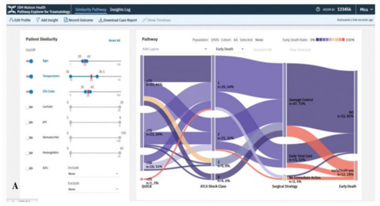
Figure 2. The screenshot of the VA system developed by Mica et al. [35] shows the pathway of the early death outcome of a hypothetical patient with an age of 35 years, an ISS of 35, and a temperature at admission of 35 °C using a Sankey diagram. Source: Reprinted with permission from ref. [35], Copyright (2020).
Visual Temporal Analysis Laboratory (ViTA-Lab) [36] integrates temporal data mining techniques with query-driven interactive visualizations to support a knowledge-based exploration of time-oriented clinical data and the discovery of interesting patterns within it. ViTA-Lab is composed of three main interfaces. The main visualization interface provides an overview of the longitudinal concepts and the distribution of derived temporal abstractions (TA) for individual and multiple patients at different temporal granularities. It provides the user with a knowledge-based browser and a graphical widget for selecting an individual patient or a group of patients. It uses a scatter diagram over time and a modified version of the bar chart visualization technique to show the distribution of TAs and help the user discover trends in these distributions.
The temporal association chart (TAC) allows visual exploration and discovery of probabilistic temporal associations among the distributions of various abstract concepts at different times. TAC’s input is a group of patients and a set of concepts that are chosen within the same or a different time window panel. The system calculates the distributions of values for each concept within the chosen time. Each concept is represented by a rectangular bar. The corresponding data values between two consecutive concepts for each patient are linked. Multiple links, including the same pair of values for a group of patients, are aggregated into a temporal association rule. This rule indicates the probability of having the second concept’s value, given the first concept’s value, and the total frequency of that combination. Thus, a group of patients who have this specific combination of values from two concepts, simultaneously or at different times based on the user-specified time period, is represented by a temporal rule.
The pattern explorer supports the exploration of temporal patterns that are discovered by data-driven computational techniques. It works based on a version of the KarmaLego algorithm, which is used for the discovery of frequent temporal patterns [37][38]. Components of the output’s temporal pattern (a pair of concept and value) are represented by horizontal lines that are ordered according to each component’s start time, maintaining, in a proportional fashion, the mean duration of each component and of the time gaps among components. The color of the same type of component in all patterns stays the same. The pattern explorer allows the user to recognize the meaning of a temporal pattern, that is, which components make up the pattern, and what temporal associations such as overlaps, before, or after hold between them.
RadVis [39] is a VA system that supports psychiatrists in analyzing and exploring multidimensional medical datasets for patients who have dementia (Figure 3). It allows the user to get a better understanding of the characteristics of patient clusters and analyze the variable values of data comprising each cluster at the same time. The system enables the user to select variables of interest from “Variable Selection Menu” and select “Cluster Segmentation Menu” to segment clusters of patients based on their traits. The user can choose the number of clusters for segmentation after selecting either a forgy cluster or a random cluster algorithm. Following either of the clustering algorithms, the cluster’s central value is calculated based on the number of clusters. After the Euclidean distance between the central value and each node is calculated, multiple nodes are included to obtain clusters of similar value. This process is repeated until the central value stays constant.
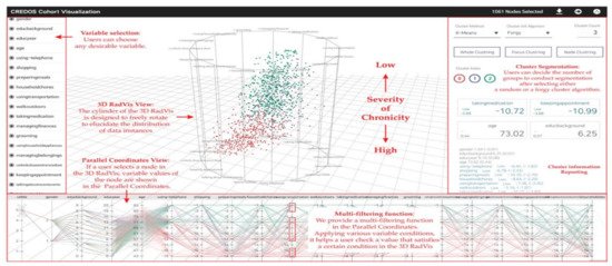
Figure 3. The screenshot of RadVis [39] combing 3D RadVis and parallel coordinates. Source: image used under CC-BY 4.0 License.
RadVis displays the distribution of data instances using 3-dimensional radial coordinate visualization (3D RadVis) that prevents node overlap. Furthermore, it facilitates the distribution of several nodes into optimum positions regardless of the number of dimensions. A patient with dementia is represented by a single node in this visualization. Nodes are color-coded according to the cluster they belong to. RadVis also supports a multi-filtering function through parallel coordinates plot to assign different conditions for a more comprehensive analysis. The parallel coordinates plot is used to display both categorical and numerical variables. It allows the user to check a value that satisfies a specific condition in the 3D RadVis. It also displays the variable values of a node that is selected in the 3D RadVis.
The predictive VA system developed by Sun et al. [40] aims to predict the risk and timing of deterioration in hypertension control using EHRs. The system is composed of three main modules. The feature engineering module converts clinical data into a feature matrix and a target label vector that can be used to build the predictive model. The target label is derived based on the physician’s assessment of blood pressure control status as in-control (i.e., positive) versus out-of-control (i.e., negative). The positive and negative transition points (from an episode of positive (negative) assessment points into negative (positive) points) are considered as target labels for the prediction model. Next, to turn event sequences into feature variables, the system specifies an observation window for each feature concept (e.g., diagnosis concept). It then aggregates all the events of the same feature concept within the observation window into a single value. The system then applies a two-level feature selection process. In the first level, within the same concept, features are chosen based on the information gain. Then a greedy forward selection algorithm is used to choose which concepts to keep. In the next step, the system starts iteratively combining features from different concepts until the combination fails to improve the performance of the prediction. Finally, various techniques, such as naive Bayes, logistic regression, and random forests, are used to generate transition point models. The system allows the user to explore the prediction results and other events through interactive visualization. An individual patient’s timeline is represented by a line, and each hypertension control assessment event is represented by a circle. Red and blue circles represent in-control and out-of-control blood pressure episodes, respectively.
The VA system developed by Guo et al. [41] helps clinicians to explore medical records from both multivariate and temporal perspectives and identify and analyze similar records (Figure 4). The system integrates an unsupervised learning-based technique with interactive linked views to support physicians in several tasks such as finding similar records based on a focal patient record, comparing patients’ medical feature values at a specific time point, or identifying (dis)similar time stamps among similar records. The system provides two overviews of all patients: One is for patients’ similarities according to the combination of tests taken during the collected time period, and the other view shows patient’s similarities according to the test values. To create the first overview, the system applies the Jaccard index [42] to compute the similarity. Then it extracts clusters of similar patients by combing a dimensionality reduction (DR) technique (i.e., t-SNE) and a density-based clustering method (i.e., HDBSCAN). For the second overview, the system first calculates the similarity of each pair of the test records and then similar to the other overview; it applies t-SNE to visualize the similarity relationships. To visualize the clustering information, each point (i.e., each patient’s record) is colored based on the assigned cluster-ID. The system allows the user to select a patient of interest from these overviews. It then automatically searches for the top-3 similar patients based on the pre-computed similarities. The system uses autoencoder-based event embedding [43] and sequence to sequence learning (seq2seq) [44] technique to handle various event types and convert records with different lengths to vectors of the same length. Then, it computes the similarity of each pair of patients using a certain distance metric, such as the Euclidean distance. The system provides multiple line charts to show changes of dissimilarities of test records over time between the patient of interest and top-3 similar patients and to visualize a statistical overview of the focal and top-3 similar patients.
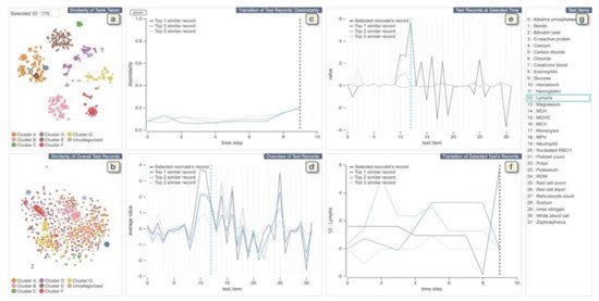
Figure 4. The screenshot of the VA system developed by Guo et al. [41]. (a,b) display each neonate’s similarities of tests taken and the records of test values, respectively. (c) shows changes of dissimilarities of test records over time between the neonate chosen from (a,b) and top-3 similar neonates. (d) displays a statistical overview of the chosen neonate and top-3 similar neonates. (e) provides all the test results at the selected time in (c) or (f). (f) displays the temporal changes of values of the chosen test in (d) or (e). (g) lists all medical test names. Source: Reprinted with permission from ref. [41], Copyright (2020), with permission from Elsevier.
SubVIS [45] is a VA system to support medical experts in interpreting high-dimensional clinical data and exploring subspace clusters from different perspectives (Figure 5). It enables the user to analyze each subspace independent of its association to a certain clustering technique. It allows the use of every subspace clustering technique available at OpenSubspace Framework [46]. SubVis allows a three-level exploration of data and clusters through its interface. The first level provides the user with a general overview of all the detected subspace clusters, their properties, and the distribution of dimensions within each subspace cluster using interactive bar charts. A matrix-based heatmap is also available to give more details on the association between the pair-wise distance. The second exploration level allows the user to choose a subset of relevant clusters in the multidimensional scaling (MDS) [47] plot to get an aggregated overview of the cluster members in an aggregation table. The distance between various clusters in the MDS plot shows their pair-wise similarity. SubVis contains various similarity measures, such as Overlapping, Jaccard Index, and Dice Coefficient. The system enables the user to inspect the distribution of the cluster members in every dimension for each cluster. In the last exploration level, a table-lens-like view [48] supports the exploration of the actual data records and provides interactive coloring and sorting of the record and its dimension.
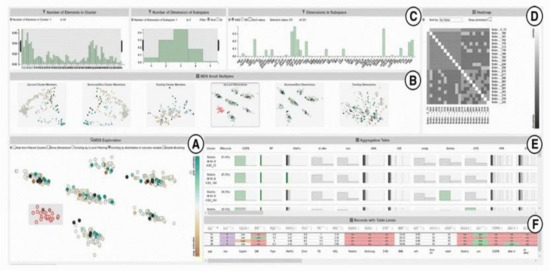
Figure 5. A screenshot of SubVIS [45] including (A) MDS projection plot, (B) MDS small multiples, (C) barcharts showing the distribution properties of the subspaces, (D) heatmap, (E) aggregation table, and (F) table lens. Source: image used under CC-BY License.
The VA system developed by Huang et al. [49] supports the interactive exploration of patient trajectories to assist physicians and clinical researchers in identifying chronic diseases and determining how a group of patients with chronic diseases might go on to develop other comorbidities over time (Figure 6). The system first aligns patient trajectories based on the time they are diagnosed with a specific chronic disease. Then once the user specifies the time windows, the patient trajectories are divided based on their timestamps, and patients within the same time window are aggregated into one. The system then clusters the patient records at each time window based on a similarity measure and creates a set of cohorts. The system supports frequency-based cohort clustering and hierarchical cohort clustering techniques. A cohort of patient trajectory network is built based on the clustering result where each node represents a cohort at a time window, and each edge shows the relationship between two cohorts at consecutive time windows where their members overlap. The system allows the user to filter edges using the variance-based association filtering technique by adjusting the entropy threshold. When the threshold is zero, only associations between fully overlapped cohorts are shown; in the case when the threshold is high, all associations are visualized. A Sankey-like timeline then visualizes the output results. The nodes are color-coded based on the unique comorbidities, and the color of the edges is determined by the two nodes it connects (i.e., a gradient for smooth transitions). Each cohort has a label that shows its dominant features. In addition, the cardinality of both nodes and edges are represented by their height.
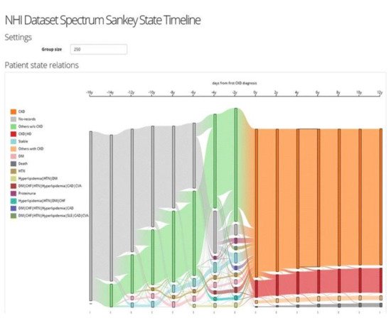
Figure 6. The screenshot of the VA system developed by Huang et al. [49] shows the result of frequency-based cohort clustering using a Sankey diagram. Source: image used under CC-BY 4.0 License.
CarePre [50] is a clinical decision assistance system that supports the exploration and interpretation of deep learning prediction models that are developed to predict future diagnosis events for a focal patient based on their medical background. It assists physicians in making more informed decisions by letting them analyze contributing factors in prediction results and explore the outcomes of possible treatments through interactive visualizations. CarePre allows the physician to input potential diagnoses (based on the patient’s symptoms and tests) for a focal patient into the system. The system then automatically estimates the risk of future diseases for the patient based on their medical history using a state-of-the-art deep learning technique and allows the physician to explore the results and the details of the historical medical records in the prediction view. The prediction view shows the patient’s event sequence leading up to the time point of prediction, which is represented by rectangular nodes arranged horizontally in order of their occurrence. The predicted likelihood of each diagnosis is also displayed as a series of rectangular nodes where the color saturation for each node shows the prevalence of the predicted diagnosis across the records for a population of similar patients.
In the next step, the physician can specify a query to retrieve a group of similar patients to help interpret the prediction results. CarePre measures similarity between sequences by computing the similarity between each pair of events using the Euclidean distance of the corresponding event vectors. It then displays event sequence data for the focal patient as well as a group of similar patients. It also aggregates the event sequences for similar patients into a flow-based visualization to allow a one-to-many comparison between the focal patient and a group of similar patients and to show the overall evolution of treatments and diseases over time. Lastly, the physician can explore alternative treatment plans and identify the key factors that contribute to the prediction result through various interactions such as editing the focal patient’s events (e.g., adding events, changing the order) in the prediction view and comparing the edited event sequence in the outcome analysis view.
Peekquence [51] is a VA system that aims to make the frequent sequence mining results more interpretable by allowing the user to explore the patterns by ranking them based on their variability or correlation to the outcome. It can also integrate patterns with a patient timeline to help the user understand where the patterns occur in the actual data. Peekquence uses the SPAM [27] frequent sequence mining algorithm to detect the most frequent sequences. The system uses four linked views to visualize the result of SPAM on the patient’s medical records. All the views use an event glyph to visualize the event sequences. The event glyph represents each unique event type appearing in the mined patterns by a circle and is color-coded based on a categorical ontology. These event glyphs are labeled with an abbreviation of the name of the event type. The sequence network view displays the frequency of co-occurring events within patterns that are mined using SPAM. The event types are represented by the nodes, and the two co-occurring nodes within patterns are connected by an edge. The pattern list view displays all the mined patterns, aligned vertically. Each row represents a pattern that is visualized as a sequence of circular event glyphs. Furthermore, the association of the patterns with the outcome is represented by the stacked bar chart next to the sequence. The event co-occurrence histogram view shows the frequency of co-occurring events with a selected pattern from the pattern list view. Each event type is represented by a bar partitioned into three blocks to show events occurring before, within, and after the chosen pattern. Lastly, the timeline view displays the patient’s event sequences aligned according to the selected pattern.
PHENOTREE [52] is a hierarchical and interactive phenotyping VA system that allows physicians to participate in the phenotyping process of large-scale patient records. It enables the user to explore patient cohorts, and to create, interpret, and evaluate phenotypes by generating and navigating a phenotype hierarchy. The system uses the sparse principal component analysis (SPCA) to identify key clinical features that describe the population given a cohort or sub-cohorts of patients. These key clinical features are used to build deeper phenotypes at finer granularities by expanding the phenotype hierarchy. Patients that are associated with each key feature are grouped into individual sub-cohorts. The system then iteratively applies the SPCS to each sub-cohort of patients created in the previous step. PHENOTREE assists physicians in identifying groups of phenotypes and their corresponding patient sub-cohorts at different granularities through this process. The system utilizes the radial Reingold-Tilford tree to visualize the results. Each node in the tree represents a structured phenotype and a sub-cohort characterized by this phenotype.
VALENCIA [53] is a VA system that aims to address the challenges of high-dimensional EHRs by integrating several dimensionality reduction (DR) and cluster analysis (CA) techniques with real-time analytics and interactive visualizations (Figure 7). VALENCIA’s analytics engine has two components—namely, DR and CA engines. The DR engine incorporates several DR techniques to transform EHRs from the high-dimensional space to one with lower dimensions. The CA engine then uses several clustering techniques to classify the data points in this low-dimensional space into meaningful groups with similar characteristics. VALENCIA allows the user to choose the most appropriate combination of DR and CA techniques and explore the results through two main views—namely, DR and CA views. The DR view has four subviews, including raw-data, projected-features, association, and variance subviews. These subviews allow the user to choose their features of interest, select the DR technique, adjust the configuration parameters, investigate how features are associated with transformed dimensions, and choose dimensions to be included in the CA engine. The CA view has three subviews—namely, hierarchical subview, frequency subview, and projected-observation subview. These subviews allow the user to examine the hierarchical structure of the CA results, choose the CA technique and configuration parameters, and observe the distribution of features in each subset of the data.
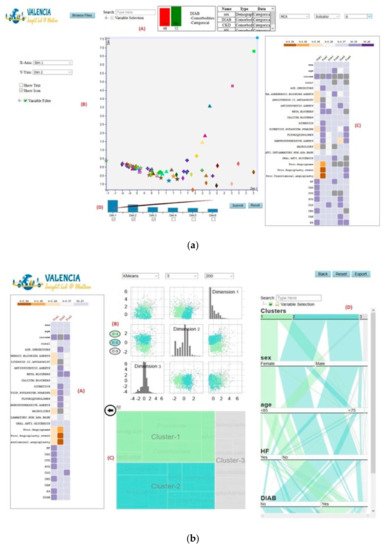
Figure 7. The screenshot of VALENCIA [53] showing (a) the DR view and (b) the CA view. Source: image by authors.
VISA_M3R3 [54] is a VA system that allows clinical researchers to identify medications or medication combinations that are associated with a higher risk of acute kidney injury (AKI) (Figure 8). The system incorporates regression, frequent itemset mining, and interactive visualization to help the user explore the relationship between medications and AKI. The analytics module of Visa_M3R3 is composed of two components. The first component is the single-medication analyzer that focuses on finding associations between individual medications and AKI using multivariate regression. The multiple-medications analyzer aims to identify associations between medication combinations and AKI using frequent itemset mining and regression. All models are validated through Bonferroni correction and represented in multiple interactive views. The regression models generated from single-medication and multiple-medications analyzers are represented in two scatter plots in the single-medication and multiple-medication views. The output of the frequent itemset mining is shown using a chord diagram in the frequent-itemset view. The user can filter and control the information presented in other views using sliders in the covariates view. Finally, the medication-hierarchy view displays additional information regarding data elements using a data table.
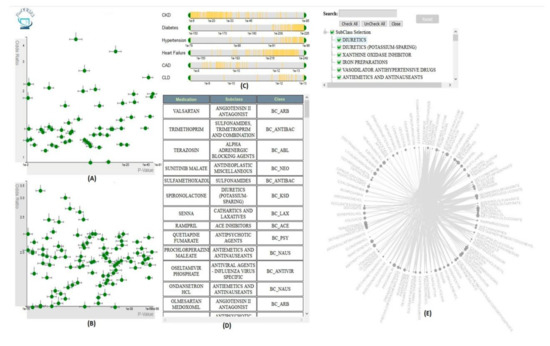
Figure 8. The screenshot of VISA_M3R3 [54] showing (A) the single-medication view, (B) the multiple-medication view, (C) the covariates view, (D) the data table, and (E) the frequent-itemset view. Source: Image by authors.
This entry is adapted from the peer-reviewed paper 10.3390/informatics8010012
References
- Murdoch, T.B.; Detsky, A.S. The Inevitable Application of Big Data to Health Care. JAMA J. Am. Med. Assoc. 2013, 309, 1351–1352.
- Doupi, P. Using EHR Data for Monitoring and Promoting Patient Safety: Reviewing the Evidence on Trigger Tools. Stud. Health Technol. Inf. 2012, 180, 786–790.
- Agrawal, A. Medication Errors: Prevention Using Information Technology Systems. Br. J. Clin. Pharmacol. 2009, 67, 681–686.
- Dey, S.; Luo, H.; Fokoue, A.; Hu, J.; Zhang, P. Predicting Adverse Drug Reactions through Interpretable Deep Learning Framework. BMC Bioinform. 2018, 19, 476.
- Abdullah, S.S.; Rostamzadeh, N.; Sedig, K.; Lizotte, D.J.; Garg, A.X.; McArthur, E. Machine Learning for Identifying Medication-Associated Acute Kidney Injury. Informatics 2020, 7, 18.
- Tang, P.C.; McDonald, C.J. Electronic health record systems. In Biomedical Informatics: Computer Applications in Health Care and Biomedicine; Shortliffe, E.H., Cimino, J.J., Eds.; Health Informatics; Springer: New York, NY, USA, 2006; pp. 447–475. ISBN 978-0-387-36278-6.
- Christensen, T.; Grimsmo, A. Instant Availability of Patient Records, but Diminished Availability of Patient Information: A Multi-Method Study of GP’s Use of Electronic Patient Records. BMC Med. Inform. Decis. Mak. 2008, 8, 12.
- Rostamzadeh, N.; Abdullah, S.S.; Sedig, K. Data-Driven Activities Involving Electronic Health Records: An Activity and Task Analysis Framework for Interactive Visualization Tools. Multimodal Technol. Interact. 2020, 4, 7.
- Heisey-Grove, D.; Danehy, L.N.; Consolazio, M.; Lynch, K.; Mostashari, F. A National Study of Challenges to Electronic Health Record Adoption and Meaningful Use. Med. Care 2014, 52, 144–148.
- Lau, F.; Price, M.; Boyd, J.; Partridge, C.; Bell, H.; Raworth, R. Impact of Electronic Medical Record on Physician Practice in Office Settings: A Systematic Review. BMC Med. Inform. Decis. Mak. 2012, 12, 10.
- Ola, O.; Sedig, K. The Challenge of Big Data in Public Health: An Opportunity for Visual Analytics. Online J. Public Health Inf. 2014, 5, 223.
- Keim, D.A.; Mansmann, F.; Thomas, J. Visual Analytics: How Much Visualization and How Much Analytics? ACM SIGKDD Explor. Newsl. 2010, 11, 5.
- Sedig, K.; Parsons, P.; Babanski, A. Towards a Characterization of Interactivity in Visual Analytics. J. Multimed. Process. Technol. 2012, 3, 12–28.
- Ribarsky, W.; Fisher, B.; Pottenger, W.M. Science of Analytical Reasoning. Inf. Vis. 2009.
- Vamathevan, J.; Clark, D.; Czodrowski, P.; Dunham, I.; Ferran, E.; Lee, G.; Li, B.; Madabhushi, A.; Shah, P.; Spitzer, M.; et al. Applications of Machine Learning in Drug Discovery and Development. Nat. Rev. Drug Discov. 2019, 18, 463–477.
- Cortez, P.; Embrechts, M.J. Using Sensitivity Analysis and Visualization Techniques to Open Black Box Data Mining Models. Inf. Sci. 2013, 225, 1–17.
- Keim, D.A.; Munzner, T.; Rossi, F.; Verleysen, M. Bridging Information Visualization with Machine Learning (Dagstuhl Seminar 15101). Dagstuhl Rep. 2015, 5, 1–27.
- Rajwan, Y.G.; Barclay, P.W.; Lee, T.; Sun, I.-F.; Passaretti, C.; Lehmann, H. Visualizing Central Line –Associated Blood Stream Infection (CLABSI) Outcome Data for Decision Making by Health Care Consumers and Practitioners—An Evaluation Study. Online J. Public Health Inf. 2013, 5, 218.
- Goldsmith, M.-R.; Transue, T.R.; Chang, D.T.; Tornero-Velez, R.; Breen, M.S.; Dary, C.C. PAVA: Physiological and Anatomical Visual Analytics for Mapping of Tissue-Specific Concentration and Time-Course Data. J. Pharm. Pharm. 2010, 37, 277–287.
- Perer, A.; Sun, J. MatrixFlow: Temporal Network Visual Analytics to Track Symptom Evolution during Disease Progression. AMIA Annu. Symp. Proc. 2012, 2012, 716–725.
- Lo, Y.-S.; Lee, W.-S.; Liu, C.-T. Utilization of Electronic Medical Records to Build a Detection Model for Surveillance of Healthcare-Associated Urinary Tract Infections. J. Med. Syst. 2013, 37, 9923.
- Gotz, D.; Stavropoulos, H. Decisionflow: Visual Analytics for High-Dimensional Temporal Event Sequence Data. IEEE Trans. Vis. Comput. Graph. 2014, 20, 1783–1792.
- Kwon, B.C.; Choi, M.-J.; Kim, J.T.; Choi, E.; Kim, Y.B.; Kwon, S.; Sun, J.; Choo, J. Retainvis: Visual Analytics with Interpretable and Interactive Recurrent Neural Networks on Electronic Medical Records. IEEE Trans. Vis. Comput. Graph. 2018, 25, 299–309.
- Kwon, B.C.; Anand, V.; Severson, K.A.; Ghosh, S.; Sun, Z.; Frohnert, B.I.; Lundgren, M.; Ng, K. DPVis: Visual Analytics with Hidden Markov Models for Disease Progression Pathways. IEEE Trans. Vis. Comput. Graph. 2020.
- Ledieu, T.; Bouzille, G.; Plaisant, C.; Thiessard, F.; Polard, E.; Cuggia, M. Mining Clinical Big Data for Drug Safety: Detecting Inadequate Treatment with a DNA Sequence Alignment Algorithm. AMIA Annu. Symp. Proc. 2018, 2018, 1368–1376.
- Gotz, D.; Wang, F.; Perer, A. A Methodology for Interactive Mining and Visual Analysis of Clinical Event Patterns Using Electronic Health Record Data. J. Biomed. Inform. 2014, 48, 148–159.
- Ayres, J.; Flannick, J.; Gehrke, J.; Yiu, T. Sequential Pattern Mining Using a Bitmap Representation. In Proceedings of the Eighth ACM SIGKDD International Conference on Knowledge Discovery and Data Mining, Edmonton, AB, Canada, 23 July 2002; pp. 429–435.
- Simpao, A.F.; Ahumada, L.M.; Desai, B.R.; Bonafide, C.P.; Galvez, J.A.; Rehman, M.A.; Jawad, A.F.; Palma, K.L.; Shelov, E.D. Optimization of Drug-Drug Interaction Alert Rules in a Pediatric Hospital’s Electronic Health Record System Using a Visual Analytics Dashboard. J. Am. Med. Inform. Assoc. 2014, 22, 361–369.
- Dagliati, A.; Sacchi, L.; Tibollo, V.; Cogni, G.; Teliti, M.; Martinez-Millana, A.; Traver, V.; Segagni, D.; Posada, J.; Ottaviano, M.; et al. A Dashboard-Based System for Supporting Diabetes Care. J. Am. Med. Inf. Assoc. 2018, 25, 538–547.
- Sacchi, L.; Capozzi, D.; Bellazzi, R.; Larizza, C. JTSA: An Open Source Framework for Time Series Abstractions. Comput. Methods Programs Biomed. 2015, 121, 175–188.
- Dagliati, A.; Sacchi, L.; Zambelli, A.; Tibollo, V.; Pavesi, L.; Holmes, J.H.; Bellazzi, R. Temporal Electronic Phenotyping by Mining Careflows of Breast Cancer Patients. J. Biomed. Inf. 2017, 66, 136–147.
- Mane, K.K.; Bizon, C.; Schmitt, C.; Owen, P.; Burchett, B.; Pietrobon, R.; Gersing, K. VisualDecisionLinc: A Visual Analytics Approach for Comparative Effectiveness-Based Clinical Decision Support in Psychiatry. J. Biomed. Inform. 2012, 45, 101–106.
- Perer, A.; Wang, F.; Hu, J. Mining and Exploring Care Pathways from Electronic Medical Records with Visual Analytics. J. Biomed. Inform. 2015, 56, 369–378.
- Dingen, D.; van’t Veer, M.; Houthuizen, P.; Mestrom, E.H.J.; Korsten, E.H.H.M.; Bouwman, A.R.A.; van Wijk, J. RegressionExplorer: Interactive Exploration of Logistic Regression Models with Subgroup Analysis. IEEE Trans. Vis. Comput. Graph. 2019, 25, 246–255.
- Mica, L.; Niggli, C.; Bak, P.; Yaeli, A.; McClain, M.; Lawrie, C.M.; Pape, H.-C. Development of a Visual Analytics Tool for Polytrauma Patients: Proof of Concept for a New Assessment Tool Using a Multiple Layer Sankey Diagram in a Single-Center Database. World J. Surg. 2020, 44, 764–772.
- Klimov, D.; Shknevsky, A.; Shahar, Y. Exploration of Patterns Predicting Renal Damage in Patients with Diabetes Type II Using a Visual Temporal Analysis Laboratory. J. Am. Med. Inform. Assoc. 2015, 22, 275–289.
- Moskovitch, R.; Shahar, Y. Classification of Multivariate Time Series via Temporal Abstraction and Time Intervals Mining. Knowl. Inf. Syst. 2015, 45, 35–74.
- Moskovitch, R.; Shahar, Y. Fast Time Intervals Mining Using the Transitivity of Temporal Relations. Knowl. Inf. Syst. 2015, 42, 21–48.
- Ha, H.; Lee, J.; Han, H.; Bae, S.; Son, S.; Hong, C.; Shin, H.; Lee, K. Dementia Patient Segmentation Using EMR Data Visualization: A Design Study. Int. J. Environ. Res. Public Health 2019, 16, 3438.
- Sun, J.; McNaughton, C.D.; Zhang, P.; Perer, A.; Gkoulalas-Divanis, A.; Denny, J.C.; Kirby, J.; Lasko, T.; Saip, A.; Malin, B.A. Predicting Changes in Hypertension Control Using Electronic Health Records from a Chronic Disease Management Program. J. Am. Med. Inf. Assoc. 2014, 21, 337–344.
- Guo, R.; Fujiwara, T.; Li, Y.; Lima, K.M.; Sen, S.; Tran, N.K.; Ma, K.-L. Comparative Visual Analytics for Assessing Medical Records with Sequence Embedding. Vis. Inform. 2020, 4, 72–85.
- Gower, J.C.; Warrens, M.J. Similarity, Dissimilarity, and Distance, Measures Of. Wiley StatsRef Stat. Ref. Online 2014, 1–11.
- Kramer, M.A. Nonlinear Principal Component Analysis Using Autoassociative Neural Networks. AICHE J. 1991, 37, 233–243.
- Sutskever, I.; Vinyals, O.; Le, Q.V. Sequence to Sequence Learning with Neural Networks. Adv. Neural Inf. Process. Syst. 2014, 27, 3104–3112.
- Hund, M.; Böhm, D.; Sturm, W.; Sedlmair, M.; Schreck, T.; Ullrich, T.; Keim, D.A.; Majnaric, L.; Holzinger, A. Visual Analytics for Concept Exploration in Subspaces of Patient Groups. Brain Inf. 2016, 3, 233–247.
- Müller, E.; Günnemann, S.; Assent, I.; Seidl, T. Evaluating Clustering in Subspace Projections of High Dimensional Data. Proc. VLDB Endow. 2009, 2, 1270–1281.
- Cox, M.A.A.; Cox, T.F. Multidimensional Scaling. In Handbook of Data Visualization; Chen, C., Härdle, W., Unwin, A., Eds.; Springer Handbooks Comp. Statistics; Springer: Berlin/Heidelberg, Germany, 2008; pp. 315–347. ISBN 978-3-540-33037-0.
- Rao, R.; Card, S.K. The Table Lens: Merging Graphical and Symbolic Representations in an Interactive Focus+ Context Visualization for Tabular Information. In Proceedings of the SIGCHI Conference on Human Factors in Computing Systems, Boston, MA, USA, 24–28 April 1994; pp. 318–322.
- Huang, C.-W.; Lu, R.; Iqbal, U.; Lin, S.-H.; Nguyen, P.A.A.; Yang, H.-C.; Wang, C.-F.; Li, J.; Ma, K.-L.; Li, Y.-C.J.; et al. A Richly Interactive Exploratory Data Analysis and Visualization Tool Using Electronic Medical Records. BMC Med. Inform. Decis. Mak. 2015, 15, 92.
- Jin, Z.; Cui, S.; Guo, S.; Gotz, D.; Sun, J.; Cao, N. CarePre: An Intelligent Clinical Decision Assistance System. ACM Trans. Comput. Healthc. 2020, 1, 1–20.
- Kwon, B.C.; Verma, J.; Perer, A. Peekquence: Visual Analytics for Event Sequence Data. In Proceedings of the ACM SIGKDD 2016 Workshop on Interactive Data Exploration and Analytics, San Francisco, CA, USA, 14 August 2016; Volume 1.
- Baytas, I.M.; Lin, K.; Wang, F.; Jain, A.K.; Zhou, J. PhenoTree: Interactive Visual Analytics for Hierarchical Phenotyping from Large-Scale Electronic Health Records. IEEE Trans. Multimed. 2016, 18, 2257–2270.
- Abdullah, S.S.; Rostamzadeh, N.; Sedig, K.; Garg, A.X.; McArthur, E. Visual Analytics for Dimension Reduction and Cluster Analysis of High Dimensional Electronic Health Records. Informatics 2020, 7, 17.
- Abdullah, S.S.; Rostamzadeh, N.; Sedig, K.; Garg, A.X.; McArthur, E. Multiple Regression Analysis and Frequent Itemset Mining of Electronic Medical Records: A Visual Analytics Approach Using VISA_M3R3. Data 2020, 5, 33.